

You are using an out of date browser. It may not display this or other websites correctly.
You should upgrade or use an alternative browser.
You should upgrade or use an alternative browser.
triangles (choice of 2)
- Thread starter lfc1892
- Start date

- Messages
- 2,930
- Name
- Matty
- Edit My Images
- No
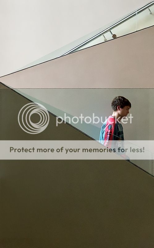
I think the first crop works better, I dont feel that the dead space at the bottom of the second adds anything compositionally. You are right about the colours, and the triangles work well.
My only criticism would be that it looks like there are some drastic oversharpening artefacts on the guys face in the first one. It looks like what happens when I push the sharpening slider in lightroom all the way up. I think its noticeable close to a couple of the diagonal lines in the shot as well.
My only criticism would be that it looks like there are some drastic oversharpening artefacts on the guys face in the first one. It looks like what happens when I push the sharpening slider in lightroom all the way up. I think its noticeable close to a couple of the diagonal lines in the shot as well.
OP
- Messages
- 2,079
- Edit My Images
- Yes
thanks for the reply and comments. I know what you mean about the sharpening haloes. it's because it was taken high iso and so had to reduce the noise and then sharpen a fair bit to show up the lines a little more. will have a play with it to soften the roughness a touch. thanks again.
- Messages
- 169
- Name
- Les
- Edit My Images
- Yes
Agree on the Sharpening and the Noise, a bit distracting.
I like the first better, and I like diagonals in photos, they can lead your eyes to what you want the viewer to focus on. However, in this case the diagonals all lead you to the left of the picture, but the person is on the right.
Also, it would be more normal to leave the dead space in front of the way the person is facing, as it makes you feel that he is moving into that space.
So, in an ideal world, this would have worked better if the person was going up the escalator, facing left, moving left, and going to where the lines converge on the left.
Just my opinion, but hopefully explaining how "my" composition could have looked, gives you food for thought next time, in similar situations.
OP
- Messages
- 2,079
- Edit My Images
- Yes
Thanks for the reply and comments. I think I made a mess of the very last step of the sharpening process before posting online so will post another version. General theory does indeed suggest space for someone to move in to, as most sources of photography theory will suggest, but at the same time, placing someone or thing on the far right, as here, asks the viewer to consider where the subject has been, as opposed to where he is going. I haven't invented the theory, honestly! I read quite a few books and online sources of photography theory etc, and it's a technique used fairly often, but not in all cases, such as motorsports etc.
Thanks again. Will sort the sharpness as it's just a mistake prior to posting online.
Thanks again. Will sort the sharpness as it's just a mistake prior to posting online.

OP
- Messages
- 2,079
- Edit My Images
- Yes
Nothing really. No camera shake or lack of focus. Seems ok on my system but I can see what you mean when looking online so maybe it's there but exaggerated by compression. Will start with the raw I think and have another crack. Strange how the noise reduction would cause it. Must be something I have done on final edit. Or may must selectively soften those areas to save the pain of starting again. . .
Thanks again
Thanks again