

You are using an out of date browser. It may not display this or other websites correctly.
You should upgrade or use an alternative browser.
You should upgrade or use an alternative browser.
Critique Wedding Rings
- Thread starter gbmphoto
- Start date
")
OP
- Messages
- 1,564
- Name
- Graham
- Edit My Images
- No
Thanks for the comment, Timmy. It may have been my sloppy editing...
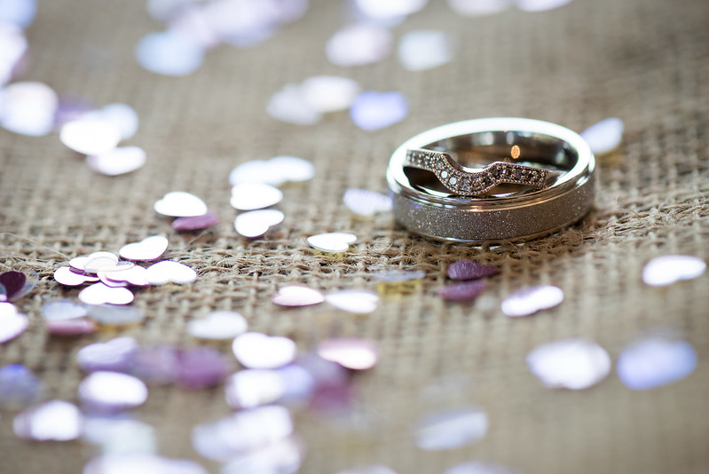
Is this any better?

D81_8758-3
I also took one of them on the pillow, although I think the first one is better as there is less distraction from the rings.

D81_8748
Is this any better?
D81_8758-3
I also took one of them on the pillow, although I think the first one is better as there is less distraction from the rings.
D81_8748
Last edited: