What do you think of these portraits?

Messages
89
Name
Paul Pierce
Edit My Images
Yes
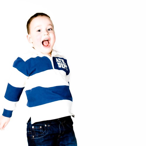
I had a try at creating some high contrast (venture style) portraits yesterday, of my two nephews, only managed to get about 25 frames; these are the best of them.

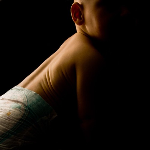
I would be interested to hear your comments and criticism :)

2226194471_f936f8576e.jpg


2226194817_c3014ea48a.jpg


2226984908_153312959d.jpg


2226985798_b2bd653792.jpg


A few low key shots. He was so interested in playing with the speedlight I was using for background lighting, that I had to abandon the first style.

2226986240_11b6111014.jpg


2226195269_19cfb722b0.jpg
 
I'm not a fan of high-key shots but the 2nd to last is simply fab
 
I'm not much good at offering critique, as I'm new to studio lighting but I love the last two, what a cutie! Might I ask what's all over his face?

It's chocolate, he grabbed a bit while nobody was looking, I moved a flash over and took a pic before he was cleaned up :)
 
As someone who used to work for Venture they ain't bad. Got good use of the white space which is really important in their shots. We didn't always work with such high contrast. Your pics almost have too much contrast and details has been lost in the face.

One the 3rd pic extend the white space a little more (up)so the boy is in just the 1st 3rd of the space, it will look as if he still has some space to jump into.

Also be careful with pics such as number 4 as it is very easy to shoot up someone's nose which isn't a best selling pic.

They give great impact though against the white background. It's really hard to keep coming up with new ideas using this style as their isn't much you can do with white space, maybe try and find some coloured balls or ribbons to mess around with.
 
I agree with with dolomitefan in that they are a bit too contrasty, certainly for my taste.
I also have to agree with the comments about the 2nd from last .. what an absolute corker! (y)
 
As someone who used to work for Venture they ain't bad. Got good use of the white space which is really important in their shots. We didn't always work with such high contrast. Your pics almost have too much contrast and details has been lost in the face.

One the 3rd pic extend the white space a little more (up)so the boy is in just the 1st 3rd of the space, it will look as if he still has some space to jump into.

Also be careful with pics such as number 4 as it is very easy to shoot up someone's nose which isn't a best selling pic.

They give great impact though against the white background. It's really hard to keep coming up with new ideas using this style as their isn't much you can do with white space, maybe try and find some coloured balls or ribbons to mess around with.

Oh yeah I didn't realise, I have just had a quick look at the image gallery on the venture website, there is a mix of high and normal contrast shots.

Funny you should say about shooting up his nose, I had to clone a bogey out of that shot :LOL:

Thanks for the rest of your advice and ideas, I will give them a try when I get another chance.


Thanks also InaGlo and FStop :)
 
The high contrast stuff really works well :) And is that chocolate all over that lil guys face...I want some now :(
 
The contrast is a bit to OTT for me but I love the compsitions of all. The chocolate shot!!!! Oh my God!!!
 
a good set, with the last but one being my favourite (y)
 
Last is best for me too... but without a nappy.. maybe a white towelling one or something.. or nothing at all... but not a commercial type paper one with prints on it.

Other than that... is a winner! (y)
 
Thanks Lee and Janice :)

Now that you mention it Janice, the disposable nappy does look a bit scruffy; I hadn't noticed.
 
Back
Top