
You are using an out of date browser. It may not display this or other websites correctly.
You should upgrade or use an alternative browser.
You should upgrade or use an alternative browser.
Ironside - Project52 -> RE-SHOOT: 'Delicate' (red rose)
- Thread starter Ironside
- Start date
I do like your first chaos image - and with all the protests going on across the globe, it would be hard for it to be less topical.
As for the police believing you to be foreign press - it's not lying to allow them to believe what they already believe and just not correcting them.")
As for the police believing you to be foreign press - it's not lying to allow them to believe what they already believe and just not correcting them.
- Messages
- 19,461
- Name
- Andy
- Edit My Images
- Yes
Hi, Dave, chaos #1 is a nice catch. Really has a sense of imminent chaos and a pitched battle.
I'd have liked to see more of the shadow in which, I feel may had added to the composition and 'big brother' feel of the image. Perhaps from a kneeling position, but I don't know how much time you had to compose and think through your photograph..
Cheers.
I'd have liked to see more of the shadow in which, I feel may had added to the composition and 'big brother' feel of the image. Perhaps from a kneeling position, but I don't know how much time you had to compose and think through your photograph..
Cheers.
- Messages
- 998
- Name
- steve
- Edit My Images
- Yes
Dave, like both "chaos" shots. If i had to choose think its no1, the picture gives a sense of chaos on the horizon, maybe a battle or something. Shows what is going on all over the world at the minute. The direct sunlight helps with the effects. Well done
- Messages
- 737
- Name
- Martin
- Edit My Images
- Yes
Hi David
I really like both of your Chaos images. If I absolutely had to choose my favourite it would be No1. There is a real atmosphere of Chaos and tension and I visualised some sort of protest when i was looking up definitions for Chaos.
No2 is a fab shot and totally Chaotic but I had to choose. You should be proud of both of these images.
Martin
- Messages
- 2,735
- Name
- Patrick
- Edit My Images
- Yes
Hi David, great pair of images for "chaos". My favourite is the first one which is a good piece of photojournalism. The sun adds hugely to the drama. What's the orange circle in the middle of the pic - I'd be tempted to clone it out.
Like your week 7 a lot.
Like your week 7 a lot.
- Messages
- 8,398
- Name
- Lynne
- Edit My Images
- Yes
Hi David
great pair of shots for Chaos ,for me the 2nd one just nudges ahead , sepia suites it well
great pair of shots for Chaos ,for me the 2nd one just nudges ahead , sepia suites it well
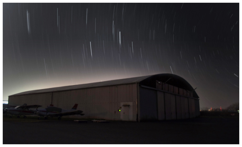
Project52 - Week Nine ('Finish')
My idea: where does the sky start and where does is finish?
A brief background about the picture - this took dedication & luck!!! I'd seen a few star trails pictures online and decided that I really, really wanted to try take some of my own, so yesterday after work I packed up my bag with my camera, tripod, mini stool, IR shutter remote control and most importantly - my scarf, before heading up to the local airfield.
After some awkward conversations in German/English I convinced them that I was no harm and strangely yes, all I wanted to do was sit in the middle of their runway for two hours to stare at the stars.
I'm beginning to like the photo, but I really (perhaps naively) expected it to turn out better. There's a lot of light pollution from the autobahn behind the airfield effecting the contrast at the top of the hanger and though some like it - I'm yet to be convinced. I wish there was more colour in the picture.
Comments welcome as always.
drodd
Also loves to mass debate
- Messages
- 5,519
- Name
- Dawn
- Edit My Images
- No
Hiya David,
Wow I really like this photo for the theme, and well done to you for doing a great job on your first attempt (something I hope to do some time soon).
I think the lack of colour gives it a bit of a 'space age' appeal, so to me it looks good.
Also like your take on the theme, and think it fits well.
Well done
Cheers
Dawn
- Messages
- 7,694
- Name
- Tina
- Edit My Images
- Yes
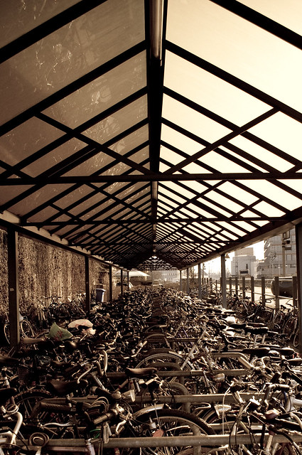
I love both your Chaos submissions. Obviously very different but the reportage piece with the glare of the light is marvellous! As is the jumble of bicycles; I also feel the processing works really well with it
I can't make my mind up about your Finish submission. I find star trails not very exhilarating so it could be that :shrug: My preconceptions
I can't make my mind up about your Finish submission. I find star trails not very exhilarating so it could be that :shrug: My preconceptions
- Messages
- 19,461
- Name
- Andy
- Edit My Images
- Yes
Hi, Dave, your finished shot is a bit soft, but to be honest, I really feel it adds to the photograph.
Also, your stars have a kind of tapered ending which I really like.
I think shifting the composition up and left a tad may help a bit??

Cheers.
Also, your stars have a kind of tapered ending which I really like.
I think shifting the composition up and left a tad may help a bit??
I packed up my bag with my camera, tripod, mini stool, IR shutter remote control and most importantly - my scarf....
Cheers.
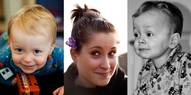
Project52 - Week Ten ('Trio')
This week I decided to up my game and buy myself my first prime lens, a Nikon 50mm with crazy aperture capabilities (1.8 can you believe); something which my kit lens seemed to struggle achieving.
Luckily, whether I be in Scotland, Holland or Germany (all three this week) I have some fantastic models at my disposal and I've been taking portraits like mad.
Three of my favourites are combined above into one collage, and this is my 'trio' submission for the week.
drodd
Also loves to mass debate
- Messages
- 5,519
- Name
- Dawn
- Edit My Images
- No
Hiya David,
Well done on the trio shot, the photos are great. However I think that it would have been better to have the last photo in colour to maintain the continuity, or alternatively all the images in b&w. Also the sky in the middle shot looks a tad over exposed (which might actually look better in b&w).
Furthermore, I think if you finished the image with a plain black border it would look fab.
Otherwise great job.
Cheers
Dawn
- Messages
- 7,694
- Name
- Tina
- Edit My Images
- Yes
Congratulations on your new lens, I enjoy my 50 also.
Your triptych doesn't work for me as I expect the pictures in such to flow. You have put your lady{?) in the middle but the children either side need to be in colour also, or all b&w.
The image in #1 is a lovely portrait of a playful soul and as such I feel more suitable to solo presentation. The middle image has a blown sky (would look better b&w?) #3 is VERY close to having the top of his head clipped off
I will endeavour to visit and do a proper critique each week from now
- Messages
- 1,468
- Name
- Tim
- Edit My Images
- Yes
I've just got a nifty fifty myself - they're brilliant aren't they!
You have done really well and got three nice portraits there but to group them together it would be nice for them to have some sort of unifying theme, such as some processing to give them all similar colours etc.
You have done really well and got three nice portraits there but to group them together it would be nice for them to have some sort of unifying theme, such as some processing to give them all similar colours etc.
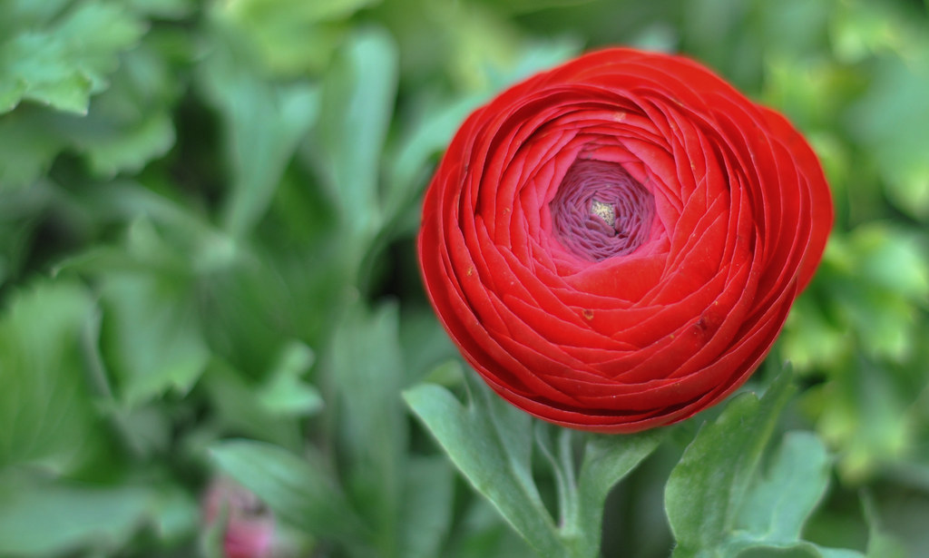
Project52 - Week Eleven RESHOOT ('Delicate')
This week I decided to try improve on probably my worst entry attempt thus far, that being the one for week seven: 'delicate'.
I'm quite pleased with this picture, the depth of field feels appropriate to me, the focus is about right (just a little over exposed at the top of the rose) all in all, the mix of deep red on green contrasts well.
What do you think?
I've just got a nifty fifty myself - they're brilliant aren't they!
You have done really well and got three nice portraits there but to group them together it would be nice for them to have some sort of unifying theme, such as some processing to give them all similar colours etc.
Congratulations on your new lens, I enjoy my 50 also.
Your triptych doesn't work for me as I expect the pictures in such to flow. You have put your lady{?) in the middle but the children either side need to be in colour also, or all b&w.
The image in #1 is a lovely portrait of a playful soul and as such I feel more suitable to solo presentation. The middle image has a blown sky (would look better b&w?) #3 is VERY close to having the top of his head clipped off
I will endeavour to visit and do a proper critique each week from now
Hiya David,
Well done on the trio shot, the photos are great. However I think that it would have been better to have the last photo in colour to maintain the continuity, or alternatively all the images in b&w. Also the sky in the middle shot looks a tad over exposed (which might actually look better in b&w).
Furthermore, I think if you finished the image with a plain black border it would look fab.
Otherwise great job.
Cheers
Dawn
Everyone said the same thing, 'don't group them together' and I totally agree... I wasn't trying to achieve a single image presentation - rather I had taken three portraits that week and wanted to show them off, I should have uploaded 3 individual images upon reflection.
@Tina - yeh the middle does have a blown sky, at the time I was trying to achieve lens flare but it didn't really work. Shame, because I think Erika looks really pretty in it and as a portrait I'm quite proud of it.
- Messages
- 243
- Name
- Vikki
- Edit My Images
- Yes
I just wanted to pop in to say that I love your week 5 of the street artist. What a great shot! I also really like the wk 8 shot chaos with the police. The 'contre jour' really works with this and I think that they police look as though they are facing an apocalypse! The second chaos shot stands well on its own and really fits the theme. I like what you have done with it.
Good work so far. Will check into your 52 in future
Good work so far. Will check into your 52 in future