Leokull's 52 for 2011. Week 14 - Object

Messages
154
Edit My Images
Yes
After a little too much Umming and Erring I've decided to give photo52 a go. Mainly because I treated myself to a Nikon D5000 a couple of months before Christmas, Yet I've still to challenge myself creatively. So I'm hoping by the end of the year I'll see a huge difference from the photos I'm taking at the moment.
I also got Photoshop CS5 for Christmas (Lucky me), so I need a good reason to give it a regular workout.
All criticism will be most welcome. It's the only way to learn.

WEEK 1. Accommodation
A bit late I know, but I wanted to start from the beginning and I've been looking for a good excuse to photo some of the more colourful streets you can find in Bristol. Saturated a bit to bring out the colour of the houses.
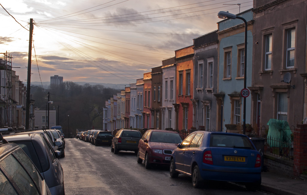
Accomodation by Leokull31, on Flickr

WEEK 2. New
It was my Birthday on Monday so I had lots of new toys to play with!
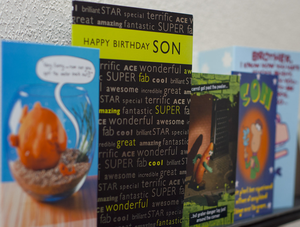
New age by Leokull31, on Flickr

Week 3 - Style
Week 4 - Open
Week 5 - Hard
Week 6 - Clutter
Week 7 - Delicate
Week 8 - Chaos
Weeks 9, 10, 11 and 12
Week 13 - Empty
Week 14 - Object
 
Last edited:
Hi Liam the "accommodation" pic is really appealing. I like gritty city scenes, and this is certainly gritty. The documentary style with lot of quirky details is great.
The sky adds a real dramatic edge, and I like the light on the houses on the right.

The blue car on the right detracts from the pic for me, but I'm not sure what you could have done about that. Also I feel the whole pic could be a bit sharper - did you use a tripod?

Good luck with the next 50.
 
Thanks for the comment Patrick. Unfortunately I didn't have a tripod at the time. It was taken while I was in a hurry So I couldn't take my time over it.
I did have another idea for that theme but it would've required me being in the right place at the right time, Something that's not so easy when you've only got a week to do it in. So I'll just have to save that idea for a personal project.
 
Week 3 - Style

Bit of a self portrait this week. Trying to convince myself that geek chic is a cool style :D
Desaturated and added a slight vignette to (hopefully) give a slight movie portrait look about it.
Although now I'm wondering if I desaturated a bit too much


Geek chic by Leokull31, on Flickr
 
Last edited:
Hi Liam,

Great idea for week 3. I actually like it being that desaturated, makes me think back to the golden age of geeks in the late 80's when everything was grey. I think the shot will survive the table being clipped but not the toes. One small nitpicking thing would be the skirting board stands out to me as its not level and appears to go up on the right left hand side.

But as I said, lovely idea and a good shot (y)
 
Last edited:
Great slippers and an interesting take on the style theme. I like the idea of trying to obtain a movie feel but have found, when trying the style myself, that trying to emulate the 16:9 ratio works better. Audiences are not used to seeing films shot in portrait orientation!
 
Thanks for the comments and pointers everyone. :clap:

I actually like it being that desaturated, makes me think back to the golden age of geeks in the late 80's when everything was grey.

Thats what I felt after I posted the photo. It never occurred to me that my photo would achieve that feeling.

when trying the style myself, that trying to emulate the 16:9 ratio works better. Audiences are not used to seeing films shot in portrait orientation!

That's a bloody good point and one I'll definitely bear in mind for future photos because I enjoyed planning this one and will most certainly try it out again with a different theme. (y)
 
Last edited:
Definitely enjoying your 52, and giving me some inspiration.

Like the week 3 shot and the PP works for me. Maybe a pair of specs peeking over the book would work?
 
Thanks for your comment Patrick. I really did want to try the glasses idea when I was setting up, but I don't wear glasses and there was nothing lying around I could use instead.

Gotta admit I did struggle this week with the theme. I tried an open door, an open eye, an open window and an open book. None of which I liked.
What made me go for these in the end was partly down to this post by Chriseve1979 and that my Macro extension tubes arrived in the post.
So how does this relate to open I here you ask?
Well now I have extension tubes, I've opened a whole new style of photograpy to myself and found it to be very accomodating. (see what I did there?) :LOL::LOL:


Close up 1 by Leokull31, on Flickr


Close up 2 by Leokull31, on Flickr


Close up 3 by Leokull31, on Flickr


Close up 4 by Leokull31, on Flickr
 
First two don't do a lot for me but the shallow depth of field in the second two is great. Welcome to the world of macro.
 
Liam, nice 4 posts..i too struggled..most *** have said they did too..

I like all 4, why? DOF and isolation of subjects is great on both 3 and 4. Images 1 and 2, i like the contrast between the colours, white on red appeals to me :naughty: .. and the straight lines make an interesting shot, similar to a map of the underground...maybe its just me. :cautious:
 
Nice one Liam I like all your images well taken and good thought into the themes well done.. your open theme pics are great nice vibrant colours and good use of dof ..look forward to seeing your week 5;)
 
Thanks for your kind words everyone. I really enjoyed my first steps into macro and I feel I've learnt a lot just from 2 hours of taking pictures of an old graphics card. (More light)!
 
?
Well now I have extension tubes, I've opened a whole new style of photograpy to myself and found it to be very accomodating. (see what I did there?) :LOL::LOL:

I can't wait to see what you come up with for week 52. :LOL::LOL::wacky:


I like 3 & 4 of your closeup shots. Nice DOF. I am tempted to get some extension tubes myself.(y)
 
Like 3&4 the best as its got a dof, the others are just straight on photos and don't do anything for me.

Like the play on words there btw :D
 
Thanks for your comments everyone.

Week 5 - Hard
Bit late with this week.
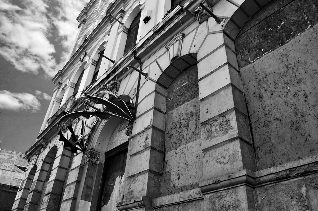
This was an idea I came up with at the start of week 5 but it took me ages to find a photo I liked. This is an old derelict building just opposite bristol temple meads that has fallen on hard times. I think it's an old Grosvenor casino, but it closed down long before I moved to Bristol.

Hard times by Leokull31, on Flickr
 
Last edited:
Thanks for the comments. I think Black and white is the only way this would have worked. The building itself is a very drab beige and there's not much colour in the original image. I did make a few changes in the photo though. Levels and curves in ps to make the blacks stand out a bit more. And I changed the sky as before it was just a horrible grey.
 
good start to your 52 Liam, some interesting shots going on :)

your week 3 shot is by far the pick of the bunch so far for me, fantastic! Well posed, the colours work well and nice and sharp. Only thing that spoils it is you've chopped your toes off! (y)

looking forward to seeing more!
 
Thanks for your comment Paul so far it's a toss up between style and hard for my personal favourite.

Week 6 - Clutter
Got the idea for this one while walking home from work. I was thinking about using photoshop to add piles of books around my living room. Then I thought, why not piles of me? So I present, a clutter of Liams!


Clutter of Liams by Leokull31, on Flickr

I know it's a bit (very) rough around the edges. But considering I've only had CS5 for 3 weeks and completed it from start to end in 2 hours, I'm quite proud of it. :D
If I've got time at the weekend. I might do a re-shoot to improve it.
 
Last edited:
i like your take on all themes and you shots, i look forward to seeing more as the year goes on, i bet you get some crackers (y) good luck
 
Thanks for your comment Paul so far it's a toss up between style and hard for my personal favourite.

Week 6 - Clutter
Got the idea for this one while walking home from work. I was thinking about using photoshop to add piles of books around my living room. Then I thought, why not piles of me? So I present, a clutter of Liams!


Clutter of Liams by Leokull31, on Flickr

I know it's a bit (very) rough around the edges. But considering I've only had CS5 for 3 weeks and completed it from start to end in 2 hours, I'm quite proud of it. :D
If I've got time at the weekend. I might do a re-shoot to improve it.

tell me what do they call this process and is it easy ?
thanks
 
haha good effort, I've seen these done badly so many times but really like this one!

only negative I can see if you want some CC is the wall on the right you can see where you have layered the shots. Maybe try using an eraser tool on say 25% opacity to blend in the layers. Another option is the healing eraser tool in photoshop.
 
Like all of your shots, but especially the clutter shot! What a great idea. I would also love to know how this is done and how easy/hard it is for a Photoshop CS noob (I've only had it for 3 weeks too).
 
Clutter is a good take and I love the look on book guy's face.

Now get some photographs on the walls...;)

#3 is great as well and I thought I'd commented on this. Gteat dull colours (hope this was intended...) and the pens in his pocket, it has areal Dilbert feel to it.

I'd like to have his feel in the shot..

Cheers.
 
Very good I like it and cleverly done :)

Thank you :D

haha good effort, I've seen these done badly so many times but really like this one!

only negative I can see if you want some CC is the wall on the right you can see where you have layered the shots. Maybe try using an eraser tool on say 25% opacity to blend in the layers. Another option is the healing eraser tool in photoshop.

Thanks for the tips! I did notice the glaring circles around standing guy But didn't have the time to sort it properly. Most of my Photoshop experience at the moment is just faffing about till it looks okayish.(y)

Clutter is a good take and I love the look on book guy's face.

Now get some photographs on the walls...;)

#3 is great as well and I thought I'd commented on this. Gteat dull colours (hope this was intended...) and the pens in his pocket, it has areal Dilbert feel to it.

I'd like to have his feel in the shot..

Cheers.

Haha yes! I would love to fill these bare walls with some photos. Must practice harder! Yes the grayish tone was intended. As cw318is said, it was to emulate the bland grayish feel of an 80's geek style.
Thanks for commenting.


tell me what do they call this process and is it easy ?
thanks
Love that last shot.....how did you get that to work?
Like all of your shots, but especially the clutter shot! What a great idea. I would also love to know how this is done and how easy/hard it is for a Photoshop CS noob (I've only had it for 3 weeks too).
Thanks for you're comments guys. To be honest I'm not 100% sure what I did either. just fiddling with different effects until it looked right. Basically though, each me is a different photo on a different layer. I also used a combination of quick selection, layer masks, the eraser tool and the opaque slider

If you can get hold of them, the cover disks from Digital Camera magazine have some great tutorials on them that include a lot of what I used to make this photo.

This video is also quite helpful
http://www.youtube.com/watch?v=vfkjHnsAsvg
 
Last edited:
Very well done!
Love the way you have looked at the other you's and changed your clothes etc :D
 
Very well done!
Love the way you have looked at the other you's and changed your clothes etc :D
A different take on the the clutter theme, and I like it a lot, you have done well considering you have only had the software for such a short period of time. Excellent job!

Thanks for the kind words!

Hope you don't mind the hijack, but I used this guy's explanation when I did mine, I believe it's called multiplicity? Linky

Cheers and you'll love doing it, great fun...

Thanks for the pointer. He certainly made it look a lot easier than how I did it.
*Heads off for a reshoot* :D:LOL:
 
Last edited:
Back
Top