

You are using an out of date browser. It may not display this or other websites correctly.
You should upgrade or use an alternative browser.
You should upgrade or use an alternative browser.
weekly Dacmirc's 52 Week Challenge 2013
- Thread starter Dacmirc
- Start date
- Messages
- 8,398
- Name
- Lynne
- Edit My Images
- Yes
Hi Lee
Space...great original take on the theme...the rebreather makes it work as very few bubbles") Smidge more on top , clone the strap & it's a good'un
Smidge more on top , clone the strap & it's a good'un
Wild....simple but effective
Space...great original take on the theme...the rebreather makes it work as very few bubbles
Smidge more on top , clone the strap & it's a good'un Wild....simple but effective
OP
- Messages
- 263
- Name
- Lee
- Edit My Images
- Yes

Work 6/52 by Dacmirc, on Flickr
Well this is basically what i do for a living.
Firstly is like to say that the white lines of the collar are annoying me as they are not straight on this shot but its fabric and will not go straight
This is my second attempt at the same theme.
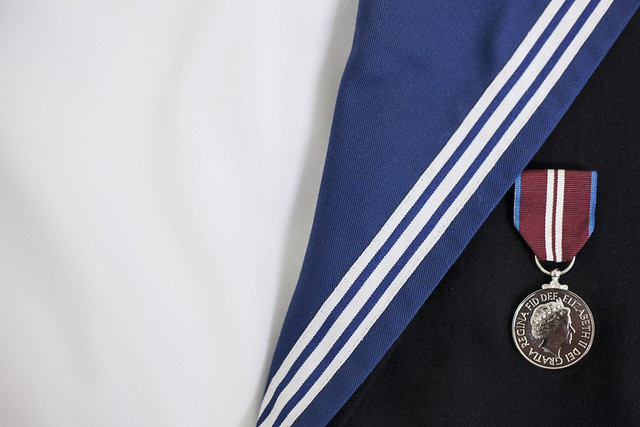
Work 2 6/52 by Dacmirc, on Flickr
- Messages
- 4,088
- Name
- Graham
- Edit My Images
- Yes
Love both these last two - really well presented, your whites are whiter than an aerial advert - the medal is shinier than a shiny thing and the detail in the cloth is pretty amazing.
So it's only really composition to discuss
like the vertical side to the first - the only other alternative I could see would be an obvious V shape - the fact the lines are not at 90º to each other works against you, but that's how they are.
second one bit too far right with too much empty space to the left, and the medal tucked under the light blue doesn't quite sit right.
But think they're both great
OP
- Messages
- 263
- Name
- Lee
- Edit My Images
- Yes
Allan - cheers for commenting, i agree im going to do an edit of the second shot tomorrow how much white should i take off do you reckon?
Graham - cheers for commenting also. I managed to get the detail in the fabric because i shot it with my 50mm and a 13mm extension tube. I couldn't focus close enough to get the composition that i wanted.
I agree about the medal position but its attachment loops are there so cant put it anywhere else and to bring in more space on the right would mean the sleeve being in the shot and it looks messy.
Once again thank you for taking the time to comment.
- Messages
- 19,461
- Name
- Andy
- Edit My Images
- Yes
Cheers Andy, what tool would i use to straighten them in PS? I used the straighten tool on the vertical ones just not sure how to manipulate the others.
Cheers again!
You culd select the whole photograph and go to free transform or transform and try the distort, or one of the others to just drag it down, keeping ther vertical straight.
Let me know if you need a hand
Cheers.


- Messages
- 213
- Name
- Everton
- Edit My Images
- Yes
Hi Lee, looking at both sets of shots, the 1st in the second set stick out for me, very sharp with great detail
M
Mad Hatter
Guest
Hi Lee, like the corner shot of no.1 rig best. Looks good with the angle of the gong, sharp focus and colour contrast. Good job matelot!
- Messages
- 4,834
- Name
- Alan
- Edit My Images
- Yes
Hi Lee
Work - both good shots - good colour, detail and focus. For the theme, I prefer #2 as it shows the context of the medal, the ubiform and the wearer, whereas #1 could just be a medal laid on a piece of cloth, without the connection to work. Also #1 has some vignetting to cope with and the edit to straighten the lines has slightly altered the roundness of the medal. Like the new crop on #2 , reducing the white area.
Work - both good shots - good colour, detail and focus. For the theme, I prefer #2 as it shows the context of the medal, the ubiform and the wearer, whereas #1 could just be a medal laid on a piece of cloth, without the connection to work. Also #1 has some vignetting to cope with and the edit to straighten the lines has slightly altered the roundness of the medal. Like the new crop on #2 , reducing the white area.
- Messages
- 8,398
- Name
- Lynne
- Edit My Images
- Yes
Hi Lee
couple of great edits to your Work shots...like both of them but leaning more toward ...#2 ... like the white to the lhs & the more even lighting
couple of great edits to your Work shots...like both of them but leaning more toward ...#2 ... like the white to the lhs & the more even lighting
- Messages
- 5,787
- Name
- Storm Trooper
- Edit My Images
- Yes
Love the diving shot, even better that it was a simple P&S camera and it does suit B&W.
I think I prefer the first of the original shots for work, nice lighting and framing.
I think I prefer the first of the original shots for work, nice lighting and framing.
OP
- Messages
- 263
- Name
- Lee
- Edit My Images
- Yes
Thank you everyone for all your comments and advice for last week, led to an update that i was much happier with. Well as they say onward and up!
Here is this weeks image.
I don't like to share mine! Haha

Gluttony 7/52 by Dacmirc, on Flickr
Here is this weeks image.
I don't like to share mine! Haha
Gluttony 7/52 by Dacmirc, on Flickr
- Messages
- 4,088
- Name
- Graham
- Edit My Images
- Yes
I think the box is necessary for the idea to work - it's a tough one this week, maybe the scribbling out of the words needs to be clearer to show the intent that they are all for you.
Bit more DOF to get the donuts in focus too, as I'd like to see them as well as the important writing on the box, and there's a bit of an annoying red reflection.
But I see where you're going, and for a difficult week, it works for me
Bit more DOF to get the donuts in focus too, as I'd like to see them as well as the important writing on the box, and there's a bit of an annoying red reflection.
But I see where you're going, and for a difficult week, it works for me
OP
- Messages
- 263
- Name
- Lee
- Edit My Images
- Yes
I don't think the box does the image any favours. I would have shot them on a plate. Plus the writing says you only get 1 1/2 cakes not all of them.sorry
Hi Carl, Im not even sure this works too well for me either, your opinion is valid like all. Im glad you've said it didnt work for you in a way. Id prefare people to be honest in what they feel about the image rather than just commenting for the sake of it. So thank you for being honest.
I think the box is necessary for the idea to work - it's a tough one this week, maybe the scribbling out of the words needs to be clearer to show the intent that they are all for you.
Bit more DOF to get the donuts in focus too, as I'd like to see them as well as the important writing on the box, and there's a bit of an annoying red reflection.
But I see where you're going, and for a difficult week, it works for me
Hi Graham, I didnt really like this weeks theme but this was my idea, kind of off the cuff actually when i noticed the misses putting them on the side in the kitchen.
I agree i should have scribbled out the writing more and maybe crossed the one on the middle out and changed it to "All For Me"
With the focus i was trying with a bit of selective but i can also see now that there is quite a bit more needed.
The annoying reflection i didn't notice, but now you've pointed it out it is rather annoying. Its actually a orangey reddy vase on the windowsill thats causing that i think. Guess thats another lesson in itself, clean your set of unwanted reflections first.
Finally thank you for commenting again guys.
- Messages
- 1,353
- Name
- Chris
- Edit My Images
- Yes
Agree with overbez....box works for me but the wider DoF to get the donuts in focus I think would have been better
- Messages
- 532
- Name
- Ray
- Edit My Images
- Yes
I agree with the above. I'm normally a sucker for a shallow DoF, but don't think it worked here. I like the idea, especially with the crossing out the "for you" and "to share" parts, but I think that would have worked better done in a thick black marker or something? The idea itself works great though!
- Messages
- 525
- Name
- Matt
- Edit My Images
- No
I like the shot, as mentioned the DOF is a little shallow and the box isn't a great feature of the shot - but I can totally see why it was included to strengthen the theme!
I've not tackled this week's theme yet - it's probably the toughest so far I think!
I've not tackled this week's theme yet - it's probably the toughest so far I think!
- Messages
- 4,834
- Name
- Alan
- Edit My Images
- Yes
Generally agree with comments re lighting and focus, but well done on shot.
- Messages
- 213
- Name
- Everton
- Edit My Images
- Yes
Like the idea and can see the thinking behind it IMO, crit as already said DOF and all the donuts in focus
M
Mad Hatter
Guest
I like the idea Lee. I think the box is necessary but I also think that a more noticeable and defined mark through the 'one to share' would have helped. The reflection is a little distracting though but nevertheless, a good composition and well in theme.
Brian_of_Bozeat
Jeff
- Messages
- 3,235
- Name
- Brian (not Jeff)
- Edit My Images
- No
Great idea, I would have liked more DOF to include the cakes at least.
- Messages
- 8,398
- Name
- Lynne
- Edit My Images
- Yes
Hi Lee
I think your gluttony shot has the makings of a good shot.....lose the cellophane , stronger pen through the words & a slightly biger DOF........gotta be a reshoot candidate...if only to eat them
I think your gluttony shot has the makings of a good shot.....lose the cellophane , stronger pen through the words & a slightly biger DOF........gotta be a reshoot candidate...if only to eat them
- Messages
- 5,787
- Name
- Storm Trooper
- Edit My Images
- Yes
Gluttony.......I like that you've kept them in the box and not put them on a plate, the lighting and focus are nice. I would have just got a thick marker pen and wrote ME over the for you and share. There is a little light reflecting of the plastic in the lid so I may have removed that or tried a few angles to reduce it.