The 52 Weeks of Daysleeping Pt 2 - WEEK 52!!! (Texture)

Messages
5,184
Name
Fi
Edit My Images
Yes
As I can no longer update my old thread title to show which week I am posting I have decided to start The 52 Weeks of Daysleeping Pt 2.

The last six months can be found here: http://www.talkphotography.co.uk/forums/showthread.php?t=104456

So... week 26 (apologies for lateness, life got in the way I'm afraid)

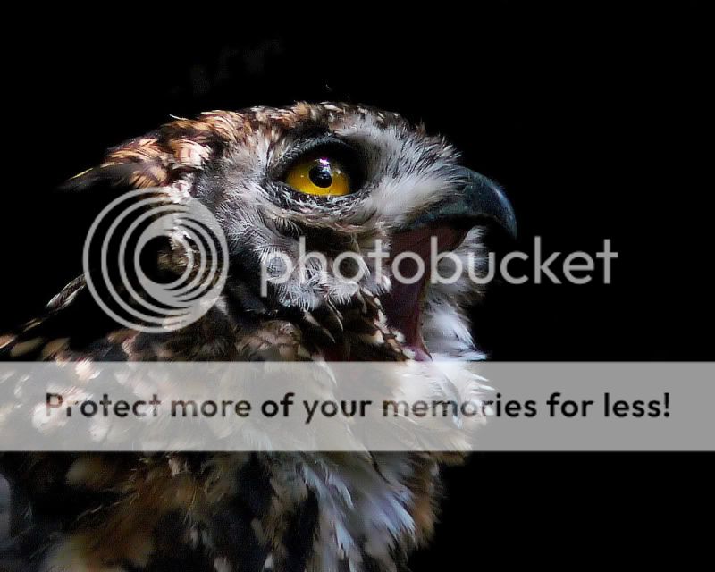
Night (owl)
Week26-Night-1.jpg


Thanks for looking ;)
 
Last edited:
That is one gorgeous photo, DS :clap::clap::clap:

The night-black background is fantastic, too. :)

I hope life is letting you get back to your photography now - it's great to see you back. :)

btw - The edit button only seems to have gone from the first post (in my thread, anyway) - is this some kind of plot to confuse the unwary (me!) or am I missing something in Forum Rules?????

Jean

Thanks Jean - I'm massivly annoyed at life for getting in the way but I'm determined to get up to date with my 52... I just need an idea for Highlight now! I'm quite pleased with "night" as I actually had an idea and made a special trip to a local wildlife park to get it - more organised than my usual rush jobs!

Marcel says that editing rights on the first post stop after 6 months so we won't be able to update our titles. My tiny mind won't be able to keep track of my own post let alone anyone elses without updated titles so I opted to start "Pt 2" :)
 
Last edited:
That's a great shot, I like the focus on the eye...brilliant...:clap:

I'm not sure about the open mouth, would loved to have seen one that was closed to compare, but that's just me...

but all the same a very nice example of a night owl...(y)
 
That's a great shot, I like the focus on the eye...brilliant...:clap:

I'm not sure about the open mouth, would loved to have seen one that was closed to compare, but that's just me...

but all the same a very nice example of a night owl...(y)

Thankyou - I will have a look through to see if I have any profile shots with a closed beak - I don't think I have but if I find one I'll be sure to post it up.

fantastic shot (y)

Thanks Toothie ;)

I think that's one of my favourite shots that I've seen on here.
I absolutely love it.

Where did you find him?

Well thankyou very much! I found him at Beale Park in Berkshire - they have some lovely birds but the backgrounds in the cages are just wooden fencing and the light streams through the foliage in akward places so it's quite tricky to contend with. I was actually in two minds whether to use this one or the first from this post - I'm still not sure which one I prefer: http://www.talkphotography.co.uk/forums/showthread.php?t=148887

I'm glad you like the one I chose though :)

I like the one on your other thread too, but I still prefer the one that you posted here.

I'm trying to find the words to explain why I like it so much, but I think that it's more of an emotional response than anything tangible.
The black background, texture of the feathers and spark in his eye are all part of it - but the overall image is somehow more than all those things put together.

The fact that you had such difficult lighting conditions makes it all the more impressive :notworthy:
 
Well I am finally up to date... phew!!

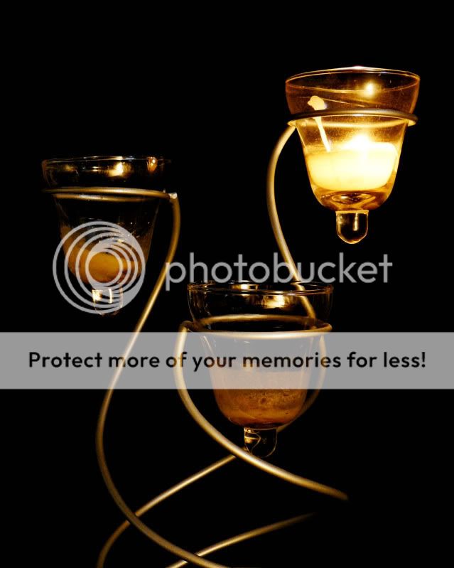
I really had no inspiration for Highlight then I spotted this candle holder malarky on a top shelf - not my best idea but I'm just glad to be only one day late :)

Week 27 - Highlight

Week27-Highlight.jpg


I'm sorry if I have not commented on your thread yet - I am trying to work my way through and get up to date with the feedback too.
 
Night.

Great owl portrait...nice balance to the composition.


Highlight.

Shame we can't see the base of the holder....good use of lighting though I think the auto-white balance has struggled a bit

It's hard when you the "WORD" gives you no inspiration....been there many times myself lol....what it does do though is make you keep your "eyes open" to photographic possibilities...which is great...and can only be helping us all....

That is well lit but as said it would be nice to see the whole thing.

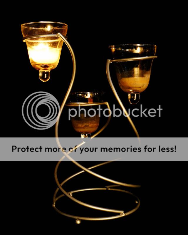
Thanks for the feedback - duly noted. I did take a shot of the whole thing - what do you reckon, better / worse / indiffernt? :shrug:

P1090017.jpg
 
I definitely prefer the second shot with the base included in it.
Considering your lack of inspiration, you really managed to come up with a good one in the end.

I love the way that the single flame reflects in the glasses on the other holders, it really captures the highlight theme.
The only thing that would slightly niggle me is the patch on the right, where part of the holder disappears into the background.
 
Love the Owl, what a wonderful shot. Detailed, colours in all the right places :D... and it's got it's eye firmly fixed on something with that intentness that only predators seem able to achieve. Pity the little mouse ... (ok it's looking up not down but...)

I prefer the second shot of highlight with all the holder in. It's well lit, and is a very interesting shape shown well. (y)
 
Love the owl. The catchlight in the eye draws you in and the black background shows it off to perfection :clap::clap::clap:

I prefer the second highlight shot, just a shame about the lack of definition on the rhs of the holder. Nevertheless, spot on theme (y)
 
Your night shot is stunning DS - clarity and composition and sharpness of the eye all work wonderfully - superb :clap:

I too prefer the 2nd highlight and is is highlight or high light :) both apply equally well :)

Well done on getting back to speed too (y)
 
I definitely prefer the second shot with the base included in it.
Considering your lack of inspiration, you really managed to come up with a good one in the end.

I love the way that the single flame reflects in the glasses on the other holders, it really captures the highlight theme.
The only thing that would slightly niggle me is the patch on the right, where part of the holder disappears into the background.

Thanks Sarah - this is one of my personal least favourites so I'm glad that you have found anything positive to say about it to be honest!

Love the Owl, what a wonderful shot. Detailed, colours in all the right places... and it's got it's eye firmly fixed on something with that intentness that only predators seem able to achieve. Pity the little mouse ... (ok it's looking up not down but...)

I prefer the second shot of highlight with all the holder in. It's well lit, and is a very interesting shape shown well.

Thankyou - I know what you mean about the intentness, that's why I like shooting birds of prey.

Love the owl. The catchlight in the eye draws you in and the black background shows it off to perfection :clap::clap::clap:

I prefer the second highlight shot, just a shame about the lack of definition on the rhs of the holder. Nevertheless, spot on theme

Thankyou - I'm really glad you guys like the owl as I was secretly quite pleased with my efforts for once :D

Highlight - I should have thought about the lighting more - at the point I took this I just wanted to get something which is obviously not the ideal attitude! I really didn't like this theme - maybe I'll revisit if we get a re-shoot.

Your night shot is stunning DS - clarity and composition and sharpness of the eye all work wonderfully - superb :clap:

I too prefer the 2nd highlight and is is highlight or high light :) both apply equally well :)

Well done on getting back to speed too (y)

Thanks Dark Star - I'm glad to be back up to speed too, it was all getting on top of me for a while and I nearly waved the white flag. Then I gave myself a stern talking to and told the rest of life to sod off for a while and let me get on with my photos :bat: :D
 
The candle holder shots are fine but the Owl shot is a stunner, Its sharp, has negative space and I love the glassy look of the eye, I would loose the hot spots above the head but a cracking shot.
 
Sorry - I've been so mesmerised by your Night shot and forgot to comment on your Highlight.

At the risk of being boring - your owl shots are really something else. :):):) I also love the ones on the other thread and think the second one deserves a caption! The one you posed on this thread just wins by a short beak, but it's a tight-run thing. I'm glad you're proud of these. (y)(y)

Highlight: Good take on the theme - fits the bill perfectly, and I prefer the second one for its base. As you'd expect, (and I think you feel the same) it doesn't make me jump up and down with excitement like the owl did - it lacks a bit of sparkle. But I've had plenty (most) like that, so I'm not in a position to criticise :muted: I'm just really glad you gave your life a good talking to and got back to your photography - we'd miss you on the 52. :)

Jean
 
Hi DS, I love your use of black backgrounds for both night and highlight shots, they add a real sense of atmosphere.

Night is my favourite shot, is an absolute stunner!! :clap::clap::clap:
 
I prefer the second shot of Highlight it really did need the base to be in the shot...:clap::clap::clap:
 
Thankyou all for your comments - much appreciated. Must apologise again for being late and for STILL not being up to date with everyone elses threads. I'm sorry.

Week 28 - Fun

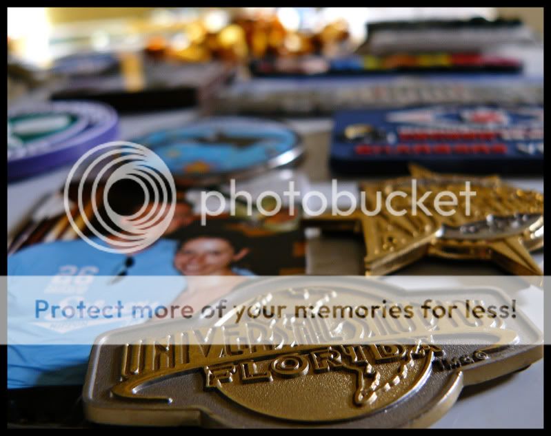
Now taking a picture of your fridge may not sound like much fun but our fridge is covered with magnets from all the fun places we have been to and things we have done. Three of my all time favourite places feature in this particular shot... and everytime I open our fridge I get a little reminder of all the great times OH and I have had together :)

Week28-Fun.jpg


Things I've learned:

1. I may like the idea but some things just won't turn out how you imagined or hoped they would.
2. We need to go back to Florida soon to re-experience some of the most fun times of our lives! :D
 
Quick catch up.

Your night shot is superb, I love it. :love:
Highlights is a technically good shot but lacks a little interest (your night shot spoilt me)
Fun, a great way to remember the fun times in your life, I think I'd have preferred a smidgen more dof.....not much mind. :naughty:

Mark(y)
 
I'm catching up too, love your night shot, excellent. highlight is on theme, but not inspiring (sorry) and i think you've nailed it again with your fun theme :clap:
 
I like it, it certainly looks like you've had lots of fun. Despite being someone very into shallow DOF... I think I have to agree and a little more DOF would be good here, I think having all of the Universal Studios within would give just enough to enable the rest to be viewed more easily.
 
love the idea of your fridge, i get bookmarks when i go to fun places :D

Would have liked to have seen the bottom edge of the in focus badge though
 
I like it, it certainly looks like you've had lots of fun. Despite being someone very into shallow DOF... I think I have to agree and a little more DOF would be good here, I think having all of the Universal Studios within would give just enough to enable the rest to be viewed more easily.

Noy been lazy (honest ;)) but I have to agree and I love the idea of having all those memories to remind you everytime you go to the fridge. Cracking idea and certainly fits the bill (y)
 
Spot on for me.
You say in your lessons learnt that it's not how you originally planned for it to turn out, but I'm struggling to see how it could be much better. The angle of the shot is really inventive - I would never have thought of that.

I'd quite like to see a bit more detail on the other magnets as has already been said . . . but on the other hand the fact that they are out of focus kind of makes the image more compelling. I keep staring at it and trying to make out what's on the other ones (yes I'm nosey too!)
 
Universal studios, now you are talking, now that is a really fun place.

I was there as best man at my mates wedding last year and it was just superb. I loved it and will definitely go back, hits the spot for me D.S.
 
Hello DS, liking the composition of this one as well as the colouring. Like other self confessed nosies have said I too would liked a little more DoF however, it is a good shot! :clap: :clap:
 
Thanks for the comments everyone - I agree about the DOF, kind of forgot that it's not obvious to everyone else what the other magnets are as you don't see them everyday like I do!!

Week 29 - Easy

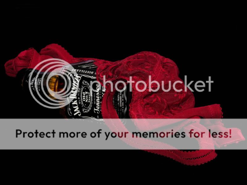
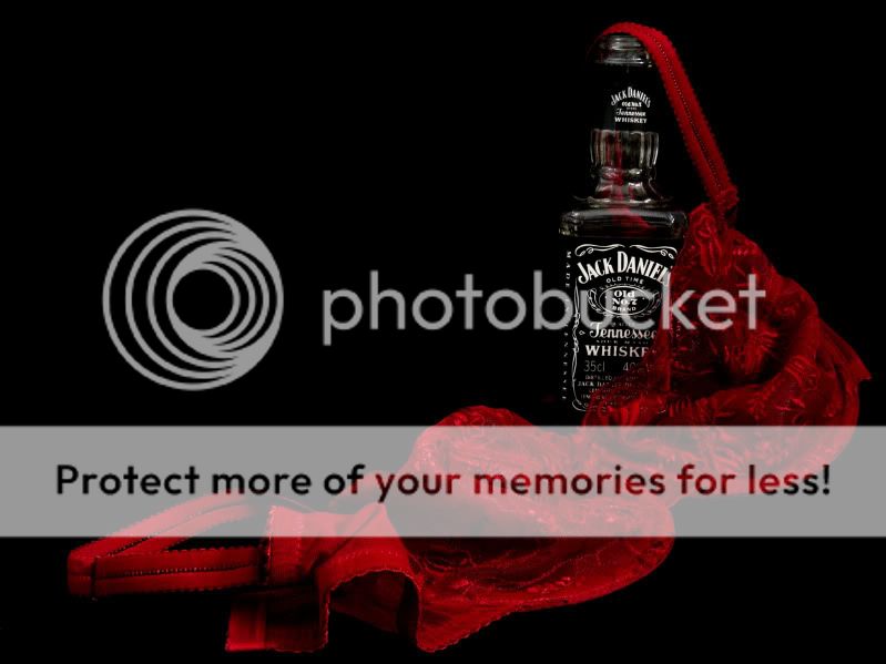
I tried to go for a different interpretation of the theme... I don't know if the fact that this sprung to mind first say's a bit too much about my own miss-spent youth though!! :p

Week29-Easy.jpg


Edit... could have used this one for fun as well couldn't I!!
 
Last edited:
Fun - great idea and a great viewpoint! If I had to change anything it would be to include the bottom of the Universal logo fully :) Thats one busy fridge though :)

Easy - that was an interpretation that crossed my mind :)

You've done it well and the colours are great...I just wonder what it'd look like with the bottle upright, lid off and the bra slung over it...? :thinking:

Although its easy for me to come up with these ideas after you've done the hard work and come up with the original shot though :)

Now that looks like a fun shoot :D!!!
 
Fun - great idea and a great viewpoint! If I had to change anything it would be to include the bottom of the Universal logo fully. Thats one busy fridge though.

Easy - that was an interpretation that crossed my mind :)

You've done it well and the colours are great...I just wonder what it'd look like with the bottle upright, lid off and the bra slung over it...? :thinking:

Although its easy for me to come up with these ideas after you've done the hard work and come up with the original shot though :)

Now that looks like a fun shoot!!!

Good to know I'm not the only one with a dirty mind! :p

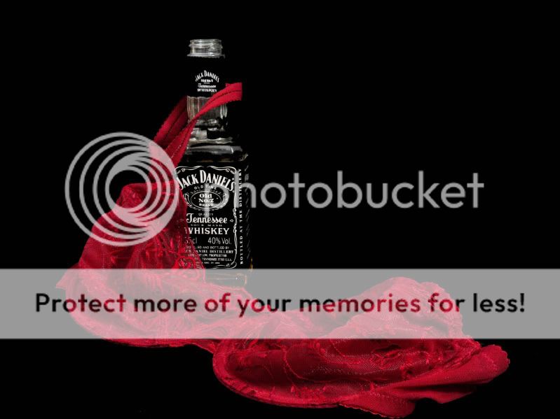
Do you mean a bit like this:

P1090572.jpg


or this,

P1090567.jpg


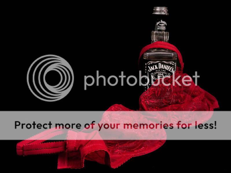
or maybe this...

P1090570.jpg


I'm finding there are only so many ways of draping a bra over a bottle of jack!! :D
 
Now thats the bizness DS :)

#2 by virtue of the fact that the bottle is totally straight - slight lean on the other two! What better way to spend a Sunday eh :)!!!
 
:LOL: :D I obviously either don't have a dirty mind or I didn't mis-spend enough of my youth because that interpretation didn't occur to me at all!

Well done on those photos, they're fab - crisp, clear and the colour is just about perfect. You obviously had great fun with them too.

The first one out of the second set works best I think.
 
Now thats the bizness DS :)

#2 by virtue of the fact that the bottle is totally straight - slight lean on the other two! What better way to spend a Sunday eh :)!!!

...and that's what I get for drinking in the middle of the day! :D

You're the one who told me to take the top of the bottle... if I did have a sneaky swig you know who I'm blaming :p

:LOL: :D I obviously either don't have a dirty mind or I didn't mis-spend enough of my youth because that interpretation didn't occur to me at all!

Well done on those photos, they're fab - crisp, clear and the colour is just about perfect. You obviously had great fun with them too.

The first one out of the second set works best I think.

There's still time!!

Thanks for the feedback - I quite liked the first one out of the second set too but John is right, there is a bit of a dodgy lean on the bottle. I don't know why I can't see these mistakes before I post the dame photo's :bonk:
 
before[/B] I post the dame photo's :bonk:


:whistle::whistle::whistle:


Well - what can I say? I thought of that interpretation for the theme, but would never in a million years have come up with such a brilliant illustration of it. I must have a dirty mind, too - but no style! It strikes exactly the right note, and I prefer the first one - lying down. (y)(y)(y)

Note to self: buy red bra and throw out boring white/beige ones. :D

Jean
 
I like both your original and the first of the second set, very good idea and the red really works well against the background black.

Excellent take on the theme.
 
Back
Top