collins82002's 52 week 7 People (page2)

Messages
251
Name
chris
Edit My Images
Yes
Week one. CURVES

This might be a cheesey but this is a picture of my wallpaper and cushions, I know i'm gonna get C&C but its my first shot *** taken just before xmas.

DSC01167.jpg
 
Last edited:
I agree, I like it too.. the flow from the wallpaper to the cushions is good. Whilst the sofa is on a slant, I think I'd be tempted to go even more slanted... but angled the other way...
 
Clever idea. After all the colours should work together since you've decorated your house that way. I wonder how a close up of one of the cushions would have looked from a few different angles.
 
Your wallpaper is giving me a headache... nice and curvey though, fits with the theme, not sure if it might be a bit snapshotish, a quick rotation might sort it.

The watch works nicely with the poem, and another one I haven't heard.
 
Your wallpaper is giving me a headache... nice and curvey though, fits with the theme, not sure if it might be a bit snapshotish, a quick rotation might sort it.

The watch works nicely with the poem, and another one I haven't heard.

The wallpaper was just a quick snap. Should has put more thought into it, gonna try extra hard next theme to make up for it. Thanks for C&C.
 
I agree, the watch works well with that Poem. Have you tried with a 2 or 3 second exposure on a watch... try to get the second hand just before the hour or 30 minute mark when the shutter opens...
 
Hi Chris,

Wallpaper shot is definitely curved - and I like the way the curves continue through to the cushions, then those different scatter cushions are there to break it up.
Agree with the others on the slant though. Either straightened or at more of an angle so it was obviously deliberate would have worked better.

I agree, the watch works well with that Poem. Have you tried with a 2 or 3 second exposure on a watch... try to get the second hand just before the hour or 30 minute mark when the shutter opens...

John's reading my mind on the watch shot.
Was just thinking that I'd like to see it with a longer exposure to get some motion in it.
Works well with the poem though.
 
HI Chris - sorry it's taken me 3 weeks to make a first visit to your thread - it's really busy on here this year. :)

Week 1: Good take on the theme - and I agree with John about the sofa. :)

Week 2: Difficult shot because of all the reflections and I agree with the suggestions about the second hand. Watches and clocks also look good (imho) when the hands are at ten to two (making them smile!). I like the poem - sparse on words but strong on message. (y)

Week 3: Definitely fits the theme. I love the dof, too (y) The main trunk looks a bit precarious - I bet you didn't stand too close. :LOL:

Jean


Thanks Jean,

Have had a look at your 52 and left comments

Cheers
Chris
 
Hi Chris. This is the first time i have seen your thread, there are so many.
1. Fits the theme well, shame about the slanting sofa.
2. A good idea although the watch looks a little wonky to me.
3. Definitely your best effort so far, I like the dof.
Good luck for the rest of the year

Hi Martin,
Thanks for C&C, Have left you C&C on your 52

Cheers
Chris
 
I like that Chris, the textures and shapes work really well. The DOF is good, but personally, a little more, just to bring that sliver of wood that's broken off back in. I can't work it out, but it looks like the DOF is on a diagonal...
 
Hi Chris, just catching up on as many 52's as I can so apologies for not getting here sooner. I imagine I'll still be finding threads I haven't read well into March at this rate.

I like your poetry shot, and agree with the slanted comments. Maybe a closer crop to make it less obvious what your subject was might have been another approach.

Brave attempt with chrome for week 2. Overall a good shot, nicely lit, and I agree with the comments about getting some motion in there.

And as has been said already, week 3 is your best so far. But then I like trees :). I'm wondering how it would look in black & white as the texture on the bark would be more apparent without distracting colours. Just an idea though - I think it's a good shot in teh first instance.

Good luck with week 4!

Ian.

Thankyou Ian for C&C just as a take 2 here it is B&W

Chopped-1.jpg
 
Week 1 - certainly lots of curves! Makes me feel slightly dizzy to look at it. :D
Week 2 - nice poem and the watch fits it perfectly. I like the lighting but it seems slightly soft to me.
Week 3 - an interesting tree stump with good shapes and textures. I would like a bit more DOF though so that they would show up better. (I prefer the colour version here).

(y)
 
well it's week 4 out the way... ;)... sorry it's really not doing much for me. Perhaps crop it and make more of the repeating patter of the roof tops ?
 
Hi Chris,

Not a huge fan of your street shot, sorry, so let's move onto week 5.
I'm surprised that we haven't seen more of these this week!

Technically you've done a really good job of the selective colouring and the subject really lends itself to this treatment. They're painted bright yellow to make them stand out after all.
Good angle, it's got that real sort of brooding look as it it's staring down at us and you've got some nice detail in there.
 
An interesting take on the theme.. well composed, good colouring and looks menacing with the angle (y)
 
Oh boy, another thread I thought I'd replied to but failed...

Street is not too bad. Maybe as John said, a crop of the roof'smight work better. Make it look a bot Corrie like.

I feel like a "bad boy" when I look at your speed camera shot. Overbearing and oppresive. Perfect representation of 'em if you ask me.

Nice!

Ian.
 
Awwwww that's really sweet Chris.

The selective colouring has been very effective in this one, and there's some lovely detail in the teddy (hedgehog).
The angle and composition are spot on too.
I think that you could maybe do with a touch more contrast in the B&W portion of the image, but it really has worked well (y)

Thanks Sarah,
Perhaps i'll make it not so obvious for next weeks theme and think outside the box:thinking:

Cheers
Chris
 
Very nice Chris, and I'm sure you'd have regretted it had you not kept it :D... The colour pop has worked on that.
 
Haha, great idea for what I think is a hard one this week.
 
Chris

sorry must have missed your 52 in all the other posts, like your 52 to date the weakest being street but glad you still posted to keep up with the 52 your best for me is a toss up between week 1 and your last image, I like the way your curved shot works especially when you just open up the picture on the computer it opens and flows down with the curves :clap:
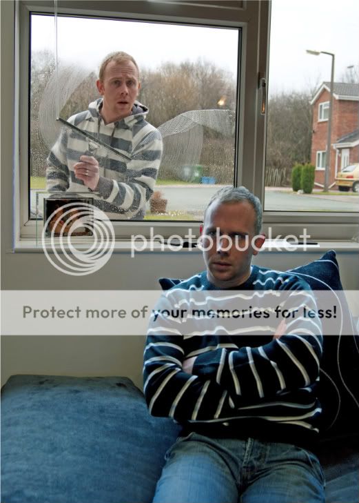
and your last image works because of the different expressions on your face made me :LOL:

Shaun
 
as above, great set to date! I like 'people' but it think it would look slightly better if the inside man was doing something. Maybe of you could see him watching the TV, that way you would get an idea what the outside man was looking through the winow for?? just an idea
 
I like your people shot - another good idea that's away from the obvious!

Phil
 
Back
Top