
You are using an out of date browser. It may not display this or other websites correctly.
You should upgrade or use an alternative browser.
You should upgrade or use an alternative browser.
Nick_A's 52 - Week 8 added (chaos)
- Thread starter Nick_A
- Start date
wegotitugetit
On the hit list !!!
- Messages
- 7,141
- Name
- alex
- Edit My Images
- Yes
good luck
OP
- Messages
- 233
- Name
- Nick
- Edit My Images
- Yes
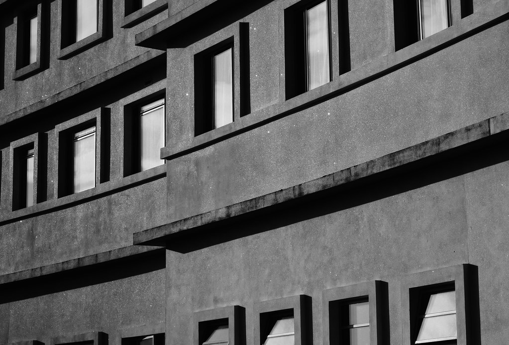
Week 1 Accomoodation
Ok well here goes with week 1. Struggled to find an original idea week one and already struggling :bonk:
Decided to play safe and go shoot a hotel. Living in Morecambe there was only one real choice the 'Midland Hotel' a fantastic looking building. Wanted to avoid the 'postcard' type of shot that shows the whole hotel and try find and angle or a curve. Saw a pattern in the windows of the hotel bedrooms and attempted to capture it.
Shot with my 450D & 50mm F1.8.
F13
ISO 100
Would love to know peoples opinions however good or bad
Thanks for looking
The rest of the set are here if people fancy a look http://www.flickr.com/photos/51477041@N06/sets/72157625660031891/
Ok well here goes with week 1. Struggled to find an original idea
week one and already struggling :bonk:Decided to play safe and go shoot a hotel. Living in Morecambe there was only one real choice the 'Midland Hotel' a fantastic looking building. Wanted to avoid the 'postcard' type of shot that shows the whole hotel and try find and angle or a curve. Saw a pattern in the windows of the hotel bedrooms and attempted to capture it.
Shot with my 450D & 50mm F1.8.
F13
ISO 100
Would love to know peoples opinions however good or bad
Thanks for looking
The rest of the set are here if people fancy a look http://www.flickr.com/photos/51477041@N06/sets/72157625660031891/
OP
- Messages
- 233
- Name
- Nick
- Edit My Images
- Yes
I know there was a lot of these posted yesterday but I was just hoping to get some people opinions on this one
My girlfriend didn't like it, said it was boring just wanted to know if that was the general consensus? For some reason it just appealed to me
My girlfriend didn't like it, said it was boring just wanted to know if that was the general consensus? For some reason it just appealed to me
OP
- Messages
- 233
- Name
- Nick
- Edit My Images
- Yes
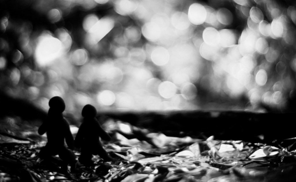
I wasnt going to post this but then, decided to anyway. The 52 for me is a way to learn and develop. Im hoping at the end of it to see at least some progression in my photos.
With that in mind I guess not every thing I try can be successful and the things that dont work help as much as the things that do. I wasnt happy with this shot at all but I still learnt a lot and will re-shoot it later in the year.
Anyway the shot. With the theme being new I wanted to try and capture New Love. I wanted this to look soft focus with lots of bokeh. A feeling of first being in love almost. It was supposed to be like a couple looking out to sea.
For me I didnt even get close. I wasnt happy with the lighting; it needs more separation between the models and the background. The models themselves should have been better they dont look right. I do like the bokeh in the background though.
Overall I dont feel it conveyed the message
Would love to know other people opinions though
- Messages
- 1,468
- Name
- Tim
- Edit My Images
- Yes
I think that's a brilliant shot Nick! The black and white is great, as is the lovely round bokeh (what lens did you use?). I would have liked a little bit more light on the figures to define their outline and give them some more prominence in the frame, but other than that I think it's great.
In terms of the theme, I think you've captured 'love' really well, but I'm not sure I would have guessed 'new love' without your explanation.
Looking forward to your offering for next week.
In terms of the theme, I think you've captured 'love' really well, but I'm not sure I would have guessed 'new love' without your explanation.
Looking forward to your offering for next week.
OP
- Messages
- 233
- Name
- Nick
- Edit My Images
- Yes
really appreciate your comment. I guess I just didn't get as near to what I would have liked/saw in my head. TBH I expected it to get totally panned on here (as I don't really like it myself)
thank you
oh and the lens was the Canon 50mm F1.8 as usual (it's all i ever seem to use)
thank you
oh and the lens was the Canon 50mm F1.8 as usual (it's all i ever seem to use
)
- Messages
- 8,398
- Name
- Lynne
- Edit My Images
- Yes
Hi Nick
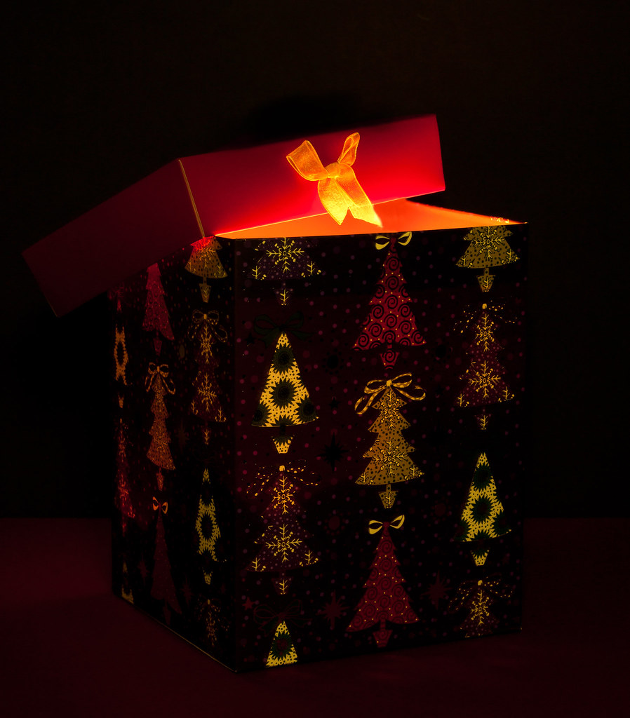
Totally great shot for week 4 "open" .Lovely warm colors & love the light inside the box,gives a warm glow ,top shot")
Totally great shot for week 4 "open" .Lovely warm colors & love the light inside the box,gives a warm glow ,top shot
- Messages
- 8,398
- Name
- Lynne
- Edit My Images
- Yes
Hi Nick
Hard - WOW ! What a great shot , love the idea ,the balance,colors....just the whole shot
Clutter - another fab take on the theme , colors really work for me
Hard - WOW ! What a great shot , love the idea ,the balance,colors....just the whole shot
Clutter - another fab take on the theme , colors really work for me
- Messages
- 298
- Name
- Adie
- Edit My Images
- Yes
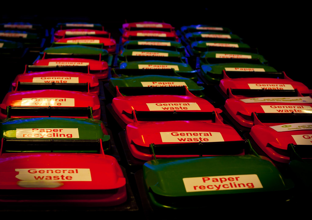
Great idea for clutter.
As the shot is generally quite dark (im guessing hand held and available light?) the dead space at the top and top right make the image unstable. A tighter crop, and from a slight rotated angle would create diagonal lead in lines, and no dead space.
Adie
As the shot is generally quite dark (im guessing hand held and available light?) the dead space at the top and top right make the image unstable. A tighter crop, and from a slight rotated angle would create diagonal lead in lines, and no dead space.
Adie
- Messages
- 14,766
- Name
- Michael
- Edit My Images
- No
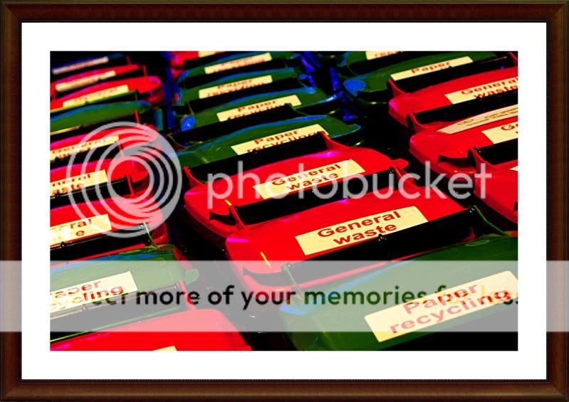
Hiya Nick, decided to have a fiddle! I use free software called photoscape,
What I did was
1. Rotate Arbitrary function to alter the angle of the image.
2. Cropped out the dead space.
3. I used the deepen function which is in the bright/colours menu in conjunction with brightness.
4. Sharpened a little
5. Added the frame.
Will be interested to see what you think,
What I did was
1. Rotate Arbitrary function to alter the angle of the image.
2. Cropped out the dead space.
3. I used the deepen function which is in the bright/colours menu in conjunction with brightness.
4. Sharpened a little
5. Added the frame.
Will be interested to see what you think,
OP
- Messages
- 233
- Name
- Nick
- Edit My Images
- Yes
hmmmmm I do like it and thanks very much for going to the effort of doing an edit I'm just not 100% sure 
I think it's the colours I'm not sure on now, it looks more similar to the original shot when I had deliberately gone for that look
but that probably just me, I agree the crop looks good
thanks again
I think it's the colours I'm not sure on now, it looks more similar to the original shot when I had deliberately gone for that look
but that probably just me, I agree the crop looks good
thanks again
OP
- Messages
- 233
- Name
- Nick
- Edit My Images
- Yes
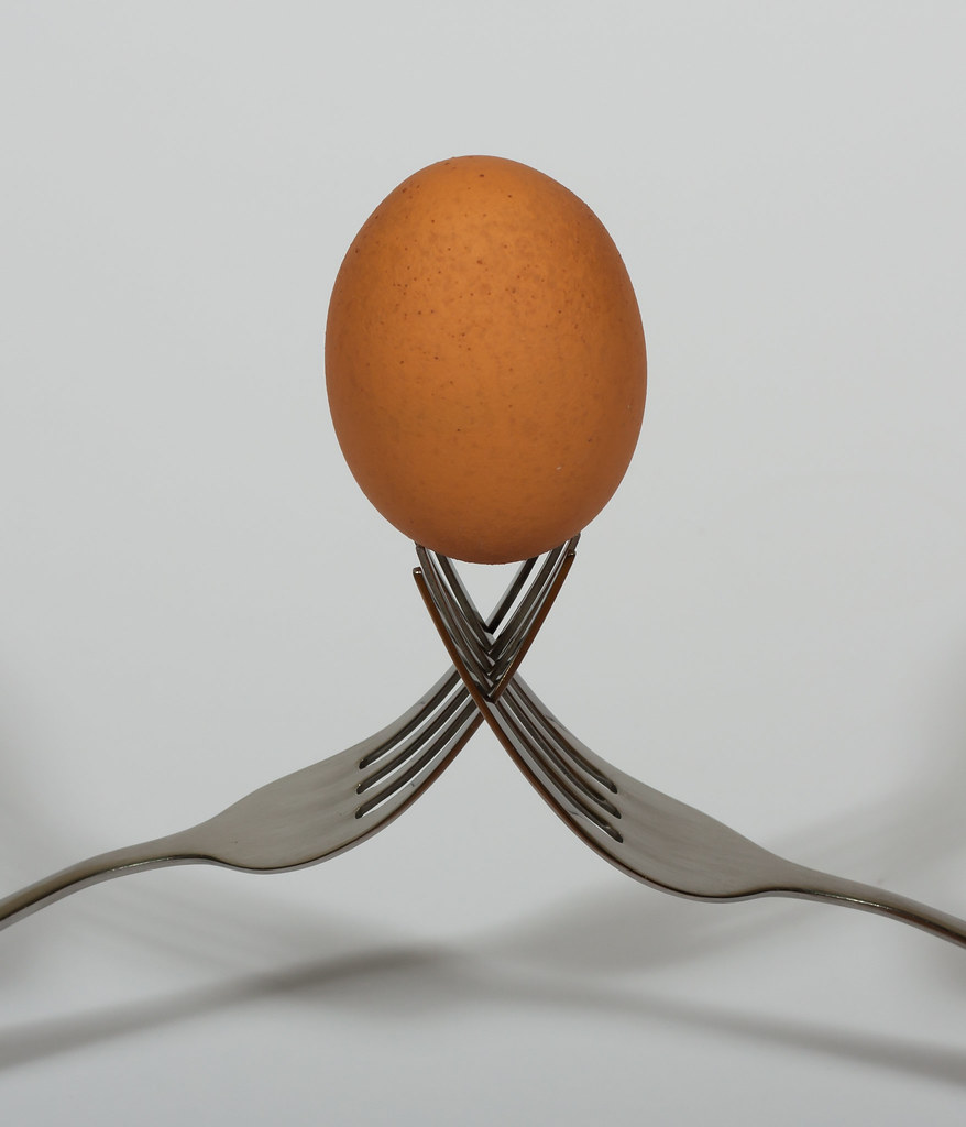
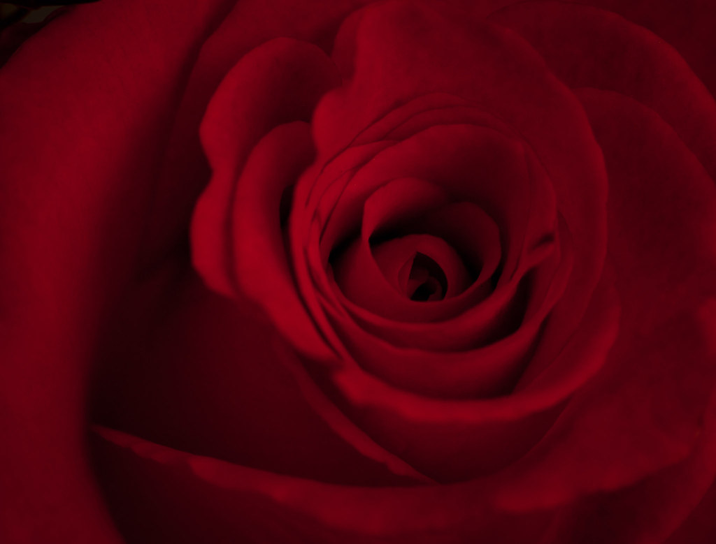
Beautiful colour and tones in this, looks a trifle soft to me, have you sharpened it at all?
yeah I sharpened it in lightroom, I was working with a fairly narrow depth of field due to using extension tubes. I think the centre is fairly sharp though? I kinda thought it looked ok with the rest getting gradually less sharp?
you think I should have got more in focus?
many thanks
- Messages
- 7,694
- Name
- Tina
- Edit My Images
- Yes
yeah I sharpened it in lightroom, I was working with a fairly narrow depth of field due to using extension tubes. I think the centre is fairly sharp though? I kinda thought it looked ok with the rest getting gradually less sharp?Beautiful colour and tones in this, looks a trifle soft to me, have you sharpened it at all?
you think I should have got more in focus?
many thanks
I would like more in focus but clearly I'm in a minority