OP
- Messages
- 84
- Name
- Jenny
- Edit My Images
- Yes
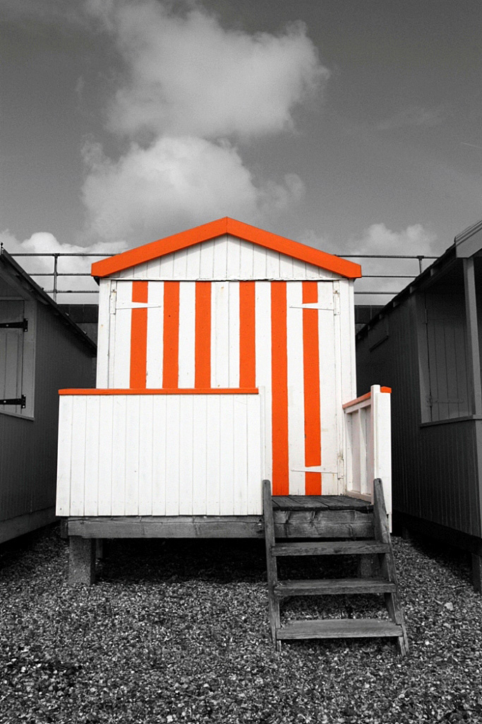
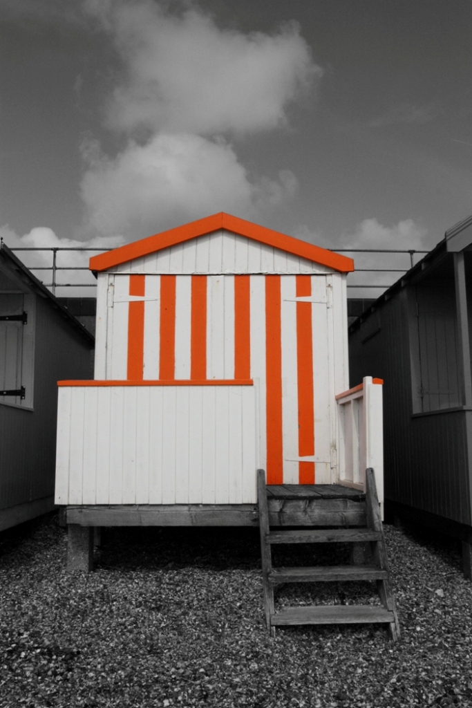
Week 1- bliss reshoot

9072 by Awesomekid on Talk Photography
Week 6- water

Week 6- water by Awesomekid on Talk Photography
Week 7- bold
Week 7- bold by Awesomekid on Talk Photography
And a catch up on week 3- scenic, it a picture I took the other year in the Lake District

Week 3- scenic by Awesomekid on Talk Photography
9072 by Awesomekid on Talk Photography
Week 6- water
Week 6- water by Awesomekid on Talk Photography
Week 7- bold
Week 7- bold by Awesomekid on Talk Photography
And a catch up on week 3- scenic, it a picture I took the other year in the Lake District
Week 3- scenic by Awesomekid on Talk Photography
Last edited:
 )
)