Critique Cat portrait

Gav.

Challenge Owner
Messages
7,760
Name
Gav
Edit My Images
Yes
Hi all,

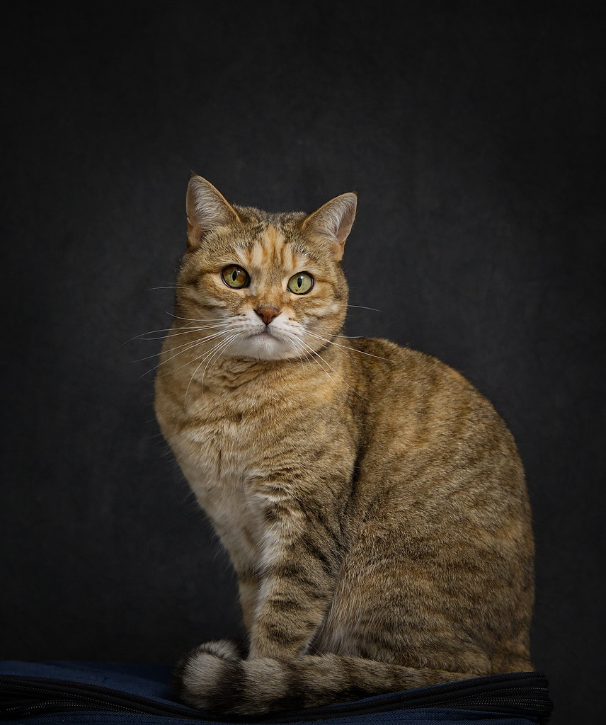
Been trying for a while to get April to sit still for me, I managed to get this shot before she decided the birds at the window were entertaining :)

Any C&C welcome as always

Thank you for looking

Gav


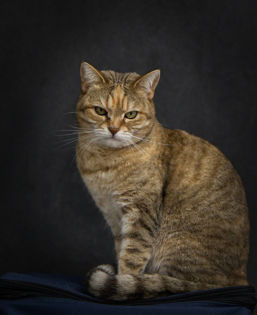
April
by Gavin Wickham, on Flickr
 
(y)

I’d say lose rhe bottom of the bag and concentrate on April?
 
Lovely Cat , one of ours was called April . Think it would improve if the back ground was completely plain with no bag present at all . Still a very nice photo and nicely lit . You done well getting her to pose at all in my opinion , they are not the most co operative of animals in my experience .
 
Lovely Cat , one of ours was called April . Think it would improve if the back ground was completely plain with no bag present at all . Still a very nice photo and nicely lit . You done well getting her to pose at all in my opinion , they are not the most co operative of animals in my experience .
The bag is important, it's the only thing she likes to sit on and we have no idea why :)
Cats are a law to their own ;)

Thank you for the feed back, I will work with for April on the next go
 
Thanks, More like this? I think I wanted to keep her eyes at the top 3rd of the image :)

View attachment 344020
Hi, yes, a bit more like that - but when I replied originally, I wasn't aware of the importance of the bag...

Maybe have two versions - one with the bag for those that know of the importance of it, and one of the beautiful cat! (but without the bag at all!)
 
Hi, yes, a bit more like that - but when I replied originally, I wasn't aware of the importance of the bag...

Maybe have two versions - one with the bag for those that know of the importance of it, and one of the beautiful cat! (but without the bag at all!)
I forgot to add the part about the bag, I will work on her sitting else where, thanks for the feed back (y)
 
I try to catch mine at rest or at play, there is a cat appreciation thread that's full of great ideas.
 
IMO, the red logo draws too much attention. So I would lose the logo and vignette/crop the bottom a bit more to deemphasize the bag some.

View attachment 344068
Hi Steven, thank you for taking the time to edit, I'm so used to seeing the logo I look past it, but I can now see it does draw the eye away, I will keep a better eye on the small things.

Thanks again (y)
 
Lovely shots the 2nd one in your recent edits is the one for me :clap:


Coho - Blue
 
Agreed!
 
Hi Gav.

Quality images. Love those. You did a great job.
I think I agree number 2 of the edits would be my choice. Being picky I would have a touch more of the bag showing just a tiny bit.

Gaz
 
I like the amount of bag in #3... there's enough there that I think it still tells the story and it's inclusion seems intentional. Cutting too much of it off makes it seem like a distraction/aspect that you couldn't quite get rid of IMO.
 
Hi Gav.

Quality images. Love those. You did a great job.
I think I agree number 2 of the edits would be my choice. Being picky I would have a touch more of the bag showing just a tiny bit.

Gaz
Hi Gaz

Thank you :)

I think I agree with the bag, now I've come back to these having not seen them for a few days, they don't look quite right

Thanks for the feed back

Gav


I like the amount of bag in #3... there's enough there that I think it still tells the story and it's inclusion seems intentional. Cutting too much of it off makes it seem like a distraction/aspect that you couldn't quite get rid of IMO.
Hi Steven

Thanks, I agree with you and @cargo on this now I've looked back.

Thanks for the feed back

Gav
 
I like the evolution of the crop.. losing the distracting bag logo helps. The shots are great, have good lighting and are taken at the subject eye level.
 
I like the evolution of the crop.. losing the distracting bag logo helps. The shots are great, have good lighting and are taken at the subject eye level.
Thank you Chris, and welcome to TP
 
Back
Top