
You are using an out of date browser. It may not display this or other websites correctly.
You should upgrade or use an alternative browser.
You should upgrade or use an alternative browser.
Clud17 52 Part 2 Week 44 Train
- Thread starter clud17
- Start date
OP
- Messages
- 1,560
- Name
- Chris
- Edit My Images
- Yes
A couple of lovely shots Chris. You can see that you have spent a lot of time getting them right. She has a nice smile and that portrait of her will be good for her promotional material.
thanks Sue, i think the more i look at it the smile does suit the purpose of the photo.
OP
- Messages
- 1,560
- Name
- Chris
- Edit My Images
- Yes
Two lovely shots. The first definitely tranquil. The second, despite her not knowing what to do with her mouth (teeth or no teeth?), she's smiling with her eyes. Will look great on her website.
Thanks Darren, she is smiling with her eyes, in fact knowing her i can see a little smirk creeping in.
ohhh liking the light shot - reminds me of those troll dolls that used to be around, nice bokeh.
as for the project very alien feel to it; the landscape that is, not Clare :bonk:
Cheers Dade, it is a little like a troll doll
 i think its the hair. I see what you mean about the alien landscape, not what i had planned i think its the colours.
- Messages
- 1,441
- Edit My Images
- Yes
Love the landscape shot - great colours. Can imaging the waves gentlely lapping the shore.
blakester
Shine On Harvest Moon
- Messages
- 6,679
- Name
- Iain
- Edit My Images
- No
Chris I like both of your images, the first does have a tranquil feel to it. The colour tone in the beach photograph works for the subject, my only critique is the silhouette, I feel although it is a sharp crisp outine there are some odd looking profiles particularly between the legs and around the arms. I think maybe a softer profile would work better with the tranquil feel. Sorry if that sounds harsh I dont mean it that way.
Your portrait image works well, it is lit beautifully, nice background and as has been said above, your subject is smiling with her eyes, a very attractive look. Iain
Your portrait image works well, it is lit beautifully, nice background and as has been said above, your subject is smiling with her eyes, a very attractive look. Iain
OP
- Messages
- 1,560
- Name
- Chris
- Edit My Images
- Yes
Love the landscape shot - great colours. Can imaging the waves gentlely lapping the shore.
I love both of those shots, ChrisThe first is very tranquil and the portrait is lovely. She must be very pleased with these.
Great "project".
Jenny
Lovely warm colours in that first shot Chris, that's come out really well, and fits the requirement to me. The portrait is really good, and that smile reaches up to her eyes too.excellent.
thanks everyone
OP
- Messages
- 1,560
- Name
- Chris
- Edit My Images
- Yes
Chris I like both of your images, the first does have a tranquil feel to it. The colour tone in the beach photograph works for the subject, my only critique is the silhouette, I feel although it is a sharp crisp outine there are some odd looking profiles particularly between the legs and around the arms. I think maybe a softer profile would work better with the tranquil feel. Sorry if that sounds harsh I dont mean it that way.
Your portrait image works well, it is lit beautifully, nice background and as has been said above, your subject is smiling with her eyes, a very attractive look. Iain
Thanks Iain, looking at it again i see what you mean, the odd profiles are actually barnacles and other stuff as these ones are further down the beach and spend longer in the water when the tide is in. I may have a go at smoothing them a bit to see what the outcome is.
SarahLee
TPer Emerita
- Messages
- 13,060
- Name
- Sarah
- Edit My Images
- No
I love that landscape shot for profile. It's one that I just can't stop looking at. Beautiful colours and extremely calming and tranquil.
I think Iain has a good point about the silhouette though. I'd be interested to see what a slightly softer de-barnacled version looks like.
10/10 for the portrait though. Not my usual type of thing, but I think it's perfect for her website. Not too formal and great expression as others have pointed out.
- Messages
- 6,964
- Name
- Phil
- Edit My Images
- Yes
Hi Chris - just catching up....
Light is a really interesting idea, but I think it would be so much stronger without the highlights and just having a simple spotlight effect lighting the drummer.
The landscape is a corker - wall-worthy IMHO. The portrait is a pleasant headshot, perfect for the purpose stated.
Phil
Light is a really interesting idea, but I think it would be so much stronger without the highlights and just having a simple spotlight effect lighting the drummer.
The landscape is a corker - wall-worthy IMHO. The portrait is a pleasant headshot, perfect for the purpose stated.
Phil
- Messages
- 3,953
- Name
- Jean
- Edit My Images
- Yes
thanks Jean, i do get stuck into a good set up
... hat trick achieved, Chris.
I love the landscape shot - the colours and sense of tranquility are just right for their purpose, but yes, debarnacling would enhance it even further.
The smile thing is always hard in this type of portrait, and although her mouth looks a little tense the warmth and smile in her eyes more than compensate. The subtle play of light on her face is lovely, and you've got nice natural-looking catchlights in her eyes.
I'm sure she's delighted with both these - I hope her business goes well.
Jean
OP
- Messages
- 1,560
- Name
- Chris
- Edit My Images
- Yes
Thanks Sarah, im going to get my chisel out and tap off those barnacles to seeI love that landscape shot for profile. It's one that I just can't stop looking at. Beautiful colours and extremely calming and tranquil.
I think Iain has a good point about the silhouette though. I'd be interested to see what a slightly softer de-barnacled version looks like.
10/10 for the portrait though. Not my usual type of thing, but I think it's perfect for her website. Not too formal and great expression as others have pointed out.
Hi Chris - just catching up....
Light is a really interesting idea, but I think it would be so much stronger without the highlights and just having a simple spotlight effect lighting the drummer.
The landscape is a corker - wall-worthy IMHO. The portrait is a pleasant headshot, perfect for the purpose stated.
Phil
Thanks Phil, not thought about a wall hanging picture but i do have it on one of the PC at work as a desktop.
OP
- Messages
- 1,560
- Name
- Chris
- Edit My Images
- Yes
... hat trick achieved, Chris.
 thanks Jean,
im pretty pleased with this weeks effort too so i may be on a quad-trick
- Messages
- 3,953
- Name
- Jean
- Edit My Images
- Yes
im pretty pleased with this weeks effort too so i may be on a quad-trick
... still no pressure, then, Chris.
Jean
OP
- Messages
- 1,560
- Name
- Chris
- Edit My Images
- Yes
Week 37 Film (Noir)
I love this theme and could shoot a whole 52 based on this theme.
Im a big movie fan and love the Film Noir genre, from its roots in the early 40's and 50's through to the more modern interpretations such as Rodrigez's Sin City. Im not sure if its the crime element, the gangsters or the low light heavy shadow cinematic effects. It was a simple choice to create something along theses lines.
For the shoot I took myself up into the attic with a black backdrop, one SB600 through an umbrella camera right and one SB600 bare as a rim light behind me. I took me a few takes to get the rim light right and to get a good effect with the smoke. Once again i had a great time getting dressed up and taking pictures of myself
A Long Dirty Night
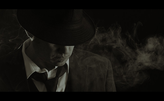
Larger on black
I love this theme and could shoot a whole 52 based on this theme.
Im a big movie fan and love the Film Noir genre, from its roots in the early 40's and 50's through to the more modern interpretations such as Rodrigez's Sin City. Im not sure if its the crime element, the gangsters or the low light heavy shadow cinematic effects. It was a simple choice to create something along theses lines.
For the shoot I took myself up into the attic with a black backdrop, one SB600 through an umbrella camera right and one SB600 bare as a rim light behind me. I took me a few takes to get the rim light right and to get a good effect with the smoke. Once again i had a great time getting dressed up and taking pictures of myself
A Long Dirty Night
Larger on black
Last edited:
- Messages
- 6,964
- Name
- Phil
- Edit My Images
- Yes
That's a cracking photo for film - love the lighting and composition, Chris. Wouldn't change a thing....
Phil
- Messages
- 1,199
- Name
- Andy
- Edit My Images
- Yes
Quick catch up from me Chris.
Surfaces - brilliant effort. The lighting and the mono really suit the image. If certain quarters are to be believed then NASA took the same approach anyway (maybe not with teh grapes and kebab stick)
Light - again a really strong shot but looks a bit dark to me. That might be my rubbish work screen though. I'll have to have another look at it on my calibrated monitor when I get home.
project - a very tranquil scene and a lovely portrait.. I'm sure Clare will be pleased with these. the only thing I may have done differently is a bit of soft focus to go with the intended usage. Could add a bit of dreamlike quality to it.
film - my favourite so far. Well done for making the effort and the results were well worth it. The pose, smoke, lighting all come together to make a cracking shot.
Andy
OP
- Messages
- 1,560
- Name
- Chris
- Edit My Images
- Yes
That's a cracking photo for film - love the lighting and composition, Chris. Wouldn't change a thing....
Phil
Quick catch up from me Chris.
Surfaces - brilliant effort. The lighting and the mono really suit the image. If certain quarters are to be believed then NASA took the same approach anyway (maybe not with teh grapes and kebab stick)
Light - again a really strong shot but looks a bit dark to me. That might be my rubbish work screen though. I'll have to have another look at it on my calibrated monitor when I get home.
project - a very tranquil scene and a lovely portrait.. I'm sure Clare will be pleased with these. the only thing I may have done differently is a bit of soft focus to go with the intended usage. Could add a bit of dreamlike quality to it.
film - my favourite so far. Well done for making the effort and the results were well worth it. The pose, smoke, lighting all come together to make a cracking shot.
Andy
Thanks very much Phil and thanks for the catch up Andy. I think the Film shot is probrably my favourite of my 52 so far.
OP
- Messages
- 1,560
- Name
- Chris
- Edit My Images
- Yes
Wow, Chris. that is a fantastic shot. I would advise everyone to view the larger version to see how good it really is. The compositon and lighting are spot on and I don't know how you got the smoke to behave like that.
Excellent
Jenny
Thanks Jenny, I had the shutter on a 10 sec timer, using a remote i released it and then i was sucking on a cigarette(not inhaling) and then blowing the smoke out around me just before the timer ended. It took a few takes to get it right and my mouth tasted rank after. I used to smoke but havn't for a few years now.
- Messages
- 1,441
- Edit My Images
- Yes
Love your film shot - great atmosphere.
OP
- Messages
- 1,560
- Name
- Chris
- Edit My Images
- Yes
Thank you all very much for the kind comments this week, im humbled by them all. I actually think this is one of the best shots i have taken and that is testament to how much this 52 has developed my skills in a short space of time. I entered the challenge thinking it will give me something to do on the dark nights of winter and underestimated just how much thought and effort it would take throughout the year.
right now what the hell am i going to do for dirty
right now what the hell am i going to do for dirty
OP
- Messages
- 1,560
- Name
- Chris
- Edit My Images
- Yes
Absolutely fantastic, and definitely the best for this week's theme. And I'm particularly impressed that you have done it as a SP - I couldn't have managed this even with a model.
cheers Tracer, i usually struggle with focus on SP but i had a few props to fucus on and then marked a spot i had to stand on. Remote triggers and off camera flash also make the job easier
OP
- Messages
- 1,560
- Name
- Chris
- Edit My Images
- Yes
Great shot. Very imaginative. I'm glad someone enjoyed this theme.
thanks Sue, i guess i saw this theme as a movie film not camera film and therefore could have re created any number of film titles. I seem to remember this theme cropping up on the POTY challenge last year and seeing some great entries.
SarahLee
TPer Emerita
- Messages
- 13,060
- Name
- Sarah
- Edit My Images
- No
Simply amazing Chris !!!!I can't add much to what's already been said, but this is fantastic. Lighting is spot on.
And I'm glad that you're really getting something out if this 52. Sounds easy in theory, but it really is a great challenge / learning curve. You've shamed me into pulling my socks up after 2 lazy weeks in a row
OP
- Messages
- 1,560
- Name
- Chris
- Edit My Images
- Yes
I can't add much to what's already been said, but this is fantastic. Lighting is spot on.
And I'm glad that you're really getting something out if this 52. Sounds easy in theory, but it really is a great challenge / learning curve. You've shamed me into pulling my socks up after 2 lazy weeks in a row
thanks very much Sarah, although i think ill have to pull my socks up after this weeks theme as im struggling to come up with some inspiration.
OP
- Messages
- 1,560
- Name
- Chris
- Edit My Images
- Yes
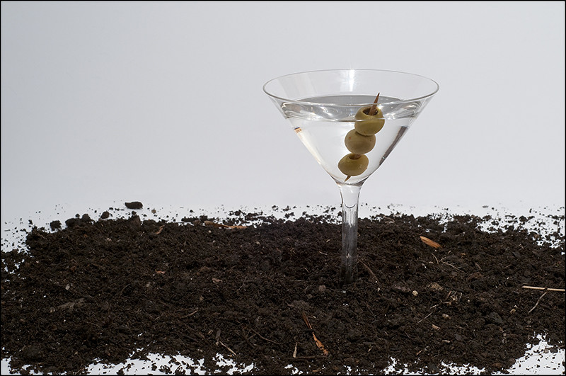
Week 38 Dirty
Well i had a great idea for dirty but unfortunately my model was ill this morning so i was left scratching my head. My first attempt had a glass full of soil with an olive garnish but i couldn't control the light and get the detail in the soil, i ended up with loads of bad reflections. This was plan C but i'm not really happy with it. It was thrown together quickly and lacks much impact to please me. Ill post it anyway but i do intend to go back to plan A soon.
A Martini is a favourite pre dinner tipple of mine and if its made correctly it should be
5.5 part Gin
1.5 part Vermouth ( I prefer Noilly Prat)
garnish with an olive
To make it a "dirty Martini" then add a bit of the brine from the olive jar.
Dirty Martini
Well i had a great idea for dirty but unfortunately my model was ill this morning so i was left scratching my head.
My first attempt had a glass full of soil with an olive garnish but i couldn't control the light and get the detail in the soil, i ended up with loads of bad reflections. This was plan C but i'm not really happy with it. It was thrown together quickly and lacks much impact to please me. Ill post it anyway but i do intend to go back to plan A soon.A Martini is a favourite pre dinner tipple of mine and if its made correctly it should be
5.5 part Gin
1.5 part Vermouth ( I prefer Noilly Prat)
garnish with an olive
To make it a "dirty Martini" then add a bit of the brine from the olive jar.
Dirty Martini
- Messages
- 1,181
- Name
- David
- Edit My Images
- Yes
Hi Chris i keep coming and looking at this, as you say a little unsure as the gin and vermouth has a feel of crisp and smooth rather than rustic dirty feel.
I cannot decide lol, although a good take and very imaginative.
I cannot decide lol, although a good take and very imaginative.
- Messages
- 1,780
- Name
- Darren
- Edit My Images
- Yes
There's something not quite jumping out at me here Chris. The idea is sound but there just seems to be something missing from this set up as you say. I am intrigued to see your plan A come together though. Dirt in or on the glass against a clean white background may give it the impact you think it's missing.
OP
- Messages
- 1,560
- Name
- Chris
- Edit My Images
- Yes
Hi Chris i keep coming and looking at this, as you say a little unsure as the gin and vermouth has a feel of crisp and smooth rather than rustic dirty feel.
I cannot decide lol, although a good take and very imaginative.
There's something not quite jumping out at me here Chris. The idea is sound but there just seems to be something missing from this set up as you say. I am intrigued to see your plan A come together though. Dirt in or on the glass against a clean white background may give it the impact you think it's missing.
thanks guys, yeh, i think the fact that i went into the shot without much drive and enthusiasm with this choice is reflected in the lack of punch.