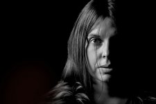
Gav.
Challenge Owner
- Messages
- 7,727
- Name
- Gav
- Edit My Images
- Yes
Thank youlovely shot Gav , like the contrast between the blacks and the whites
Thank you, DaleBest one yet, top work.
Thank you, George"Excellent" portrait style capture Gav, nuff said.
Thank you, Dan, much appreciatedThis just confirms what I was saying on your other post. Lovely portrait Gav, well done!
Thank you, ChrisThat works very nicely, Gav, the lack of expression say's it all.
Cheers Neil, One light, around 20-25 degrees from Em towards the camera, just over head height, 600mm round grid softbox, aimed slightly in front of Em's face so the edge of the light catches the back off the head, if that makes sense.Love this look Gav..........one light set up at about 45 degrees or something else?
Cheers Gav. I’ll try that one dayThank you, Chris
Cheers Neil, One light, around 20-25 degrees from Em towards the camera, just over head height, 600mm round grid softbox, aimed slightly in front of Em's face so the edge of the light catches the back off the head, if that makes sense.
Little tweak of the RAW to pull down shadows a tiny bit more.
I was only after one side of the face.This is a one light setup umbrella to the my ( photographer) right. Just positioned slightly forward and high to allow both eyes to have a catchlight. Heavy contrast processing to bring te portrait to life.
I was playing with the hair, I was trying to keep it tidy but not too neat, bit of luck was involved thoughThis is a great example of when hair in front of the face works. I don’t know if it was an accident, but the strands falling over Em’s right eye adds something to this, Gav. Nice work!

Thank you, it's a journey for the both of us, her confidence has grown since starting this.should be said, fair play to your good lady sitting for you, looking forward to see ing more shots

Thank youExcellent!
Thank you.A nice dramatic portrait. I think I'd have preferred a small amount of detail in the shadows, just as a hint to there being something there to add a bit of mystique (especially the [camera] right eye). On my screen it looks like it's faded completely to black which feels a little unreal to me. Top marks if that's what you were going for though.


Thank you for this Steven, really appreciate your time and effort to help a tool like me.Very nice image... but two things struck me right away.
The first is that the highlights are a bit strong IMO. That can be altered by moving the light farther away (harder light/less falloff/less power); or by moving it closer on reducing the power (softer light, more falloff), or with editing.
The second was that the balance/composition is off IMO. The placement to the left makes the entire right half of the image almost irrelevant. I get the intent of negative space/contrast/etc... but the balance/weight/heaviness is off.
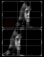
This is my take on the image; light dodge/burn, a slight crop vertically, recomposed for balance.
View attachment 394564
And this is the original vs the edit; both in the 3:2 format with the golden ratio overlay.
View attachment 394565
In my edit "the image" crosses well across the midpoint and is biased more towards the center (focus). And if you crop it down to a square removing the empty column, what remains is a more balanced 50/50 composition (which better suits the square/symmetrical format).
In your edit the right half could be removed w/o significantly impacting the image (light); and if you crop it down to a square what remains feels/looks a bit awkward... IMO the original composition needs some light/details on the shadow side to help fill/balance it out.
Just my 2c... feel free to do with it what you want.
And BTW, I chose the 3:2 format and golden ratio because it best suits the image and explains/demonstrates what I was feeling/seeing... a different image and I might have chosen something else entirely (or ignored them all).

Actually I can see where Steven is coming from on this, and I have to agree with him.Thank you for this Steven, really appreciate your time and effort
As Status Quo sung ...I just thought I might get away with breaking some rules
Don't you start!!!Actually I can see where Steven is coming from on this, and I have to agree with him.
Who are they??


Don't you start!!!
Yah sorry I forgot you are a yung'unWho are they??
Helps bring back memories of being a travel sick kid in the carI hope that helps
You can... I.e. I selected "the rules" that best fit the image IMO; but in doing so I ignored/broke other rules. I could have chosen "the rule of thirds" and just noted that it's all good because her eye is on the left 1/3 line in the original composition... which is true.I just thought I might get away with breaking some rules
Cheers StevenYou can... I.e. I selected "the rules" that best fit the image IMO; but in doing so I ignored/broke other rules. I could have chosen "the rule of thirds" and just noted that it's all good because her eye is on the left 1/3 line in the original composition... which is true.
I don't actually follow the rules; but I will reference them as they suit an image to see if they can help me refine my composition. I tend to work from "feel" in this aspect; and I use/reference the rules to help me make some sense of (show me) "the reasons" why I feel a certain composition works better. However, I've seen people try to apply rules like "the golden spiral" to explain their composition with an image like this... and that just makes no sense.
If you're doing these for you, then what you prefer should win out. Sometimes, getting varied feedback allows you to see things you didn't see before, or look at an image in a different way which can be really helpful on one hand, or cause you to second-guess yourself constantly on the other. Steven's reworking gives a different look to the image that I prefer. It would be interesting to show a re-cropped-and-shadow-lifted version and your original to your model and see what she thinks!I just thought I might get away with breaking some rules
Thank you, Appreciate itBTW, I only bother because you seem to care/listen.
Thank you, I agree, this the reason I like posting here and taking crit', this is just a hobby for me, I'm not looking for likes, follows or sales, I purely want to do the very best I can.If you're doing these for you, then what you prefer should win out. Sometimes, getting varied feedback allows you to see things you didn't see before, or look at an image in a different way which can be really helpful on one hand, or cause you to second-guess yourself constantly on the other. Steven's reworking gives a different look to the image that I prefer. It would be interesting to show a re-cropped-and-shadow-lifted version and your original to your model and see what she thinks!


Thank you, I'll take another look with 'fresh eyes' soonSo *for me*, I much prefer the detail in the shadows. It adds more mystery and character. The portrait option is ok, but not as good - mainly because I'm comparing it to the other which is far more dramatic. And again, for my taste (and on my screen), I think you could afford to go a bit harder on the contrast. Just a shade though....

I think I still prefer my first take on the darkness, but I can't decide a preferance on the crop/direction yet.I prefer the darkness TBH.
Also, I prefer the square crop or even add a bit more to the right, as per Steven's 2nd example,
with Em's eye on the left 1/3rds.
That's what I was getting at, your first image / crop ( it's the same as Steven's second example) with Em's eye on a vertical and horizontal 1/3rd.I think I still prefer my first take on the darkness, but I can't decide a preferance on the crop/direction yet.
