
- Messages
- 4,182
- Name
- Paul
- Edit My Images
- Yes
Not sure if this is in the right place but I'm posting from holiday so it's all a bit rushed and... erm... foreign!
I've had my first stab at street photography - I've never really felt comfortable before but being a tourist means you're allowed to stand around with a camera taking pics") It was also a street market in the nearest larger town so a good excuse to give it a whirl.
It was also a street market in the nearest larger town so a good excuse to give it a whirl.
I'm after some feedback as there should be more opportunities for these sorts of photos before I leave so any suggestions for improvement would be most welcome... Bear in mind I've only been taking photos since the start of the year (well, give or take and excluding "snaps" previously) so my standard of photography isn't exactly stellar yet. Which is why I need you all to help!
I've processed a few into the stereotypical B&W but I do find it suits them. Some are colour though, when I thought that made more sense.
Thanks in advance (apologies for the number - there are yet more on my flickr!):
3: Le kebab traditionnel
 Briquebec 3 by Paul, on Flickr
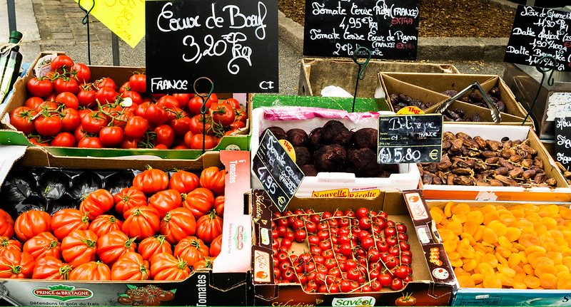
6: Tomates
 Briquebec 6 by Paul, on Flickr
7: Les honneurs
 Briquebec 7 by Paul, on Flickr
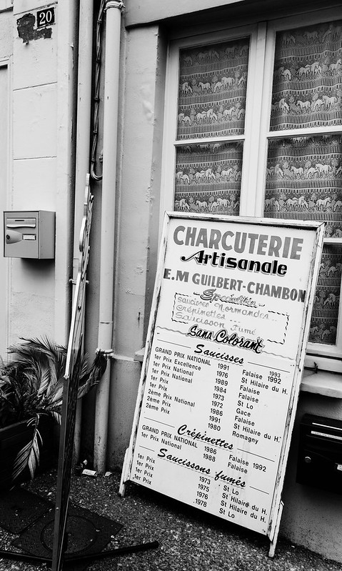
8: Calvados
 Briquebec 8 by Paul, on Flickr
9: Haberdasher
 Briquebec 9 by Paul, on Flickr
11: Les chaussures
 Briquebec 11 by Paul, on Flickr
13: Cotton
 Briquebec 13 by Paul, on Flickr
17: Boulangerie
 Briquebec 17 by Paul, on Flickr
Edited to add: sorry for original misuse of critique tag and number of images (>6)... I had forgotten that rule when posting. I'm keen to have thoughts, critique etc. or even just "don't like #9) comments! Constructive critique most definitely welcome if you have time - pretend the tag is still there!
My own comments for further background/perusal:
3: Le kebab traditionnel - I really struggled with the distortion (even just at 18mm) here and can't seem to get the horizontals horizontal throughout the scene from top to bottom... Back to the image, the juxtaposition made me smile but not sure if that's come through enough in the photo?
6: Tomates
Loved the colours and variety but it may lose some context with the tighter crop?
7: Les honneurs
Again, struggling with verticals this time - but the proud statements from the board contrasted pretty starkly with the state of disrepair of his building away from the entrance.
8: Calvados
A real character and apart from cropping tighter (losing the top 25% perhaps) not sure what else I could/should have done here?
9: Haberdasher
The one I'm probably least fussed by because the vibrancy of the scene in real life doesn't really pop as much as I'd hoped... PP-fixable perhaps (when I have a proper monitor in front of me!)
11: Les chaussures
I liked the range of tones and sweep of the stall but maybe that's not enough?
13: Cotton
My favourite even though very simple - definitely keen to know what I could have improved here (was limited in terms of going with a wider aperture because of the cheap kit zoom I had with me)
17: Boulangerie
I also like the tones on this one but not sure the composition works?
I've had my first stab at street photography - I've never really felt comfortable before but being a tourist means you're allowed to stand around with a camera taking pics
It was also a street market in the nearest larger town so a good excuse to give it a whirl.I'm after some feedback as there should be more opportunities for these sorts of photos before I leave so any suggestions for improvement would be most welcome... Bear in mind I've only been taking photos since the start of the year (well, give or take and excluding "snaps" previously) so my standard of photography isn't exactly stellar yet. Which is why I need you all to help!
I've processed a few into the stereotypical B&W but I do find it suits them. Some are colour though, when I thought that made more sense.
Thanks in advance (apologies for the number - there are yet more on my flickr!):
3: Le kebab traditionnel
Briquebec 3 by Paul, on Flickr6: Tomates
Briquebec 6 by Paul, on Flickr7: Les honneurs
Briquebec 7 by Paul, on Flickr8: Calvados
Briquebec 8 by Paul, on Flickr9: Haberdasher
Briquebec 9 by Paul, on Flickr11: Les chaussures
Briquebec 11 by Paul, on Flickr13: Cotton
Briquebec 13 by Paul, on Flickr17: Boulangerie
Briquebec 17 by Paul, on FlickrEdited to add: sorry for original misuse of critique tag and number of images (>6)... I had forgotten that rule when posting. I'm keen to have thoughts, critique etc. or even just "don't like #9) comments! Constructive critique most definitely welcome if you have time - pretend the tag is still there!
My own comments for further background/perusal:
3: Le kebab traditionnel - I really struggled with the distortion (even just at 18mm) here and can't seem to get the horizontals horizontal throughout the scene from top to bottom... Back to the image, the juxtaposition made me smile but not sure if that's come through enough in the photo?
6: Tomates
Loved the colours and variety but it may lose some context with the tighter crop?
7: Les honneurs
Again, struggling with verticals this time - but the proud statements from the board contrasted pretty starkly with the state of disrepair of his building away from the entrance.
8: Calvados
A real character and apart from cropping tighter (losing the top 25% perhaps) not sure what else I could/should have done here?
9: Haberdasher
The one I'm probably least fussed by because the vibrancy of the scene in real life doesn't really pop as much as I'd hoped... PP-fixable perhaps (when I have a proper monitor in front of me!)
11: Les chaussures
I liked the range of tones and sweep of the stall but maybe that's not enough?
13: Cotton
My favourite even though very simple - definitely keen to know what I could have improved here (was limited in terms of going with a wider aperture because of the cheap kit zoom I had with me)
17: Boulangerie
I also like the tones on this one but not sure the composition works?
Last edited: