- Messages
- 5,816
- Name
- Mike
- Edit My Images
- Yes
I find one of the difficult parts of offering crit is sometimes not knowing how the original shot was framed and exposed. So, I thought I'd try and start a thread whereby we show the straight out of camera shots and your edited result. In my opinion it will enable us to offer a better opinion on things, so please feel free to post your own work.
So, that said, here's my starter for 10 -
I'm struggling getting time to go out and shoot right now, so I thought I'd practice a bit more PP work. I've gone back and picked a couple of old shots and posted both the originals and my edits. What I'd appreciate is thoughts on what I've done right and more importantly done wrong with the processing. All shots have been resized to 1024 px longest size with a max size of 200kb so I could upload them to the gallery here
Nutty original
 Default Album by pooley on Talk Photography
Edited
 Default Album by pooley on Talk Photography
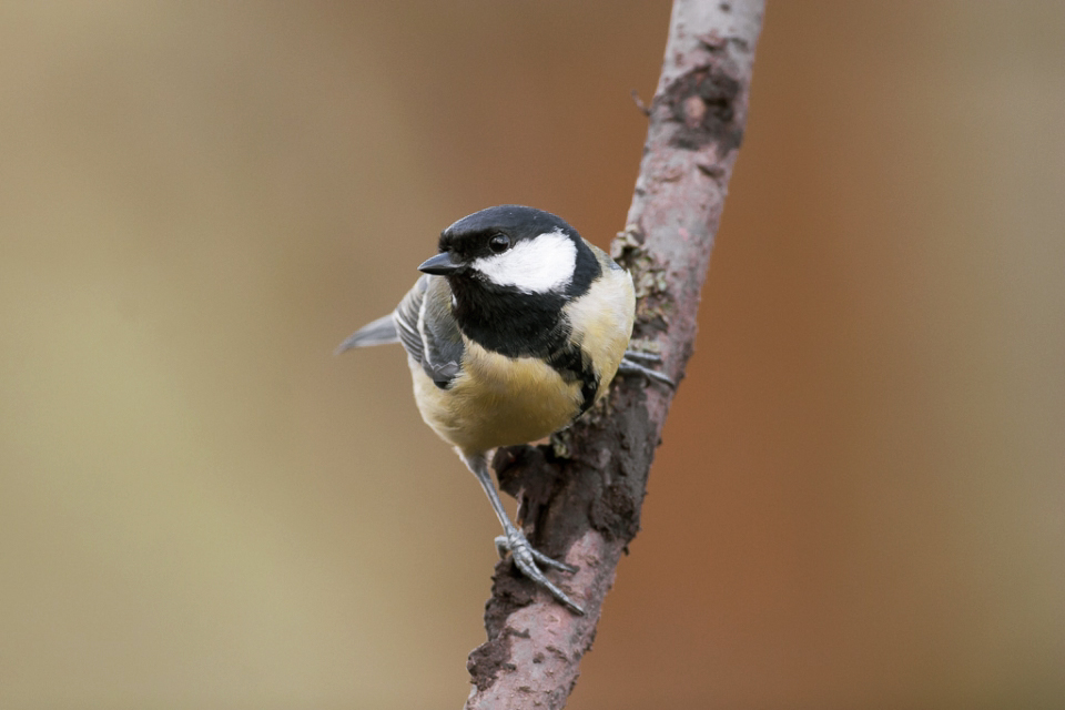
Great tit original
 Default Album by pooley on Talk Photography
Edited
 Default Album by pooley on Talk Photography
So, that said, here's my starter for 10 -
I'm struggling getting time to go out and shoot right now, so I thought I'd practice a bit more PP work. I've gone back and picked a couple of old shots and posted both the originals and my edits. What I'd appreciate is thoughts on what I've done right and more importantly done wrong with the processing. All shots have been resized to 1024 px longest size with a max size of 200kb so I could upload them to the gallery here
Nutty original
Default Album by pooley on Talk PhotographyEdited
Default Album by pooley on Talk PhotographyGreat tit original
Default Album by pooley on Talk PhotographyEdited
Default Album by pooley on Talk Photography
Last edited:
")