
You are using an out of date browser. It may not display this or other websites correctly.
You should upgrade or use an alternative browser.
You should upgrade or use an alternative browser.
weekly susiejb 52 /2014 Support
- Thread starter susiejb
- Start date

OP
- Messages
- 7,548
- Name
- susie
- Edit My Images
- Yes
Nice Susie... I really like the colour tone.
Out of interest, what is it?! I think the composition is great - framing and aspect works really well. Very simple in a good way and love the contrast.
That was quick Paul
") Thanks for hopping in.
Thanks for hopping in.It's just white paper folded in a shape ..it looked a bit bland so I added the effect ...I tried lots of colours but decided I liked this one the best .
- Messages
- 4,088
- Name
- Graham
- Edit My Images
- Yes
Great idea susie... (I would say that this week ), a beautifully smooth curve.
I also tried a bit of toning on mine... nothing as brave as yours though, that might be why I didnt like it. Anything I did just made the WB look off, so I settled for a bit of blue in the shadows only, 'cept I don't have any shadows to speak of, so its very subtle.
Yours is much bolder, I like it.
), a beautifully smooth curve.I also tried a bit of toning on mine... nothing as brave as yours though, that might be why I didnt like it. Anything I did just made the WB look off, so I settled for a bit of blue in the shadows only, 'cept I don't have any shadows to speak of, so its very subtle.
Yours is much bolder, I like it.
OP
- Messages
- 7,548
- Name
- susie
- Edit My Images
- Yes
Hi Susie really nice abstract image, had no idea what it was until i read the above, like the colour tone not an effect I have ever felt happy with when I have tried but this works
simple but effective
Thanks Allan ...much appreciate your comment as always.
OP
- Messages
- 7,548
- Name
- susie
- Edit My Images
- Yes
Great idea susie... (I would say that this week
I also tried a bit of toning on mine... nothing as brave as yours though, that might be why I didnt like it. Anything I did just made the WB look off, so I settled for a bit of blue in the shadows only, 'cept I don't have any shadows to speak of, so its very subtle.
Yours is much bolder, I like it.
yes I did see yours Graham and loved it (will comment in a min) I saw something like this on the internet and decided to try it ... my original idea was for stark black and white, but I wasn't happy with it so I added the effect.- Messages
- 4,836
- Name
- Alan
- Edit My Images
- Yes
Hi Susie
Smooth - nothing much to say really as it is spot on the theme, comp is just right and the colour is beautiful. I partic like the subtlety of the tones in the LH side
Smooth - nothing much to say really as it is spot on the theme, comp is just right and the colour is beautiful. I partic like the subtlety of the tones in the LH side
- Messages
- 1,412
- Name
- Elaine
- Edit My Images
- Yes
Lovely smooth curve, great lighting and colour conversion and I love the way the diagonals flow into the corner Not too sure about the wobbly vertical edge, I wonder what it would look like cloned out to a straight vertical?
Not too sure about the wobbly vertical edge, I wonder what it would look like cloned out to a straight vertical?
OP
- Messages
- 7,548
- Name
- susie
- Edit My Images
- Yes
Hi Susie
Smooth - nothing much to say really as it is spot on the theme, comp is just right and the colour is beautiful. I partic like the subtlety of the tones in the LH side
Thanks Alan ... much appreciated .... glad you like the colour .... t was hard to decide.
OP
- Messages
- 7,548
- Name
- susie
- Edit My Images
- Yes
That's cool.
Lovely smooth curve, great lighting and colour conversion and I love the way the diagonals flow into the corner
Ta d00d
Thanks Elaine ... I spent ages trying something else that didn't quite work out as I hoped so I was in slight fed up /desperation mode when it came to this ... I was holding the folded paper in one hand and my camera in the other, which is not ideal. I would really like to try it again and set it up properly as I love the concept, but I agree it needs a bit of improving
- Messages
- 1,412
- Name
- Elaine
- Edit My Images
- Yes
Ha ha, I thought I was the only one that tried those sort of balancing tricks Susie. I have two tripods, a freestanding one and a little desktop one, but it always seems like too much of a faff to set them up. In fact, I don't even know where the big one is, I think the last time I used it was a couple of years ago when I was trying to get some shots of a supermoon
- Messages
- 8,398
- Name
- Lynne
- Edit My Images
- Yes
hi Susie
that works really well as an abstract , lovely curve, the different tones of one color work well & the frame finishes it of ( though maybe a bit thick for my tastes )....kinda reminds me of Warhol's work....could see it as a set of 3 all in differing colors....
that works really well as an abstract , lovely curve, the different tones of one color work well & the frame finishes it of ( though maybe a bit thick for my tastes )
....kinda reminds me of Warhol's work....could see it as a set of 3 all in differing colors....
OP
- Messages
- 7,548
- Name
- susie
- Edit My Images
- Yes
Interesting take on the theme and I do like a nice abstract.
Now, the colour, good to experiment. I did a B&W conversion and quite liked it.
Cheers.
Thanks for looking and commenting Andy ... much appreciated.
OP
- Messages
- 7,548
- Name
- susie
- Edit My Images
- Yes
Super image Susie
Thanks Phil ... I find PP just a case of trial and error ... I tend to stop when I see something I like
OP
- Messages
- 7,548
- Name
- susie
- Edit My Images
- Yes
hi Susie
that works really well as an abstract , lovely curve, the different tones of one color work well & the frame finishes it of ( though maybe a bit thick for my tastes )
Thanks Lynne I like the idea of the different colours, maybe turn it too at the same time ... definitely one for a mess with in the future .... maybe next year


OP
- Messages
- 7,548
- Name
- susie
- Edit My Images
- Yes
Hi Susie, really like the second shot
Thanks Allan ...they're nice aren't they, I just took that one of those and intended to go back and do some more but I couldn't find them again ...very annoying

The effect is a very slight 10% sharpen and a simple sunburst, it's one I like a lot, it ads a really nice glow.
- Messages
- 4,088
- Name
- Graham
- Edit My Images
- Yes
Hi susie, hope the walk in the woods has made you feel better, couple of great images to come back with.
First one for me, your added sunglow on these works really well. Looks super natural.
Perfect low POV for each of these, being able to see under the cap really benefits the image. Seeing an angle you don;t normally see really works. When i was mushroom hunting, I found a few clumps, but didn;t like the clustered look, or having to crop half of one out, but you've done both of those things really well. Lovely colours on both of these too.
- Messages
- 9,095
- Name
- Mandy
- Edit My Images
- Yes
Hi so sorry I haven't popped in for a while, life's been hectic I have had a look at your I ages I have missed and I got to say, some lovely ideas for the themes and nicely thought out. Sorry I can't offer crit on all the images individually but I am so far behind at this moment and time.
Smooth - I love the abstract feel to this image and the colour, compositionally very good and fits into the theme beautifully.
Smooth - I love the abstract feel to this image and the colour, compositionally very good and fits into the theme beautifully.
OP
- Messages
- 7,548
- Name
- susie
- Edit My Images
- Yes
Hi susie, hope the walk in the woods has made you feel better, couple of great images to come back with.
First one for me, your added sunglow on these works really well. Looks super natural.
Perfect low POV for each of these, being able to see under the cap really benefits the image. Seeing an angle you don;t normally see really works. When i was mushroom hunting, I found a few clumps, but didn;t like the clustered look, or having to crop half of one out, but you've done both of those things really well. Lovely colours on both of these too.
Thanks for looking Graham. Thank you .... I did feel better...there's nothing much more uplifting than being outside with my camera
I was relieved to find some .... there's not so many about at the moment.
OP
- Messages
- 7,548
- Name
- susie
- Edit My Images
- Yes
I like #2. The uber low angle and lack of detail underneath the 'shrooms works well. Just the bright upper left that draws my eye by way of crit.
I've never managed to get a decent fungi photograph.
Cheers.
Thanks Andy .... I made fungi my winter project and they are fascinating, maybe I did too much sunglow on the bright bit

OP
- Messages
- 7,548
- Name
- susie
- Edit My Images
- Yes
Hi so sorry I haven't popped in for a while, life's been hectic I have had a look at your I ages I have missed and I got to say, some lovely ideas for the themes and nicely thought out. Sorry I can't offer crit on all the images individually but I am so far behind at this moment and time.
Smooth - I love the abstract feel to this image and the colour, compositionally very good and fits into the theme beautifully.
Lovely to see you Mandy and thank you for taking the time to look
OP
- Messages
- 7,548
- Name
- susie
- Edit My Images
- Yes
Hi Susie, two great shots, 2nd for me, love the underneath pov, detail and colour in the fungi
Hi Phil ....thanks for hopping in .... I always think they have a fairytale look
- Messages
- 4,182
- Name
- Paul
- Edit My Images
- Yes
Oh Susie, can't believe I nearly missed commenting on your thread!
Shot 1 for attached is a lovely shot. Had someone else taken this they'd be getting plaudits, but you've gone and made it look almost "ordinary" with your shot #2...
Shot 2... WOW!
The detail and lighting on the middle mushroom especially is just amazing. Composition is absolutely perfect and that glow is heavenly, even if you did add it in post. Absolute perfection*
* Ok, I'd crop off the bottom 10% as there seems to be some sort of light spill or something OOF? Apart from that very easily changed bit, this shot is utterly, utterly perfect.
If you uploaded that to a stock photo site I'd be shocked if you didn't make quite a lot of money from it...
OP
- Messages
- 7,548
- Name
- susie
- Edit My Images
- Yes
Oh Susie, can't believe I nearly missed commenting on your thread!
Shot 1 for attached is a lovely shot. Had someone else taken this they'd be getting plaudits, but you've gone and made it look almost "ordinary" with your shot #2...
Shot 2... WOW!
The detail and lighting on the middle mushroom especially is just amazing. Composition is absolutely perfect and that glow is heavenly, even if you did add it in post. Absolute perfection*
* Ok, I'd crop off the bottom 10% as there seems to be some sort of light spill or something OOF? Apart from that very easily changed bit, this shot is utterly, utterly perfect.
If you uploaded that to a stock photo site I'd be shocked if you didn't make quite a lot of money from it...
Paul you are always so encouraging to me and I really do appreciate it. Thank you for the above ... nature is my favourite subject so I suppose in a way it's echoed in the photo's that I take.
OP
- Messages
- 7,548
- Name
- susie
- Edit My Images
- Yes
I don't like to fall behind so I drove down to the beach today ...it was very, very windy and cold so it was intended to be an extremely brief visit ...but I almost got a parking ticket ...in the middle of winter ...off road... the mind boggles ...the traffic warden was nice and let me just catch a couple of shots.
This chap really must know what he's doing as the sea was really churning and wild.
Harnessing the Energy

the mind boggles ...the traffic warden was nice and let me just catch a couple of shots. This chap really must know what he's doing as the sea was really churning and wild.
Harnessing the Energy
- Messages
- 11,087
- Name
- Allan
- Edit My Images
- No
Hi Susie, another good and different idea for the theme, I think this could probably do with a bit of a crop, just below the wave about a third up from the bottom and a little more exposure seems a little dark to me.
That sea looks very wild some people are crazy
and a little more exposure seems a little dark to me.That sea looks very wild some people are crazy
- Messages
- 4,182
- Name
- Paul
- Edit My Images
- Yes
Hi Susie... definitely on theme As a very unaccomplished windsurfer (not a crazy kitesurfer), all I can that is that looks utterly terrifying!
I agree with Allan's comments totally: definitely a lift of the shadows if lifting the exposure would blow out the foam and perhaps a crop to just under the crashing wave 1/3 up? An perhaps a small sliver off the top to make it a bit more letterbox?
Well spotted and well captured and always good to see something else from each of us!
As a very unaccomplished windsurfer (not a crazy kitesurfer), all I can that is that looks utterly terrifying!I agree with Allan's comments totally: definitely a lift of the shadows if lifting the exposure would blow out the foam and perhaps a crop to just under the crashing wave 1/3 up? An perhaps a small sliver off the top to make it a bit more letterbox?
Well spotted and well captured and always good to see something else from each of us!
- Messages
- 7,502
- Edit My Images
- Yes
Hi Susie, great shot, love the high pov I'm going to disagree about needing a crop, I think the vast amount of sea around the surfer adds more to the image, makes it more dramatic. It does look a tad on the dark side,............. but I'm undecided if that just adds even more to the image, iyswim
I'm going to disagree about needing a crop, I think the vast amount of sea around the surfer adds more to the image, makes it more dramatic. It does look a tad on the dark side,............. but I'm undecided if that just adds even more to the image, iyswim- Messages
- 9,111
- Name
- David
- Edit My Images
- Yes
Hi susie
Attached ... I agree with the above comments ... excellent stuff. #2 is most unusual but I think if I had to choose I'd say #1 for that warm lighting effect.
Harnessing the Energy ... great title that. Love it ... expansive, dark and dangerous ... the kitesurfer a little silhouette on the white water. I don't think it needs cropping. I love the sharp outline and bright colours of the kite too.
Last edited:
OP
- Messages
- 7,548
- Name
- susie
- Edit My Images
- Yes
Hi Susie, another good and different idea for the theme, I think this could probably do with a bit of a crop, just below the wave about a third up from the bottom
That sea looks very wild some people are crazy
Hi Susie... definitely on theme
I agree with Allan's comments totally: definitely a lift of the shadows if lifting the exposure would blow out the foam and perhaps a crop to just under the crashing wave 1/3 up? An perhaps a small sliver off the top to make it a bit more letterbox?
Well spotted and well captured and always good to see something else from each of us!
Hi Susie, great shot, love the high pov
Hi susie
Attached ... I agree with the above comments ... excellent stuff. #2 is most unusual but I think if I had to choose I'd say #1 for that warm lighting effect.
Harnessing the Energy ... great title that. Love it ... expansive, dark and dangerous ... the kitesurfer a little silhouette on the white water. I don't think it needs cropping. I love the sharp outline and bright colours of the kite too.
Thank guys ...much appreciated comments. I take on board the point about the crop but Phil and d00d have nailed my thoughts on this one ...I did try a crop but but I felt it lost the impression of this tiny windsurfurer in the boiling ocean so I left it completely as taken.
The colour is frustrating because on my main computer here it looks just right, but on my iphone it looks really dark
I may have to have a fiddle around with this computer screen and see if I can get the two a bit more in line with each other !- Messages
- 4,088
- Name
- Graham
- Edit My Images
- Yes
that's cool susie, really good interpretation of the theme. I wouldn;t crop it at all, I think having the space around shows the isolation, and the person gives it scale.
Great crashing waves too, with the filled with wind feel of the kite and the spray being kicked up behind.
'tis a bit on the dark side for me.... Do you ever use the histogram? (You might get one on the back of the camera in playback mode, or most editing / picture viewing packagaes have them). Below is the one for this shot.....
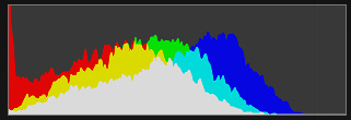
Simply it shows the distribution of tones (from dark on the left, to bright on the right. As there is a fair bit of white in this image, I'd probably expect the (right hand end of the) graph to be more towards the right side of the range.
An image with a lot of black or shadow areas, will be more skewed to the left side.
It's not a definitve indication of anything, but is useful as a guide.
Great crashing waves too, with the filled with wind feel of the kite and the spray being kicked up behind.
'tis a bit on the dark side for me.... Do you ever use the histogram? (You might get one on the back of the camera in playback mode, or most editing / picture viewing packagaes have them). Below is the one for this shot.....
Simply it shows the distribution of tones (from dark on the left, to bright on the right. As there is a fair bit of white in this image, I'd probably expect the (right hand end of the) graph to be more towards the right side of the range.
An image with a lot of black or shadow areas, will be more skewed to the left side.
It's not a definitve indication of anything, but is useful as a guide.