- Messages
- 1,517
- Name
- Dr Ozone
- Edit My Images
- Yes
Ok, been out in the hills a lot so not had any time and a bit late than I anticipated but at least captured an extra entry from Raf.
All good edits and different approaches.
Jim- good to see you in here again- with or without your Simpson characters . Like the effect achieved on the Cannon and yes, straightening it a bit helps a lot.
Rhodese- I like the lens blur effect on the background and additional pillar. I swither on the humanoids being removed first or not and also if a bit more vibrancy on the cannon is needed but undecided.
Neil- Those are some Spinal Tap numbers there- all the way up to 11. I think its worked well here although it would be interesting to know if they had a particular subject matter in mind. There's certainly plenty of detail, contrast and nothing obscured via shadows.
Paul- Your colours are similar to mine although I didn't do the sky and you achieved it in a more technically proficient manner compared to mine lol. I do like how you have rescued some colour in the blown highlights
Raf- Despite lack of workflow I like what you have done with the sky and the B&W works well. Needs to be rotated though and like Rhodese's I'm undecided on leaving the people in.
mmm...so- tricky this- it does seem to lend itself well to B&W and colour- I had only been thinking in colour because of the cannon but either work.
From the colour world I'm taking Paul forward. B&W - been flicking from tab to tab on Jim and Neil's- it's quite interesting if you do it quickly- or maybe it's just me lol
Anyway- from B&W I'm taking Jim's effect forward.
So, tough call- it is almost flip a coin for either colour or B&W- I'm going to award it to Jim as I like the art of possible. Liked your homer version but you may not have won with that. Well done Jim
Here's mine:
In LR
sharpened 59
clarity 17
vibrance 52
saturation 5
contrast 10
adjustment brush -43 on highlights though not sure it did anything lol
In PS
rotated free transform
cloned out people and jacket type object
cropped
Done (might have lightened the cannon somewhere with highlights or shadows but I wasn't paying enough attention and can't see that step now)
 Edit118 by Dr_Ozone, on Flickr
All good edits and different approaches.
Jim- good to see you in here again- with or without your Simpson characters
. Like the effect achieved on the Cannon and yes, straightening it a bit helps a lot.Rhodese- I like the lens blur effect on the background and additional pillar. I swither on the humanoids being removed first or not and also if a bit more vibrancy on the cannon is needed but undecided.
Neil- Those are some Spinal Tap numbers there- all the way up to 11
. I think its worked well here although it would be interesting to know if they had a particular subject matter in mind. There's certainly plenty of detail, contrast and nothing obscured via shadows.Paul- Your colours are similar to mine although I didn't do the sky and you achieved it in a more technically proficient manner compared to mine lol. I do like how you have rescued some colour in the blown highlights
Raf- Despite lack of workflow
I like what you have done with the sky and the B&W works well. Needs to be rotated though and like Rhodese's I'm undecided on leaving the people in.mmm...so- tricky this- it does seem to lend itself well to B&W and colour- I had only been thinking in colour because of the cannon but either work.
From the colour world I'm taking Paul forward. B&W - been flicking from tab to tab on Jim and Neil's- it's quite interesting if you do it quickly- or maybe it's just me lol
Anyway- from B&W I'm taking Jim's effect forward.
So, tough call- it is almost flip a coin for either colour or B&W- I'm going to award it to Jim as I like the art of possible. Liked your homer version but you may not have won with that
. Well done JimHere's mine:
In LR
sharpened 59
clarity 17
vibrance 52
saturation 5
contrast 10
adjustment brush -43 on highlights though not sure it did anything lol
In PS
rotated free transform
cloned out people and jacket type object
cropped
Done (might have lightened the cannon somewhere with highlights or shadows but I wasn't paying enough attention and can't see that step now)
Edit118 by Dr_Ozone, on Flickr St Agnes and Gugh

 View from St Agnes & Gugh
 not_mine-1020150
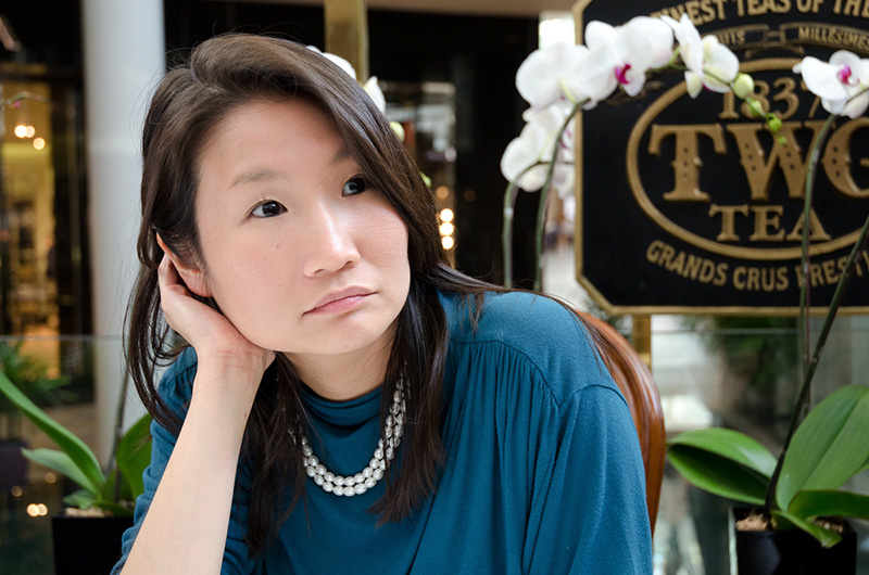

 David's wife
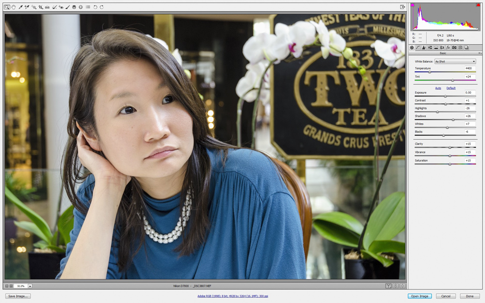

 _DSC3807
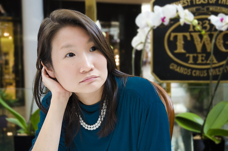 Edit121
 not_mine-3807
 It makes such a difference to see how others tackle things.
 spain not.mine

 Edit122