THE PP GAME!

Thanks Rhodese- it's fair to say my patience was straying so not wanting to let the side down with a non-appearance- I did some stuff:D

Well done Graham:clap:

Missed your chance there Doc, some dragons perching on the cranes would have been the winner for me :)
Well done Graham.
 
OK, scooter then.... ickle bit of motion blur! :D

I hadn’t noticed, it’s probably all that single malt I have imbibed over the years. They say the eyes go first followed by Willy McKnob; McKnob is still ok, so I must well hope I have a while to go yet. :).

Rhodese.
 
Hmmmm. too subtle obviously!

Speaking of single malts... :D
 
Here's my take on the whisky problem ( No problem really but I prefer Irish whiskey:))
Started with ACR and gave +14 clarity changed WB to daylight and was happy with the auto exposure results.
On with PS.
Straightened a tadge.
Made layer by copy of bottle, glass and top,
Found picture of Oban and pasted it behind.
Made layer mask and faintly put background in behind glass and bottle.
Made copy of the BG and pasted it over the reflected part of the stand using the distort tool and used 24% opacity.
Flattened image resized for flickrrrr.
oban by Farmejim, on Flickr

CHEERS :beer:
 
Missed your chance there Doc, some dragons perching on the cranes would have been the winner for me :)
Well done Graham.

Yes poor show from me- I should have just gone for that- I would have felt better:LOL:

Good use of Oban scenery:)
 
Hello Graham,
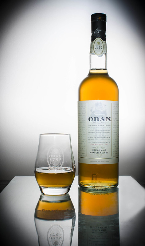
I like working with type of subject. It usually finishes with the missus waking me up; I then have to take pictures of a less than full bottle.
I have my suspicions this may be the case here after a close inspection of the cap, and those bubbles… hmmm? :angelic:.

Here we go,

Open in ACR, auto, open in PS.
Crop, straightening the vertical ever so slightly, add space to the bottom and the R/H side.
Copy layer. Switch background layer off.
Fill the bottom space with by painting with colours selected from the bottom area of the image.
Fill the spaces ether side of the base by cloning and painting.
Fill the space down the side by making a selection, then copy and pasting into a new layer.
Using the transform scale tool, stretch the selection over the space.
Flatten to the copy layer.
SAVE.
On the copy layer select the upper part of the glass, copy and paste into a new layer, then with the transform tool, flip the selection vertically.
Move it down into position then using the warp command in transform, mould to the reflection.
Select the rim of the glass paste into a new layer and move that into position again flipping.
Use, masks and dodge and burn to blend all the components together.
SAVE.
Selecting the label of the bottle use similar methods to attain an acceptable blend this time adjusting exposure to match the original and taking care with the warp tool to achieve a reversal of the curvature particularly the writing on the sides.
Apply a slight ripple filter to the label.
Blend the component parts as before.
Flatten visible.
Tidy up, blending any anomalies.
Flatten.
Add border with stroke.
SAVE.
Save for web.


CICKTHEIMAGEFORBIGANDASIP.

There’s a diabolical contusion when looking at the rim of the glass.
Look at it blink and it kind of flips the edges, outside to in and back. :thinking:.


Rhodese.
 
Last edited:
First thoughts were to empty the bottle for some realism:D

My second thought was that it didn't seem like there was much to do but there was actually quite a few imperfections in the glass/ surface which showed up under closer inspection.

In LR
Add post crop vignette -100
Vignette 193
Sharpen 48
Luminance 17
Orange saturation 40

In PS
Free transform to straighten a touch
Clone stamp and healing brush to remove imperfections
Some slightly dodgy looking cloning etc on surface- added layer, sampled colour and brushed over to give more uniform effect


Edit123 by Dr_Ozone, on Flickr
 
Thankyou chaps.......

In posted order..

Jim, Great inventive idea, and very well executed... top to bottom, dealt with the darker top corners well, :), couple of small selection issues (neck of the bottle RHS), love the way the reflection has come through the transparent glass, most of the necessary highlights / blemishes taken care of. The line at the back of the glass base is cut off a bit hard, and you left the black cloth at the 2 sides. As obviously a large part of the image is an addition, I'll take that into account on judging. (To be fair.. (y))

Rhodese, reflection is obviously the bulk of the work here and it works well for it, one f the point raised in crit when I posted this in my 52... was to have more of the reflections included, the glass (sheet) isn't big enough to do that but you've created them really well, ripple on the label is ace.. I also found that the image was quite tall, but your additions to the sides are a really welcome addition. Extending the glass is good too, would have maybe liked to see the two top corners lightened.

Dr O... imperfections in the glass.... sorrrryyy! But you've done a good job of cleaning them up, colour comes across nice and rich... nasty highlights on the bottle and glass taken care of well too. Feeling this is a bit tall and thin for my eyes, and the vignette is rather heavy.

As Rhodese spotted, the cap has been opened, and the contents are in fact lukewarm, watered down tea! Filled into an empty whisky bottle... The bubbles would be on the list of things to watch for were I to do this again, as well as using a larger, less scratched sheet of glass.

Hate to do this to you Rhodese... but I have to hand back the crown to you..... There are a couple of little things I'd still do to your image, tiny crop off the bottom and right hand side, and a lightening of the top corners.

Well done Rhodese.

And Jims late entry has just given me a great chuckle as I was typing this out! :)

Is it me or has the judge not posted their edit up in the past few rounds???

Here was mine...

Re-edited this week too and found the lens correction anti-vignetting tool quite useful for taken the dark off the two top corners caused by not enough flash hitting the high up parts of the wall behind.

 
Last edited:
Thanks Graham, I quite liked the “Vinaigrette:) in the top corners.

Well done all. :clap:.

On Friday, “They are coming to take me away”, “hehe” “haha”. (You’re showing your age if you remember that.)
and unfortunately I’m going to be busy getting ready, so can I pass.
Sorry.

So its back to you Graham, thanks again.

Rhodese.
 
........... so can I pass.

Ok - No problems...... You can only pass once though.. :)

Another that needs not-a-lot doing to it, so should be nice and easy.

I'll give it till Friday.

NYNX9zN.jpg


https://www.dropbox.com/s/khkr0gonwg2v31a/DSC_0067.NEF
 
Last edited:
Thanks for the feed-back Graham, the rhs of the bottle-neck wasn't very good:oops: :$. Well done Rhodese, so they finally caught up with you eh?!!
There's nowhere to hide anyone in this one Graham :( Never mind I'll do me best.
 
Thanks for the feedback Graham- I think I may have altered the perspective a bit as a well. I did go a bit OTT on the vignette:D.

Well done Rhodese:clap:

Jim- pocket;)
 
OK - tricky one to judge here!

To move the game on - I declare the winner to be.... anyone who wants to be! (Don't be shy, first in best dressed! :))

Even if you've not played before, all you need is a RAW file, an unedited preview small jpg, and return about 4 days later to judge.

(y)
 
Last edited:
lol, sorry Graham- was hoping to get some time later as had in my head evening judging. been a busy week- and it's not finished yet:(.

At least it's sunny for a change:)
 
Oh well, I suppose someone has to start the ball rolling :)

First the ACR capture...........View attachment 14379 click for larger.
Deleted the LHS and filled it with sky but image looked unbalanced so extended the canvas on the RHS and filled with sky.
Removed the little bit of shrubbery.
Converted to B&W with a little bit of blue toning. Added a bit of contrast.
Opened the pocket and inserted a Simpsons character like Doc suggested but then closed it as it was a blatant attempt to throw the match and get disqualified.

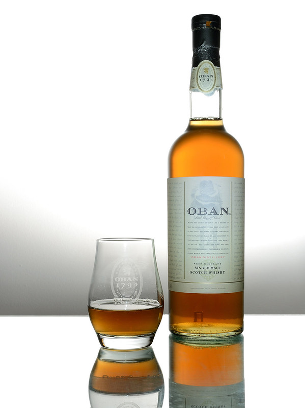
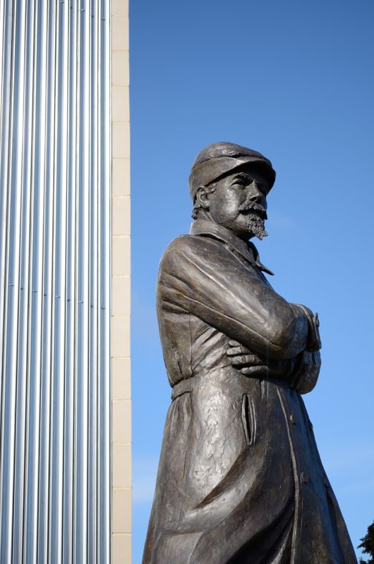
Statue of some-one! by Farmejim, on Flickr

Who is this guy Graham? Tried to Google image find him but to no avail, he looks like a South African Boer or something like that.
 
Hi Jim - are you deliberately trying to mess things up! ;)

Statue is of Samuel Cody, in memory of his first powered flight, and also his tragic last, both from near Farnborough airport.

http://www.bbc.co.uk/news/uk-england-hampshire-23591409

Edit is certainly good enough to take the win, shadows lifted nicely, removing the wall works well, and you've done well to make him stand out from the sky behind. I do like the blue toning too. Nice work :clap:

I stayed with colour, and just went for a lift of the shadows, bit of detail enhancement and a perspective correction and crop.

Samuel Cody Statue by overbez, on Flickr

In terms of the next image, I'm happy for you to go Jim, or if you're happy for anyone else to pop one up.......

Main thing must be, lets have the next one. :D
 
Last edited:
Hi Jim - are you deliberately trying to mess things up! ;)
In terms of the next image, I'm happy for you to go Jim, or if you're happy for anyone else to pop one up.......

Main thing must be, lets have the next one. :D

This was the attempt to throw the game................
View attachment 14419

I'll put up an image later on unless anyone else has got something to excite us :)
 
Oh dear! This looks like an epic fail on my choice of pic to edit :( Sorry guys n gals. Here's what I done, mainly trying to get the perspective OK but it's overdone with processing now I look on Flickr, tried to get some detail in the shadows but it's too much.
Boston The Haven, edited. by Farmejim, on Flickr

Looks like the competition is open
OK - tricky one to judge here!

To move the game on - I declare the winner to be.... anyone who wants to be! (Don't be shy, first in best dressed! :))

Even if you've not played before, all you need is a RAW file, an unedited preview small jpg, and return about 4 days later to judge.

(y)

What Graham said!! :)
 
Sorry guys- I'm struggling for time at the moment- pretty much flat out and missing world cup as well- not that I'm that into football- Scottish football is so dire it switches you off the sport lol. Anyway, might be another 2-3wks before I'm back to some kind of normal schedule but can't promise much else just now.
Have fun anyway:) tho look a bit slow- hol time/ footall or manic work I guess:(
 
Hello Jim,
They took me away you know, but I’m back now.
I may be a little late with my entry, but better late than never ay.

Open in ACR, auto, open in my new PS CC2014. :).
Copy layer, switch off background layer.
Correct the building perspective using the distort tool in transform.
Filled the gap left by the correction to the buildings with fill content aware.
Added adjustment layers for Hue/Saturation, curves, levels, and colour lookup (Fall colour look).
New layer fill with 50% grey, change the blend mode to soft light then with a low value brush, dodge and burn with black and white respectively.
New layer add a 40% grey grad to the sky, mask and hide over the buildings.
Flatten, add a border using stroke.
SAVE.
Save for web.


click image for BIG and Zooooom.

Re the new CC2014. Do I have to reload all my actions or am I missing something.


So how do we restart this font of knowledge and know-how?


Rhodese.
 
Sorry Jim, I've had a short sharp trip away to the USA which has left me behind in work and also knackered - seems like a double dose of jet lag :(
...So how do we restart this font of knowledge and know-how?
Don't know :(

Anyways, had a quick stab at this ...

Import into LR
Minor rotation to slightly straighten the warehouse walls
Warmed colour temp 7300 and tint +15
Added a grad from top to near bottom with colour temp -15, exposure -30 and saturation +50
Bumped global exposure +.35
contrast -15
highlights -50
Shadows +50
whites +9
Blacks -17
Clarity and vibrance + 10

Export sRGB qual 75%
not_mine-4543 by PabloRosso, on Flickr
 
DSCF4543.jpg


Lightroom 5 edit.

temp 5673, tint +9.

shadows +100, highlights -100
whites +16, blacks -41.
exp -0.61

clarity +6, vib +65, sat +4

Blue hues boosted a little.
Rotation and straighten.

Gradient filter top left at an angle to boost cloud definition. Similar filter bottom right to add contrast to water.
 
Come on Jim , lets see if we can get this going again.

Rhodese.
 
Well, well, so there's still intelligent life lurking around the forum!:) I thought we'd put this baby to bed and turned the lights of!!

OK, so instead of the usual 3 days or so we've had 3 weeks. Ha, ha, never mind let's get the ball rolling again.
  • Rhodese, I would have liked to see a bit more detail in the sky and I think there seems to be a reddish hue to the finished product but you have got to grips with the PS CC2014 well and the perspective and content-aware fill have worked well.
  • Paul, again, the sky does not have enough going on and the image seems a little over-exposed and lacking contrast, having said that, you have got more detail into the right-hand bank than I did or Rhodese.
  • Andrew, some might say it looks a bit over processed and has an HDR look but I like it. There's detail in the sky and plenty of contrast in the water. Good effort.
First prize goes to Andrew:banana:. Well done.

You know what to do Andrew, post a pic for us to experiment with and hopefully improve.
 
Cheers Jim, :) well done Andrew. :clap:.
As they say in this neck o the woods. Andrew "lets get guwin."

Rhodese.

come on, come on, come on, come on, come on, come on, come on, come on.:banana::).
 
Thanks. The hdr look is achieved by shadows +100, highlights -100 and then adjusting the blacks/whites. Was watching some youtube vids by Serge Ramelli (not sure on spelling).

I'll upload a pic this evening.
 
My first thoughts were, what the. Then I thought B&W, then I thought old gardening boots, an old picture left in the shed to be found after twenty years of fading and abuse.
So that's what I went for, a faded and forgotten about old picture.


Open in ACR, see screen grab.

5870-1405501580-7b85b535d8a4f65e24e04bb746c7d1f2.jpg


Open in PS.

Crop for the post to be upright, I did crop for the barrel and sink but it didn't look right.

Copy layer.

Image adjustments, posterize, set to 4, ok.

Image adjustments, gradient map, violet, green, orange, ok.

Drop the opacity to 45%.

Select all and using stroke add a 40 pixel off white border.

SAVE.

With the brush tool set at various sizes and opacities then picking up different colours, paint on the image.

New layer, fill with 50% grey and set the blend mode to overlay.

With the lasso selected make a hap hazard delta kind of selection tapering down from the top left.

Feather by 50 pixels and fill with white, lower the opacity to 60%.

Flatten.

SAVE.

Save for web.


CLICK IMAGE FOR BIG AND ZOOM.

Rhodese.
 
Last edited:
You've captured the look of an old forgotten and faded colour pic there Rhodese. It reminds me of my attempts with colour printing and why I gave it up! :)

I decided to go down the monochrome route but the finished article was disappointing so I went back and did some colour picking. Ok, ok, yeah I know everybody hates selective colouring but I don't and it's three colours in this one.

First opened ACR, here's the capture
View attachment 16169

Next made copy of background layer and, like magic, turned it black 'n white...
Selected the green in the colour layer and saved as new layer, then did the same for the blue tone in the boots and the brown of the leaves.
There were now 5 layers so flattened the image and cropped a bit off the top and RHS.
Some noise had crept in so removed some of that the resized and saved for Flickrrrrr.

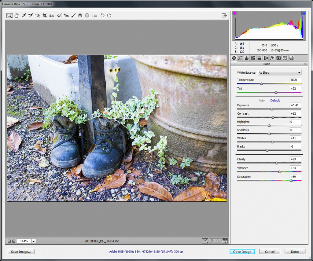
Old boots by Farmejim, on Flickr
 
It's looking like a two horse race.....Again. :(.

It's the sunshine, you know it addles the brain, best stay indoors and play on photoshop. :).

Rhodese.
 
It's looking like a two horse race.....Again. :(.
...
one coming up on the rails ;) ...

Import into LR, apply lens corrections
Crop quite tight
Using the eye dropper on the old sink, set the coour temp (7550 and +27 tint)
Bump exposure +.4
Drop blacks -30
Saturation + 15
Apply strong contrast curve.

not_mine-0036 by PabloRosso, on Flickr
 
The thread is alive!

I'm picking Rhodese as the winner as the aged photo look works well. Well done!

My effort is this - usual tweaking in lightroom with some post vignetting applied.
20130803-_MG_0036_2.jpg
 
Well thank you kindly, may you be blessed with a thousand keepers.

No! Hope you wasted valuable time searching :) :)

Well done Rhodese :banana:
:LOL:


So on we go, this one I hope will be a little more challenging, it's noisy, there's camera movement and should go in the bin.

The thing is I want to keep it on the premise that any image is better than no image. After all it is only a holiday snap, a memory.


"Off you jolly well then", good luck.


RAW.......https://www.dropbox.com/s/gtuf8nldkvfvkxm/DSCF1154.RAF

Rhodese.

Edit , I'll call it Teusday PM.
 
Last edited:
I've done something but not finished and no time today but I'll try later if I get home in time. Off to .................:beer:Cheers :)
 
Back
Top