THE PP GAME!

Graham,
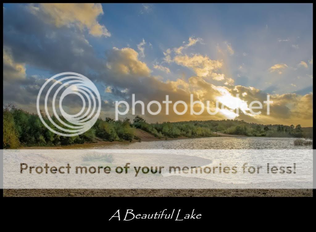
I have followed your advice on posting (y), but this time I have hosted the 1024pixel web image (The image on the contest page.) in the TP Gallery and the full size link on Imger. I think TP is the better it’s that bit lighter (I know its low rez). Remember what I said about the big cat’s nose.

What do think? Anybody.

Rhodese.

I like the Imger version Rhodese. Very nice edit BTW, the golden border complements the gold in the image.
 
Jim, I think Imger is darker, I have had to push the exposure to get any detail.
 
Yes it is a smidgen darker but the detail in the lake is much better.(y)
 
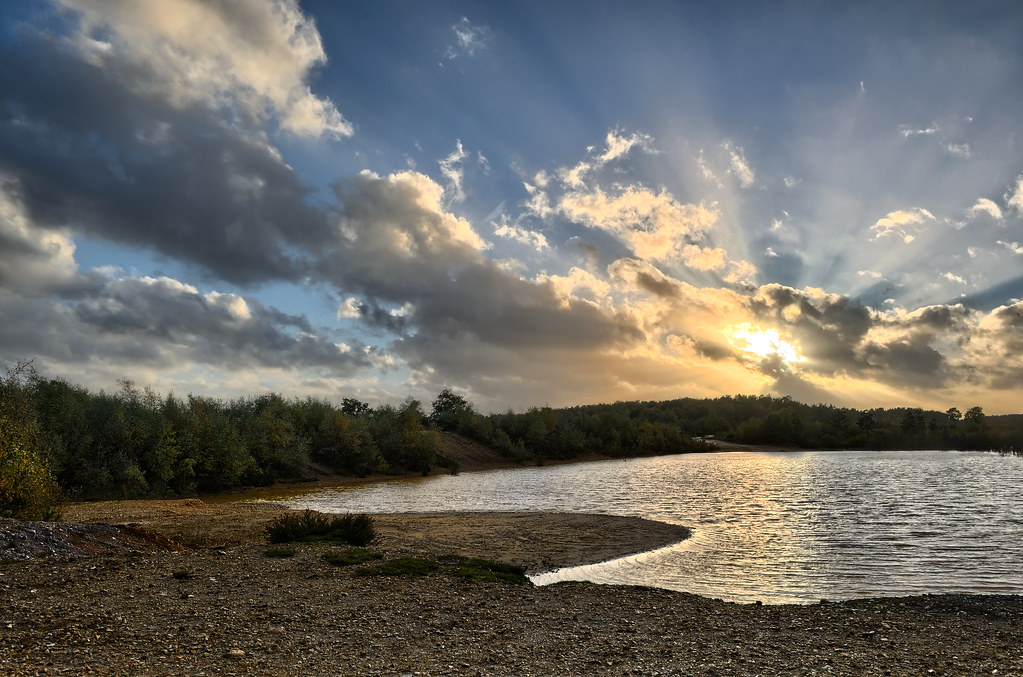
Click for full size


Rotate to straighten
highlight recovery
shadow recovery
+10 clarity
apply my custom Kodak Portra 160VC preset
Export to PS
Duplicated in layer and made B&W with heavy red filtration to darken blues.
blend with original layer by merely reducing opacity to 30%
increased saturation in adjustment layer to restore colour

removed annoying reeds at the right
removed annoying life buoy

Flatten
reduce to 8 bit
embed sRGB
Save as JPEG

Critique/comments welcomed.
 
Last edited:
Hello David, welcome back :welcome:.
Your knowledge and know how has been greatly missed. That’s one heck of an edit.

Rhodese.
 
Yeah.. been really busy... but thought I'd have a go a this one.
 
In LR5
Exposure +0.20, Highlights -64, Shadows +100, Clarity +10, Red +4, Yellow +31, Blue -4, Purple +27, Magenta -100, Enabled lens correction, Tiny vignette of -7, Sharpened 113, Radius 1.4, Detail 73, Masking 25, Noise Reduction Luminence 21, Colour 39.

Lots of brush work with 12 different points sorry but no note of what settings.

In Picasa border with caption.

30 minutes & FB + CC all good

 
Ok - it's that time again....

No-one opting out of feedback, so starting in posted order was Jim, B&W was always going to be a toughie here for me, good job covering the sun, you've "lost" the clouds top left a bit in your edit though.

Nattelie - a very warm welcome to you. A subtle edit - got a good blue to the sky, the sunbeams starting to come out. A bit more detail int the shadows would be good. Not sure how you insert your pic as an attachment, but I think inserting as an image works better.

Rhodese - nice edit, the yellowy gold of the sunset, spilling out into the beams, reflected nicely in the lake all works well. It was still daylight at this time so I was looking for more detail in the shadows really. (Oh, I can't see any difference between your TP gallery version and the imgur one - I even downlaoded them both, resized the imgur version, and toggled between them - couldn;t see any differences)

David. Welcome back. Blimey, how to give critique on an edit like that.. It has that familiar Pookeyhead look and feel to it. Great contrast in the sky, particulary in the top left clouds, pulled the sunbeams out nicely. A bit more of a boost to the saturation would work for me, but I remember I used to think that about most of your edits, so that could be down to my monitor.. The reeds annoyed me too. (y)

John, a brave man to follow Davids edit, but a gallant effort. shadows lifted really well, and I like the colour, but lacking the sunbeams and a bit of contrast in the clouds maybe.

Taking the crown for this round..... for me is David's edit, closely followed by John's. :clap:

Here's mine.


Was actually a 5 exposure merge (using 2 bracketed shots +/-2EV from this one), which interestingly didn't really make that much difference when I tried with and without them. Just gave me a bit less of a blown area round the sun.

Over to you David, no stones in the snow please this time. :cautious: :LOL:
 
Last edited:
A very well done David on your return :notworthy:

As yet again a difficult one to get the suns rays & sort out the blown highlights so good to all that entered as it was challenging (what a whinger I am) :LOL:
 
Cheers :)

I agree with the saturation levels... I suppose it's just my style... I seem to err towards muted colours.

OK... let me dig out a RAW.


Ok.... it's a D800 RAW.... sorry for the size. If anyone has trouble opening it... let me know and I'll post up a link to a DNG version.


Ooooooh.... I do like to be beside the seaside... Oh I do like to be beside the seeeeea... :)

4LuR5j2.jpg


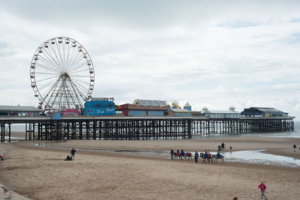
That's how it appears straight off camera.

Click here for the 14bit RAW.

have fun.

I'll call it Wednesday evening if there are enough to judge.... otherwise I'll give it another 24 hours.
 
Last edited:
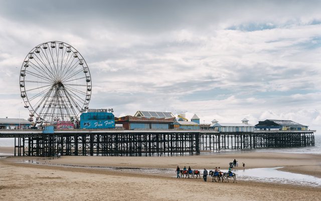
OK - I'll be the first to stick my head above the parapet,

(Click for big)


Opened in Lightzone...
Set WB to warm the look slightly
Used Zonemapper to increase (global) contrast
reduced the brightness to bring out the sky (with selection area)
increased local contrast (fair amount, small radius)
(this also sharpened the image so no further sharpening applied)
cloned out seagulls as they just looked like dots (left the one by the wheel for scale)
increased vibrance a fair bit, and dropped saturation a bit to compensate for.

Into PS
Noticed the WB had brought a bit of yellow to the highlights in the clouds, so added Colour adjustment layer with bit of blue added to highlights, which brought them whiter
Tried the B&W adjustment layer trick to bring the blues a bit stronger in the sky (y)
(With layer mask to not affect the blues on the pier)
Straightened to horizon (just visible on the left under the pier)
Tiny vertical perspective adjustment
This left the RH edge and Lower RH corner tight for cropping, so cloned in the missing triangle area.. grrrrr..
Cloned out the people lower left as they were blocking the donkeys line through the image.
Moved the other family lower right to gain separation from the lad on the last donkey.
crop off the bottom.

30 minutes altogether (10 for first bit - 20 for next)
Feedback now (recently) changed to an opt-out system...... I'm happy to hear your thoughts. (y)
 
Last edited:
As I haven't done any digital shooting for ages, I also haven't done much in the way of processing either, and I've forgotten a lot, and, how to make my images 'big'....
So, it's a normal size flickr one that you can click on...
I've cropped, and cloned out some people and those pesky birds!.
After that, I sharpened a little....didn't really need it, but it's a habit that I always add a bit.
The rest was a preset that I had made up some time ago(is that cheating :LOL:)
Took as long as it takes to eat a bowl of Weetabix and drink a coffee.
feedback's fine.

10924030803_d7222a1830_b.jpg
 
Well done David, I thought there was no doubt, which way the cookie would crumble as soon as I saw your edit. :clap:
There’s me as usual, with “warmanosity”? being all, then along comes this wapscalion (As Pontius Pilate would say in “The life of Brian.”) with a bucket of cold water and steals the day.
Welcome back David, welcome back.

Well not to be knocked back from my love of “Warmanosity”, it’s a feel of 1960s cheap; send it in a bag film, that I have gone for.

Open in ACR, see screen grab.


The edit.


CLICK FOR FULL SIZE, CLICK AGAIN FOR ZOOM.

Open in PS, copy layer.
Square the horizon with a crop.
SAVE.
Remove people and the foreground left, tidy up litter, using content aware, spot healing and clone tools.
I kept the gulls.
SAVE.
Make a rough selection the sky, feather by 100 pixels, adjust levels, remove the upper darkness from the selection, feather and apply another small adjustment in levels.
Dodge and burn the sands and the water.
Dodge the middle tones on the donkey group.
SAVE.
Apply a colour lookup layer, Filmstock-50 at 100% opacity.
Flatten, and add a 15 pixel border.
SAVE.
Save for web.

Rhodese.
 
Last edited:

Photo (1 of 1).jpg
by Furtim!, on Flickr

Cloned out seagulls, trash and errant people in Elements 12.

Then in LR5:
  • Graduated filter on sky to boost shadows.
  • Graduated filter on beach to boot exposure
  • Subtle green / magenta split toning to give a little warmth
  • Profile correction / correct verticals / straighten image
  • Drop overall exposure by 1/4
  • Drop highlights (-50), Shadows (-10), Blacks (-35), boost whites (+30).
  • Medium Contrast
  • Very small vignet
  • Radial filter to boost exposure, saturation and clarity on the horse riders.
Comment not required but welcome if you have the time.
 
Thanks Graham. I'm enjoying this PP game! :) The attachment is the new forum thing (and laziness on my part tbh!)

I should remember to write these down as I go, but nevermind...

tweaked the curves down, shadows and highlights 35 & 35, cloned out people etc (bodged a bit of it though :( ) and cropped, unsharp mask and about 6% warming filter (81)
Not sure if it works though.

 
Well done David, I thought there was no doubt, which way the cookie would crumble as soon as I saw your edit. :clap:
There’s me as usual, with “warmanosity”? being all, then along comes this wapscalion (As Pontius Pilate would say in “The life of Brian.”) with a bucket of cold water and steals the day.
Welcome back David, welcome back.


LOL... thanks for the kind words.... and reminding me of Life of Brian :)

Although the rules are I post up my edit as well at the end... I've actually never really edited this shot. It was something I took when I was testing the D800 and D800E that were loaned to me prior to me buying. It was just a test. If I have time.... I'll edit it myself.
 
Quick Edit..

Opened in LR to adjust the tones a little..

Opened in CS5 to increase Yellow and Blue, added a Slogan for any beach lover and tried to fade/vintage out and give the whole image an 80's/90's "postcard" feel..

Also removed all birds I could see and a few people..

_DSC0026_zpsf2bf04a1.jpg
 
Last edited:
Hey I'm new!

Heres mine..

10942797244_a76d31dc08_b.jpg


Opened in ACR

Add contrast
Add vibrance
Colour correct
Add a little clarity
Reduce exposure
Straighten and Crop

Open in PS

Clone out various to clean up the image
Reduce saturation
Adjust some shadows with adjust layer
Sharpen


Edit: Got there eventually with the image code, Thanks Lee
 
Last edited:
Hey I'm new!

Heres mine..

<a href="http://www.flickr.com/photos/106548343@N02/10942797244/" title="DSC0026-2 by DP|_|Photography, on Flickr"><img src="http://farm3.staticflickr.com/2893/10942797244_a76d31dc08.jpg" width="500" height="304" alt="DSC0026-2"></a>

Opened in ACR

Add contrast
Add vibrance
Colour correct
Add a little clarity
Reduce exposure
Straighten and Crop

Open in PS

Clone out various to clean up the image
Reduce saturation
Adjust some shadows with adjust layer
Sharpen

You need to just grab the BB code and paste it in your text....
I'll add the image for you...I clicked on 'all sizes' and then copied and pasted the image straight in....
nice edit, and welcome...
Ps, I you figure it out, I'll remove the image from my reply.....
 
Last edited:
Hey I'm new!

Heres mine..

10942797244_a76d31dc08_b.jpg


Opened in ACR

Add contrast
Add vibrance
Colour correct
Add a little clarity
Reduce exposure
Straighten and Crop

Open in PS

Clone out various to clean up the image
Reduce saturation
Adjust some shadows with adjust layer
Sharpen


Edit: Got there eventually with the image code, Thanks Lee
Welcome! Beautiful edit too. :) Looking forward to seeing more. :)


Been a while since I had a go at this, added some micro contrast on the pier, curve on the sky (both masked) added light behind the big wheel, crop and slight clean up..thats about it..maybe 10 min tops
 
Last edited:
I'll call this tonight. Will be around 8pm ish.
 
Here's my effort.................

Opened RAW . Contrast +20 Shadows +19 Blacks +8 Clarity +28

In Photoshop.
Cloned out all people except the donkey riders.
Selected Big Wheel and gave it some spin with radial blur.
Added a sunbeam for the donkey riders
Decided to add a camel train for a faux leading line.
Made it much much, smaller so that I could upload sometime before next Tuesday! (Rural broadband speeds! Ha!)


PP_test
by Farmejim, on Flickr
 
Jim your posts always make me smile but was hoping for a few topless sunbathers - female of course ;)
 
Jim your posts always make me smile but was hoping for a few topless sunbathers - female of course ;)
Sorry to disappoint John. The topless sunbathers are only visible after the water-shed...9pm.
 
Only just got in..... I'll give my decision a little later when I've had chance to have a good look at them all.
 
OK.. here goes.

Lots of good versions here, so I'll give some feedback on all first: You know me... I just call it as I see it, so it's pretty blunt feedback.

In reverse order of posting for who didn't opt out of feedback

Farmerjim -
Amusing edit :) The camels are nicely done but the radial blur on the wheel has left some of the gondolas half sharp/half blurred. It's certainly a fun edit... made me smile. It's a little dark too.

TheDrift-
I like the crop, and I actually like the cold tones.. but the light behind the wheel isn't working for me.. it just draws my attention to the fact that I'm not seeing something natural, and makes too much of a feature of the processing itself... and there's a little too much processing on the clouds IMO. Slightly overdone.

Deno_56 -
Nice edit. Slightly overdone with the sky, and overall it looks dark. The clean up is very nicely done though, and the tones are very pleasing.

Bennyboo -
Nice idea.. Blackpool postcard :) It looks older than 80s, 90s though... that font is definitely older looking, and the processing gives a feel of hand tinted black and white. I like it. Not my cup of tea precisely, but it;s very well done.

MagicMynx -
Nice tonal balance, and colours.. nice retouch. I like everything about this, but for one thing. There is far too much sharpening. It's added light halo around dark objects, and gives it a heavily processed feel that is the first thing I noticed when viewing it.

Furtim -
A little blocked up in the shadows perhaps, but a nice edit.. good retention of quality, and is nice and precise. I don't think the split toning works though. It doesn't warm it for me... it just makes it look cyan in tone.

Rhodese -
Nice warm edit for a nostalgic feel :) Contrast is a little harsh, with some shadow detail being blocked up a bit, but it's an attractive feel and vibe to it. Perhaps a bit heavy handed with the tones, but it works well enough. Content aware used appropriately, and a 100% view shows you've done nothing to destroy quality. Retains the crispness of a D800/prime lens combo.

Solo man -
Removing the birds was a good call. They are an irritation due to their small size. The clean up is well done. Sharpening is not really apparent at this resolution, so I can't judge whether than was effective. It has a heavy magenta/blue cast to it though, which has made the blue items in the shot appear violet, and taken the warmth from the sand, and also made the sky a weird magenta/blue. I look for a well thought out process as well as the image though. Not sure running a preset qualifies :)

overbez -
Nice edit. Nice balance between warmth and accuracy. A well thought out process to the workflow. Nice and sharp.. nothing destructive going on. Being fussy I'd say the sky is a bit heavy. Overall though, I'd say this is a well thought out edit, that shows a preconceived idea, and knowing pretty much what to do in order to get it. Again.. a little dark.


Tough call this. I'm giving it to Graham (overbez) though. It has a precision about it when you look at the logic of what he did. Nice work.

Right... sorry the crit was brief... but I'm shattered. I've been writing feedback all day actually... LOL

I did manage to do an edit myself last night... like I said, this is something I'd never edited as it was just a test image. Here's how I interpreted it.

Click for big etc,... Imgur has really over-compressed it though :(


Night Night..... Zzzzzzz.... :)

Over to you Graham
 
Last edited:
Graham - looks like you're buying the biscuits (and cappuccino to go with them) all round this time to celebrate your zillionth win.

Seriously though well done :banana:
 
Morning all.... Thankyou David - it does seem that my practice in this thread has learned me something..... It's nice to see plenty of new faces in recently too, it seriously is a good place to improve your editing, you never know what type of image is going to come up, or from what camera it's from. That's the appeal, and the challenge for me. (y)

I hope everyone takes David's feedback positively, it may be blunt, but it's honest and and everyone's has plus points to balance his (personal) negatives.

Moving on......

I had umpteen tries at editing this to get what I wanted, and never really got there. I might have a re-edit myself, as well as posting my original one.


And the RAW... http://speedy.sh/mszbN/DSC-2354.NEF

Will call it sometime after Sunday afternoon... Should be a simple one for you all. (y)
 
Morning all.... Thankyou David - it does seem that my practice in this thread has learned me something..... It's nice to see plenty of new faces in recently too, it seriously is a good place to improve your editing, you never know what type of image is going to come up, or from what camera it's from. That's the appeal, and the challenge for me. (y)

I wholeheartedly agree with this (y)

I hope everyone takes David's feedback positively, it may be blunt, but it's honest and and everyone's has plus points to balance his (personal) negatives.

David's a pussycat (aren't you:p ) as I would say the CC is absolutely fine as it isn't 'pixel peeping' (y)
 
Thanks for the feedback David, good call!(y)

Well done Graham:clap: looking forward to this....not:runaway:
 
Thanks for the feedback David, good call!(y)

Well done Graham:clap: looking forward to this....not:runaway:

Clone all pylons & wires out, then a farmer (excuse the suggestion as I know you are a farmer) , or two, with tractor & a few cows perhaps - which is your style ;)
 
Ok, this image was NOT easy to edit.....and won't be to everyone's taste... an eye candy image for sure :LOL:

So, for me there was always going to be a bit of artistic license involved in my edit, as although I've seen such expressive skies whilst growing up in Africa, I've never seen it with pylons in....
And I had real problems with the sky...and I'm not entirely happy with it, but here it is anyway....
Again I've used Flickr, but it can be clicked for bigger(I think)
Done in LR4...and took a long time and a lot of failed edits
I cropped and sharpened.... and then increased the temp and tint.
I decreased the exposure, highlights and whites, and increased the shadows, blacks and contrast
I decreased the vibrance and saturation
In the HSL sliders I adjusted the red, orange and yellow luminance.
I adjusted the tone curve graph a lot!, and also increased the highlights and shadows and decreased the lights
Using the adjustment brush I increased contrast(more than once) and shadows, and dodged and burned a little here and there

Edit to add....feedback is fine.

10978174043_db0b0bf3c2_h.jpg
 
Last edited:
Clone all pylons & wires out, then a farmer (excuse the suggestion as I know you are a farmer) , or two, with tractor & a few cows perhaps - which is your style ;)
Mmmm, interesting ideas John. Looks like tooo much work to get rid of the power problem:)
 
Back
Top