
- Messages
- 1,756
- Name
- Jim
- Edit My Images
- Yes
Thanks PhilOP updated with some bold changchangemake it more clear.

")

Thanks PhilOP updated with some bold changchangemake it more clear.
"Exciting" was probably the wrong word to use. I meant it's got composition problems! Glad you enjoyed it, I had a quick bash myself before I went out and think it's quite tough.Jim, I don’t know about “not very exciting” I think it has loads of potential.
Rhodese.
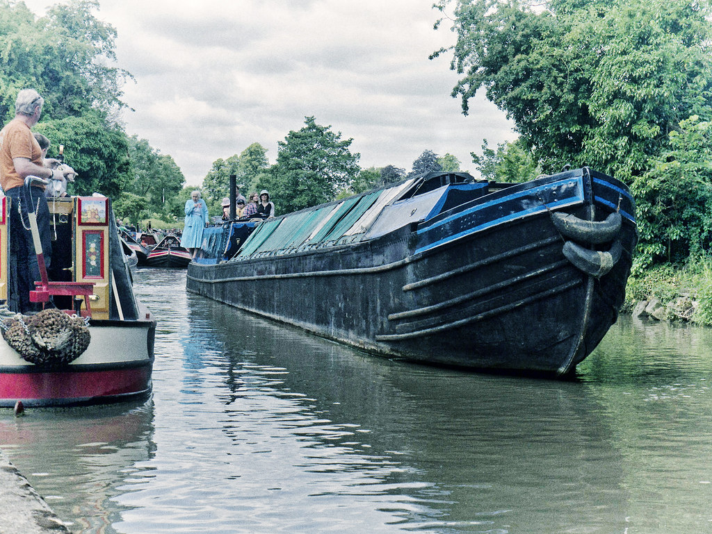
Here goes my first entry then! Hopefully this will work, I've set the image to private on Flickr seeing as obviously it isn't mine but I think you'll still be able to see it on here. If not, I'll upload it somewhere else
I think it would be better set this image as public on Flickr as I know I, and I'm sure others, like to view the entries as large as possible. The images here aren't large enough for assessment IMO. Copyright infringement isn't a problem in this case.
Thanks Josh, I'm seeing it large nowI've just set it to public but left it so that it doesn't appear in public searches


 Hee-hee!

Never use the gallery here myself..... but I just tried one and it worked fine.
Resized to 1024 in Picasa, and then used CS2 to reduce size to under 200kb, had to go down to quality level 7 though.
http://www.talkphotography.co.uk/gallery/photos/619/
Well done Neil..
And well done Jim for surviving your first round of judging... honestly, it's far harder than just simply whacking in an edit.


And Jim it is difficult to give a critique in case someone argues that you're wrong


John I know what you’re saying, “It is difficult“, “I mean how anybody can criticise my work? When I know it’s perfect, immaculate and without fault, really the cheek of some people.”
Rhodese.
And Jim it is difficult to give a critique in case someone argues that you're wrong
Oh...what...oh yes sorry, my girl-friend's always right.Well done Neil and thanks for the crit, Jim!
Hope you join in the next one Josh.
For sure Graham! Gonna make sure I don't come 1st again


Need to miss out next few edits guys and gals!
Moving house and up to my eyes in it.
Will pop in when I can
Cathy
Hope your move goes smoooothly

Grrr.. another seemingly simple one.... why have I spent the last 20 minutes on it then eh???
.
pictures are always a pain and this one is no different. Do you go for a studio type look or a wild thing, “wild thing” I don’t think that would work here with a cuggaly little thing as this.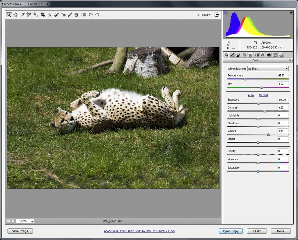
 ) and also I tend to delete the originals from my computer, and teh RAW's, so if I decide to make a little change after posting, , I can get back a higher res file to work on).