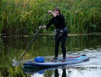
What's more important, the face or the paddle ?

Messages
2,528
Name
Keith
Edit My Images
Yes
Interested to know what people think of these three options, all unedited, just the position of the paddler and paddle/oar for critique.
Which do you think makes the better photo?

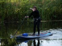
Paddleboard 1
This is my favourite, the arm is partly masking the face, but I like the interaction of the paddle and the water, so it has my vote.
Paddle 1.jpg

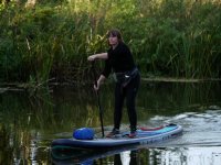
Paddleboard 2
Better shot of the persons face and end of paddle submerged.
Paddle 2.jpg

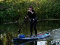
Paddleboard 3
Clean shot of the face and paddle out the water
Paddle 3.jpg
 
I think I like No.1 best too.

I can't really tell if the face is sharp but even if not it could still be the choice :D
 
I think I like No.1 best too.

I can't really tell if the face is sharp but even if not it could still be the choice :D
Sharper in the originals Alan. It's getting harder now, walking at 4:30pm in a very shady area and low sun (probably my last walking week at this time of day with a camera)
Aperture priority not such a problem but fast shutter action starting to prove a challenge, mind you, it came up nice when I lifted the shadows and fiddled a bit.
Paddleboard 4.jpg
My pick is the second image as her whole face is on show, all are good but the 2nd is the one for me.
Yeah I guessed that one would be a preference and I can see why Dave, the more complete picture.
 
It’s an interesting point and quite similar to movement in animals (think of the way an animal walks. Some poses just look better than others. It’s hard to explain in writing without examples).

I’d personally same having a clear face in this situation and positive action/movement is key. No 2 I’d probably the closest to that. A shot between 1 and 2 would be interesting to see if you had one, though any interaction of the paddle crossing behind the blue bag on the deck may not look right.
 
Sometimes you have to face up to the fact that you missed a good shot. I know how hard that is with the 'nearly' shots that had they been ataken a fraction of a second sooner or later would have been brilliant. But you have to be brutal with your pictures. Even when it means killing your 'baby'!

The line between good and failed is a fine one. No matter how much you want number 1 to be a good shot, it ain't. Number 2 is OK, so out of the three is the one to pick. Learn from your mistake (we all make them) and move on.

As a general guideline if you are making a picture of a person then there has to be a compelling reason to cover part of their face. After that look for expression and gesture. Finally the overall composition.
 
I think Ed nailed it in the post above, Keith. There's a great shot somewhere in between the three.

I'm interested in your observation about this possibly being your last 4:30 pm walk - the light is just starting to get interesting then, the low sun will start to create some lovely opportunities. I love this time of year because I can go out early in the morning or late afternoon at reasonably civilised hours and it's dawn / dusk and there's an hour or so where everything is either gorgeous or (increasingly) misty.

Take your picture from a few days ago of the bandstand in Bedford park, or wherever it was - there's a great opportunity to go back there in really good low-sun light and get a cracking shot.

Cheers
Derek
 
It’s an interesting point and quite similar to movement in animals (think of the way an animal walks. Some poses just look better than others. It’s hard to explain in writing without examples).

I’d personally same having a clear face in this situation and positive action/movement is key. No 2 I’d probably the closest to that. A shot between 1 and 2 would be interesting to see if you had one, though any interaction of the paddle crossing behind the blue bag on the deck may not look right.
That's exactly what happened Rob, the in-between shot looked like the paddle was stuck in the blue bag :)
 
Sometimes you have to face up to the fact that you missed a good shot. I know how hard that is with the 'nearly' shots that had they been ataken a fraction of a second sooner or later would have been brilliant. But you have to be brutal with your pictures. Even when it means killing your 'baby'!

The line between good and failed is a fine one. No matter how much you want number 1 to be a good shot, it ain't. Number 2 is OK, so out of the three is the one to pick. Learn from your mistake (we all make them) and move on.

As a general guideline if you are making a picture of a person then there has to be a compelling reason to cover part of their face. After that look for expression and gesture. Finally the overall composition.
I agree, as much as I want number 1 to be "the one" it isn't. Some good advice there, I guess I'm resigned to No2 for the sensible reasons.
 
I think Ed nailed it in the post above, Keith. There's a great shot somewhere in between the three.

I'm interested in your observation about this possibly being your last 4:30 pm walk - the light is just starting to get interesting then, the low sun will start to create some lovely opportunities. I love this time of year because I can go out early in the morning or late afternoon at reasonably civilised hours and it's dawn / dusk and there's an hour or so where everything is either gorgeous or (increasingly) misty.

Take your picture from a few days ago of the bandstand in Bedford park, or wherever it was - there's a great opportunity to go back there in really good low-sun light and get a cracking shot.

Cheers
Derek
I've been trying to use the late afternoon light, and to be honest that local walk is probably not the right place to get the best from it.
Good observation on the bandstand, I probably need to think more about subjects and areas to be at the right time, where the low light is going to work on a photo.
 
I agree, as much as I want number 1 to be "the one" it isn't. Some good advice there, I guess I'm resigned to No2 for the sensible reasons.

I still prefer number one. Her face isn't totally obscured but so what? I still find it by far the most interesting picture. I'd put number two in second place and number three last as I find it the least interesting.
 
I still prefer number one. Her face isn't totally obscured but so what? I still find it by far the most interesting picture. I'd put number two in second place and number three last as I find it the least interesting.
The thing is, though, if her face wasn't obscured it would be a better shot than number 2. The pose, gesture and action of the paddle are great, but had the left arm been an inch lower the whole picture would have been MUCH better.

Maybe I set my bar too high. But I'm always trying to make the best pictures I can, and the difference between that and 'almost' can be very small. Sometimes 'almost' is good enough. I guess that is a personal decision.

I don't think it's a question of setting a bar too high, it's more a question of opinion.

To me the first and second have some movement in them. The first through the ore and water and the position of the arm indicating effort and the second through the position of the body and poise and I can imagine the effort involved. The third I find rather static, lacking the movement and effort of the first and the effort of the second.

The fact that the face is partially obscured in the first doesn't bother me, it's still the one I prefer although the more I look at number two the more I like it and it's becoming a close second.
 
The thing is, though, if her face wasn't obscured it would be a better shot than number 2. The pose, gesture and action of the paddle are great, but had the left arm been an inch lower the whole picture would have been MUCH better.

Maybe I set my bar too high. But I'm always trying to make the best pictures I can, and the difference between that and 'almost' can be very small. Sometimes 'almost' is good enough. I guess that is a personal decision.
I set the bar very low this afternoon, forgot to put a memory card in the camera.
 
I don't think it's a question of setting a bar too high, it's more a question of opinion.

To me the first and second have some movement in them. The first through the ore and water and the position of the arm indicating effort and the second through the position of the body and poise and I can imagine the effort involved. The third I find rather static, lacking the movement and effort of the first and the effort of the second.

The fact that the face is partially obscured in the first doesn't bother me, it's still the one I prefer although the more I look at number two the more I like it and it's becoming a close second.
I find that often my initial favourite is no longer the one I like best when I go back and look at images later.
Hence when I have several shots of an image I often keep them all.
 
I find that often my initial favourite is no longer the one I like best when I go back and look at images later.
Hence when I have several shots of an image I often keep them all.
Sometimes the longer you leave them the easier it becomes to choose the best ones!

I set the bar very low this afternoon, forgot to put a memory card in the camera.
That's pretty low!

I'm not sure it's my bar that's too high, more that I'm obsessed with 'micro composition'. The way details in pictures interact with each other. Things like not having horizons going through heads, and foreground objects not lining up with background objects (unless that's desired).

There was a perfectly well composed landscape posted on TP the other day with a finger post in it. All I could see was the way the top of the finger lined up with the hill top in the distance behind it. Just dropping the camera an inch would have broken that horizon line and improved the picture to my mind.

I started a bit of a discussion about ths in one of my project threads.

 
Sometimes the longer you leave them the easier it becomes to choose the best ones!


That's pretty low!

I'm not sure it's my bar that's too high, more that I'm obsessed with 'micro composition'. The way details in pictures interact with each other. Things like not having horizons going through heads, and foreground objects not lining up with background objects (unless that's desired).

There was a perfectly well composed landscape posted on TP the other day with a finger post in it. All I could see was the way the top of the finger lined up with the hill top in the distance behind it. Just dropping the camera an inch would have broken that horizon line and improved the picture to my mind.

I started a bit of a discussion about ths in one of my project threads.

It's interesting how different aspects of photography matter in different ways to people, there's no wrongs or rights to my mind.
Sometimes I'm really pleased with the way I've composed a picture, other times I'm just glad I took a picture.
I'm still learning, and also starting to learn more about what matters most to me.
 
Sometimes the longer you leave them the easier it becomes to choose the best ones!


That's pretty low!

I'm not sure it's my bar that's too high, more that I'm obsessed with 'micro composition'. The way details in pictures interact with each other. Things like not having horizons going through heads, and foreground objects not lining up with background objects (unless that's desired).

There was a perfectly well composed landscape posted on TP the other day with a finger post in it. All I could see was the way the top of the finger lined up with the hill top in the distance behind it. Just dropping the camera an inch would have broken that horizon line and improved the picture to my mind.

I started a bit of a discussion about ths in one of my project threads.


I didn't have time to read the whole thread but Sam Abell immediately came to mine and I see he got a mention in one of the later posts, so I assume he's been discussed. I love his Life of a Photograph video and apply many of the ideas myself, or rather I've started to try and apply them.
 
I didn't have time to read the whole thread but Sam Abell immediately came to mine and I see he got a mention in one of the later posts, so I assume he's been discussed. I love his Life of a Photograph video and apply many of the ideas myself, or rather I've started to try and apply them.
It was pretty much a discussion around Sam Abell. That is a good video, which I've watched more than once. ;)
 
Sometimes the longer you leave them the easier it becomes to choose the best ones!


That's pretty low!

I'm not sure it's my bar that's too high, more that I'm obsessed with 'micro composition'. The way details in pictures interact with each other. Things like not having horizons going through heads, and foreground objects not lining up with background objects (unless that's desired).

There was a perfectly well composed landscape posted on TP the other day with a finger post in it. All I could see was the way the top of the finger lined up with the hill top in the distance behind it. Just dropping the camera an inch would have broken that horizon line and improved the picture to my mind.

I started a bit of a discussion about ths in one of my project threads.

I watched the Sam Abell video, very interesting.
 
I find that often my initial favourite is no longer the one I like best when I go back and look at images later.
Hence when I have several shots of an image I often keep them all.
When I'm looking at the days pictures on my pc I sometimes see a picture and wonder why I took it but I try not to delete these as I must have seen something there because I bothered to take the picture. So, I revisit these pictures over time and only then decide if they're keepers or should be deleted. Often pictures which I very nearly deleted become ones I really like.
 
Many of mine are taken purely as practice shots. I figure if I take enough shots of swooping seagulls and slowly (although it's not happening yet) I get a higher hit rate, then that one day when I'm out walking and I see a red kite with a mouse in it's jaws then I'll be in with a shot (excuse the pun) and all that practice will be worthwhile. Not that I aspire to bird photography, and yet for some reason that's what I'm taking at the moment. But the principle applies to any genre, practice...
I'd say that when I return home from a walk or a ride I will delete 95% of what I've taken, and of the remaining 5%, probably only two or three images will get as far as any post processing effort, however minimal.
 
Anticipation and timing are the key.
And a bit of luck.
I ran ahead down the bank and found the best spot and checked the composition, and got prepared.
I must have shot a burst of around 15 images as she approached, but as luck would have it, none had the paddle in the best place with the face in view.
 
Many of mine are taken purely as practice shots. I figure if I take enough shots of swooping seagulls and slowly (although it's not happening yet) I get a higher hit rate, then that one day when I'm out walking and I see a red kite with a mouse in it's jaws then I'll be in with a shot (excuse the pun) and all that practice will be worthwhile. Not that I aspire to bird photography, and yet for some reason that's what I'm taking at the moment. But the principle applies to any genre, practice...
I'd say that when I return home from a walk or a ride I will delete 95% of what I've taken, and of the remaining 5%, probably only two or three images will get as far as any post processing effort, however minimal.
That's an interesting comment. When I started photography, I was disappointed by the number of images I deleted.
These days I put less pressure on myself and I accept it.
 
That's an interesting comment. When I started photography, I was disappointed by the number of images I deleted.
These days I put less pressure on myself and I accept it.
It's interesting to look at the contact sheets of the 'greats' of photography. They all took a lot more crap photos than brilliant ones. ;)
 
I like the first picture best. It really depends on the story you are telling – the paddle iinteracting with the water tells a more interesting story than the paddle doing little and the face clear. For me, the face is not an important part of the story.
 
I like the first picture best. It really depends on the story you are telling – the paddle iinteracting with the water tells a more interesting story than the paddle doing little and the face clear. For me, the face is not an important part of the story.
Thanks for the feedback John
 
And a bit of luck.
I ran ahead down the bank and found the best spot and checked the composition, and got prepared.
I must have shot a burst of around 15 images as she approached, but as luck would have it, none had the paddle in the best place with the face in view.
Luck is something that you have no control over, such as your visit to the river coinciding with the paddle-boarder coming down the river.
The act of paddling is a repetitive action, therefore it is relatively easy to anticipate and time the shot to give you the best possible position of the paddle.
Yes, unfortunately the best shot of the paddle was when the arm was raised too high.
Shame there weren't more places to get shots on that stretch, I had one burst and she was gone. Ah well you can't win em all.
 
Back
Top