weekly XenosElaine's 52s Thread - Support added

Fireworks is the absolute pick of the lot there Elaine....

Super colour, sparks, movement, a real flowery feel to it, set off well by the black sky behind.

Rather like the pigeon too... super detaill retained in the white feathers, and a lovely catchlight in the eye.
Thanks Graham :)
 
Thanks Judi. I'm glad somebody apart from me likes the pot throwing, because it's almost exactly the shot I had in mind when I first saw the Action theme before I went away and I was just dead chuffed to have managed to get it without being flattened by falling urns :)
 
Like the pigeon as Mono, though looks a little flat on my monitor, perhaps push the contrast on pp
 
Like the pigeon as Mono, though looks a little flat on my monitor, perhaps push the contrast on pp
No, pushing up the contrast just makes it whiter and flatter. I'd need to darken the neutral range in selective colour adjustment - but that would also make the head too dark. So I'd first have to lasso just the body - but my mouse skills aren't good enough to draw around it dead accurately without leaving a wobbly outline :(
 
Hi Elaine....I like the pot throwing one too :) but my absolute favourite is the fireworks...they look amazing, I love fireworks. Some unique interpretations for mono but I think my favourite there is the pigeon, a nice clear shot.
Thanks Susie. The fireworks were amazing - a far better and longer display than we expected!
 
I'm really liking the fountain with the building behind it.

It has an almost HDR feel to it, in a nice way, just done nicely. (y)
Thanks Mark. I wouldn't know HDR from HRT :oops: :$ Just a bit of colour adjustment and a lot of heavy cropping to eliminate the parked cars at ground level behind the fountain :rolleyes:
 
Good images Elaine (y) I quite like the pot throwing one too ..........can you imagine what H&S would have to say in this country :D

As mentioned, fireworks and pigeon stand out (y) :)
 
Action - I like the firework shot.

Mono - the monolithic fountain for me I like the composition.

Thanks Mandy. As I said, there was an awful lot of very heavy cropping involved in getting the composition of the fountain one looking half decent :oops: :$

Good images Elaine (y) I quite like the pot throwing one too ..........can you imagine what H&S would have to say in this country :D

As mentioned, fireworks and pigeon stand out (y) :)

Ha ha Phil! If it was in this country the whole of the town would be roped off and everyone issued with hard hats and goggles :p There was already quite a crowd gathered there when we arrived, so we were quite a distance from the front, but we watched it on telly later and were surprised just how close people were to the falling pottery. It certainly gave the municipal cleaning staff plenty of overtime afterwards though with the massive clear-up operation :)
 
HI Elaine

proper set of holiday shots....not your usual holidays shots either .

Pigeon I like in Mono which is odd as they have some lovely colors in their plumage


Pot throwing is very strange.....interesting but strange.......could just do with a bit of lightning in places to make it pop a bit more

Fireworks.......wonderfull (y)
 
Thanks Lynne. I have to admit that I did have the 52 challenge very much in mind when taking these particular shots! The other 700 photos that I took are much more like conventional holiday snaps :D
 
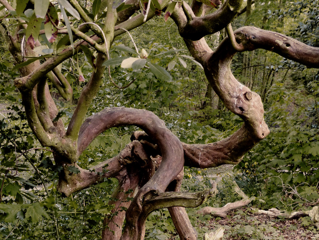
Week 17 Twisted. Well, because I'm still working my way through the rest of my holiday photos, I decided to make this week's effort a fairly quick and easy one, so I went for a walk around the park for inspiration. After a couple of hours wandering and sorting through the results, I ended up with these two.

# 1 Twisted Branches

14025603185_b2398157d4_b.jpg


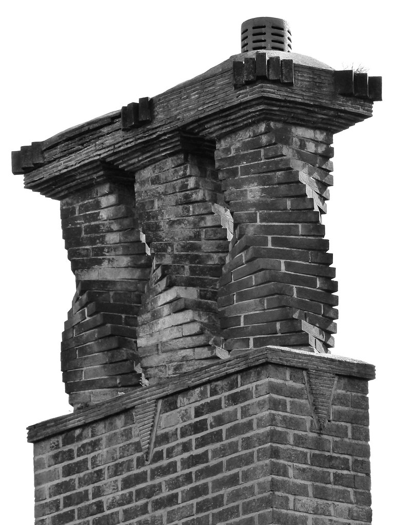
I've always liked the quirkiness of the chimney on a house around the corner from me, so....
#2 Twisted Bricks

14002486426_93958f7fc5_b.jpg
 
Last edited:
Hi Elaine

Chimney pots for me , very unusual so a good spot & the mono works but wonder what it'd look like in color especially if you could get a shot with some decent sky :clap:

it may be the upwards angle but it does seem to need a slight cw rotation...just a smidge mind you :rolleyes:
 
Hi Elaine. Love the bricks, good spot. Although the tree fits the bill, it's just a bit messy for me.

Cheers.
Thanks David. I'm quite partial to a bit of mess and disorder in nature-based shots, but I know what you mean :)
 
Hi Elaine

Chimney pots for me , very unusual so a good spot & the mono works but wonder what it'd look like in color especially if you could get a shot with some decent sky :clap:

it may be the upwards angle but it does seem to need a slight cw rotation...just a smidge mind you :rolleyes:

The chimney bricks are lovely warm colours and would look great against a deep blue sky with the sun in the right direction, but there's a very narrow field of view between the trees to get a clear shot of them and I think I'd get arrested if I camped outside the house long enough to get the perfect shot :eek: I thought the alignment was pretty spot on till you pointed it out and you're correct, it does lean slightly to the left. Well spotted!
 
Oooof, I rarely spot when photographs aren't level.

Two interesting submission and I like them both. I'd agree a nice cloudy sky would take it up a level or so. The first one would look better with a bit more separation, but I do like the detail.

Cheers.
 
Oooof, I rarely spot when photographs aren't level.

Two interesting submission and I like them both. I'd agree a nice cloudy sky would take it up a level or so. The first one would look better with a bit more separation, but I do like the detail.

Cheers.
I agree with Andy Elaine. The chimney is the pick for me and you've already heard about a better sky. I like the one you've got, it may work well with a little more contrast in the mono one?
 
Nice idea with the chimney and I also feel a wider view (slightly), with a 'better' sky would set the three chimneys off nicely.

although the white background version does have a certain simple appeal to it too.

Twisted trees work well in colour
 
Oooof, I rarely spot when photographs aren't level.

Glad I'm not alone :)

Two interesting submission and I like them both. I'd agree a nice cloudy sky would take it up a level or so. The first one would look better with a bit more separation, but I do like the detail.

Cheers.
Thanks Andy.
 
I agree with Andy Elaine. The chimney is the pick for me and you've already heard about a better sky. I like the one you've got, it may work well with a little more contrast in the mono one?
Thanks Adam. I'm always a bit nervous of over-processing, but I agree that this could probably have taken a little more contrast to bring out the pointing between the bricks.
 
Nice idea with the chimney and I also feel a wider view (slightly), with a 'better' sky would set the three chimneys off nicely.

although the white background version does have a certain simple appeal to it too.

Twisted trees work well in colour
Thanks Graham. The only way I could get a wider view of the chimneys is to knock on their door and ask if I could go in their back garden, so not very practical - although I would have probably got a better sky from that side with the sun behind me :)
 
Thanks d00d and Judi :)
 
Hi, find myself agreeing with the above remarks chimney pic for me, great spot (y)
 
Another vote for the chimney pots from me too Elaine (y) I like the processing, think the white sky makes them more prominent. As Lynne mention, I also thought it just leaned a little to the left :)
 
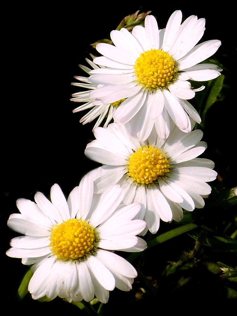
Thank you to everyone who has replied. Been a bit busy this week so I need to catch up with my comments. Everywhere I've been seems to be carpeted in daisies at the moment, so how could I not use them for this week's theme -

Fresh as a daisy

14075031526_a0b9f1a57a_b.jpg
 
Ha ha! I've just looked through the main photo thread and seen that out of 4 submissions so far for Fresh, mine's the third one with daisies :p
 
Thanks Susie. I didn't set out to give it a black background, but there were so many messy blades of grass surrounding the flowers and I was already getting strange looks from passers-by for plucking out the ones directly in front of them that I thought I might get taken away if I started a full manicure job! So I decided to paint most of them out in pp and black seemed like a good contrast with the white petals. I think that maybe the greens that you have used give more of a fresh and natural feel though :)
 
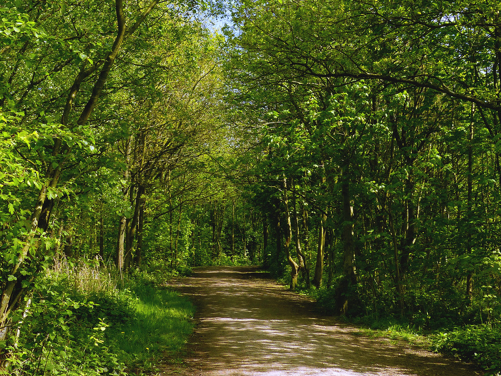
So, here's another idea from my day out today at Pennington Flash. Bit of shoehorning required, but at least it's not another daisy :p

Fresh Air

14118563573_6ab177d40c_b.jpg
 
Back
Top