You are using an out of date browser. It may not display this or other websites correctly.
You should upgrade or use an alternative browser.
You should upgrade or use an alternative browser.
weekly XenosElaine's 52s Thread - Support added
- Thread starter XenosElaine
- Start date
- Messages
- 8,398
- Name
- Lynne
- Edit My Images
- Yes
HI Elaine
Love those Fresh daises...well exposed , well lit , 3 is always good
Shape......I love that you spotted the similar shape in the table....background needs a little work just to even it out but other than that I like it lots
Numbers....gotta be the Duck for the fun of it
Love those Fresh daises...well exposed , well lit , 3 is always good

Shape......I love that you spotted the similar shape in the table....background needs a little work just to even it out but other than that I like it lots

Numbers....gotta be the Duck for the fun of it
cowboy
Guy Fawkes
- Messages
- 3,143
- Name
- Mark
- Edit My Images
- No
well done one this one keeping detail in the shadow side of the toucan even with teh strong backlighting. makes for a really striking shot.
good choice to keep the greens in colour too, they work well as a splash of muted colour with the black and the white.

- Messages
- 1,409
- Name
- Elaine
- Edit My Images
- Yes
Thanks Mandy.Three good entry's for numbers I like the number plate on the motorbike and the door knocker.
- Messages
- 1,409
- Name
- Elaine
- Edit My Images
- Yes
Oh, that's nearly as bad as some of mine Phil, but cheers!The ducks a quacker Elaine.........................good fun image


- Messages
- 1,409
- Name
- Elaine
- Edit My Images
- Yes
Thanks Susie. I thought I might get a shot of 2 little ducks at the duck race, but when I saw that one I had to use itI wanted to say that Phil, yes, it has to be the duck for me too...what a great find for this week.
- Messages
- 1,409
- Name
- Elaine
- Edit My Images
- Yes
Thanks Graham. I hadn't actually noticed the reflection until you mentioned it!No shortage of inspiration here this week Elaine, I'm another fan of the duck.
Well exposed too, in particular ref the white bonnet, also catching a small reflection under the duck.
- Messages
- 1,409
- Name
- Elaine
- Edit My Images
- Yes
Thanks for looking and commenting.Hahaaaa at Two-can
Nice shot, nothing wrong with that at all, good to have a tenuous link, good colours, liking the black against the bright plant
Numbers - some great ideas again, I love the humour and set up of the 999 shot, but my choice goes with the number plate, really like the crop and again the angle, works really well
- Messages
- 1,409
- Name
- Elaine
- Edit My Images
- Yes
Thanks Allan. I wasn't sure whether to make it a square crop, but settled for the traditional portrait format in the end.Hi, has to be the duck, bit of a crop of the top grill thing but thats being picky, made me smile
- Messages
- 1,409
- Name
- Elaine
- Edit My Images
- Yes
Cheers d00d... getting our monies worth here ... 3 lovely, clean colourful images.
- Messages
- 1,409
- Name
- Elaine
- Edit My Images
- Yes
Thanks Judi. The bg's actually mostly pp - the door needs a fresh coat of paint!Hi Elaine,
I have to go for #3 as 13's my lucky number nice even colour bg well lit
- Messages
- 1,409
- Name
- Elaine
- Edit My Images
- Yes
Thanks for the comments Lynne.HI Elaine
Love those Fresh daises...well exposed , well lit , 3 is always good
Shape......I love that you spotted the similar shape in the table....background needs a little work just to even it out but other than that I like it lots
Numbers....gotta be the Duck for the fun of it
- Messages
- 1,409
- Name
- Elaine
- Edit My Images
- Yes
Thanks Andy. Yes, I've always had a bit of a soft spot for Harleys since my first husband had one many, many years ago - it's the whole Easy Rider thing I supposeWPC Duck to the rescue
I like #2, nice detail and well it's a Harley. I'd have been tempted to get lower wi a shallower DOF.
Cheers.
- Messages
- 1,409
- Name
- Elaine
- Edit My Images
- Yes
Many thanks Craig.Love the duck shot , its fun sharp great colours
- Messages
- 1,409
- Name
- Elaine
- Edit My Images
- Yes
Thanks for looking Mark.
- Messages
- 1,409
- Name
- Elaine
- Edit My Images
- Yes
Thanks Simon. I wasn't sure how well the duck would go down with some of the more technical-minded on here, but I think it has served its purpose in making people smileHi Elaine, I like the duck for its fun value. You had some bright colours there to deal with and they don't seem washed out to me either.
- Messages
- 1,409
- Name
- Elaine
- Edit My Images
- Yes
Week 21 - Strong/Strength
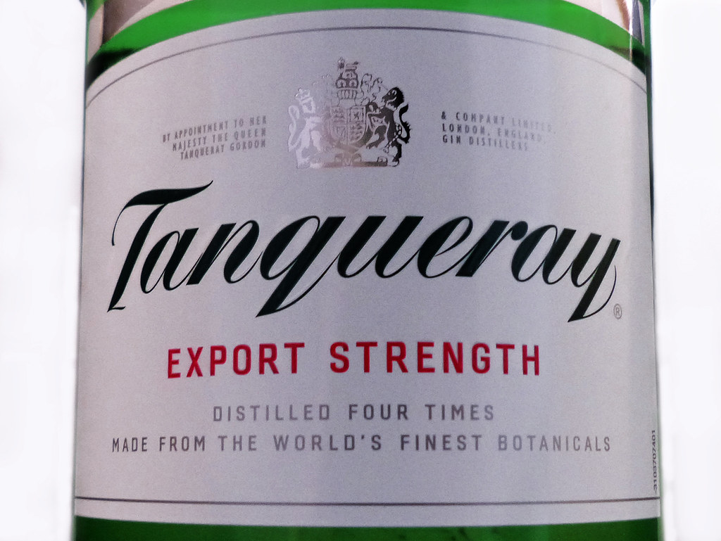
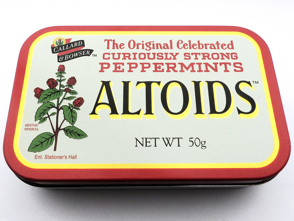
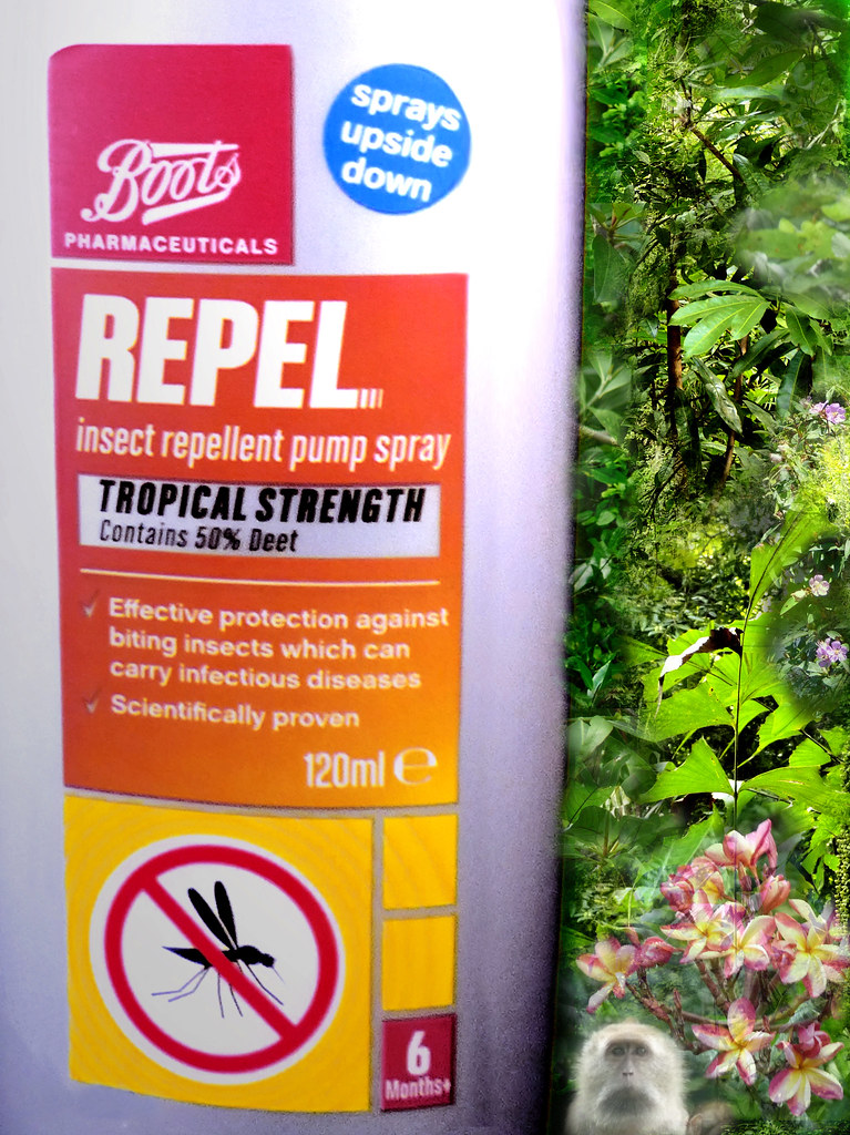
I really hate doing product-type shots, but couldn't think what else to do for this one with the lousy weather we've had recently. So, three options again.
#1 Export Strength
#2 Curiously Strong
#3 Tropical Strength - I thought this made a particularly boring shot and the print on the plastic bottle wasn't very sharp either, so I've played around in pp and cloned various bits of jungle that I shot in Malaysia last year into the background to make it a bit more interesting
I really hate doing product-type shots, but couldn't think what else to do for this one with the lousy weather we've had recently. So, three options again.
#1 Export Strength

#2 Curiously Strong

#3 Tropical Strength - I thought this made a particularly boring shot and the print on the plastic bottle wasn't very sharp either, so I've played around in pp and cloned various bits of jungle that I shot in Malaysia last year into the background to make it a bit more interesting

- Messages
- 9,095
- Name
- Mandy
- Edit My Images
- Yes
Number 2 for me but I feel it's just a bit to tight I the frame for my tastes.
- Messages
- 8,398
- Name
- Lynne
- Edit My Images
- Yes
HI Elaine
I like the product shot of the peppermints...sharp , good colors , well lit & in your face it can be hard trying to make a plain object have some appeal in a shot....how about putting the tin to one side of the shot & having a few of the mints laid around/in front of it, maybe even have the lid not snapped closed ?
I like the product shot of the peppermints...sharp , good colors , well lit & in your face
- Messages
- 1,409
- Name
- Elaine
- Edit My Images
- Yes
Thanks for all the comments and feedback. As I said, I hate doing product-type shots, as I always struggle with angles, lighting, etc to make them look interesting, so all your suggestions are very much appreciated and I'll bear them in mind for next time, because it's definitely an area I need to practise. 
- Messages
- 1,409
- Name
- Elaine
- Edit My Images
- Yes
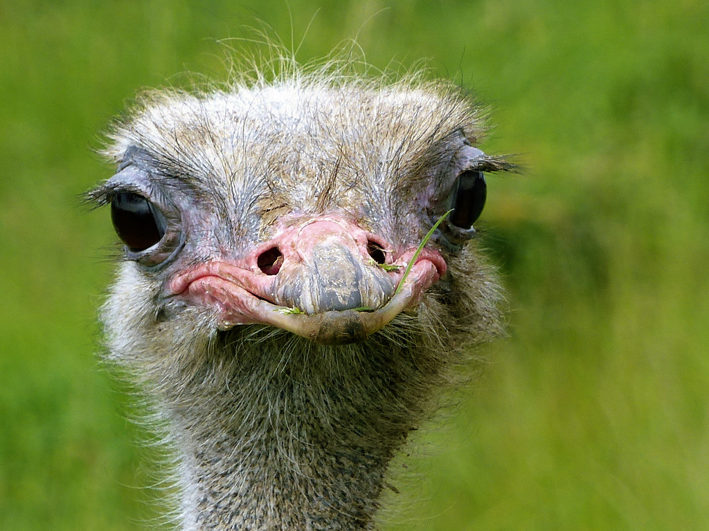
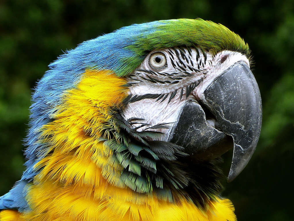
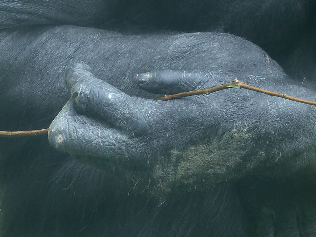
I'm just back from a family weekend in Conwy, where I managed to pick up this week's theme on Friday night. I took a lot of rather mundane-looking shots of fabrics, wood, stone walls, etc to fit the theme, but in the end I've gone with details from 3 more general shots that I took at the Welsh mountain zoo, which I think are far more interesting, whilst still on theme.
#1 Ostrich - I love the fluffiness and the long silky eyelashes, but he was obviously far more appreciative of the texture of the mouthful of grass he was chewing on.
#2 Macaw - Soft feathers and smooth, hard beak.
3 - Chimp - This was taken through thick glass so not brilliant for quality, but I couldn't resist the combination of his worn, leathery hands and the woody twig he was playing with.
#1 Ostrich - I love the fluffiness and the long silky eyelashes, but he was obviously far more appreciative of the texture of the mouthful of grass he was chewing on.

#2 Macaw - Soft feathers and smooth, hard beak.

3 - Chimp - This was taken through thick glass so not brilliant for quality, but I couldn't resist the combination of his worn, leathery hands and the woody twig he was playing with.

- Messages
- 822
- Name
- Richard
- Edit My Images
- Yes
really nice and deffo on theme, number 3 has plenty of different textures
- Messages
- 1,409
- Name
- Elaine
- Edit My Images
- Yes
Thanks Richard 
- Messages
- 4,088
- Name
- Graham
- Edit My Images
- Yes
I also prefer #3 for the rarity value of it, I've seen plenty of ostriches and parrots but this is a refreshingly differnent angle on an animal shot.
Through glass obviously made it harder but I think you've still retained the textures and the detail, possibly this has introduced a bit of a blue cast to the shot?
Through glass obviously made it harder but I think you've still retained the textures and the detail, possibly this has introduced a bit of a blue cast to the shot?
- Messages
- 1,409
- Name
- Elaine
- Edit My Images
- Yes
Thanks Graham. The glass actually gave everything a bit of a sickly yellowish green hue and I think I've slightly over-tweaked the blue to try and compensate for that 
- Messages
- 1,409
- Name
- Elaine
- Edit My Images
- Yes
Thanks Simon. I think the hands are the best bit of the best one of several shots I took of the chimps. The reflection and distortion seems to have been minimal compared to some others.I can't decide which one I like more - 1 or 3, but those are the two that stick out for me.
I think it's number 1 for its colourfulness though. You dun gud!
Though, I have to say, I hadn't noticed you'd shot number 3 through glass!
- Messages
- 1,409
- Name
- Elaine
- Edit My Images
- Yes
Thanks Susie. I think it's the fact that they are so human-looking that makes them so fascinating.Hi Elaine...the ostrich shot is excellent....but that last one has a very magical quality about it....the more I look at it the more I love it

