£ from my trip to the Lakes

Messages
2,102
Name
Peter Hartland
Edit My Images
Yes
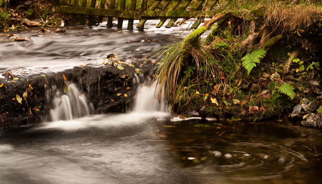
Welcome your comments on these 3 from my trip to the Lakes last week

p957905812-4.jpg


p808147114-5.jpg


p500740138-5.jpg
 
Lovely set like no.3.
 
first is great Peter love it, the last shot just cant get past the foreground post its way to dominating, and is very grainy, and not sharp really, #2 doesn't do anything for me its just a stream soz
 
Last edited:
What is the thinking behind them ? being honest nothing within the detail and interest stands out IMO, with all images I ask myself "Would I hang that on my wall" and being totally honest this is not the case here.
 
Last edited:
in shot #1 i have seen these fences diving into the water and I always think it would make a great shot, especially on a calm day. I tried once and found the results very unsatisfactory from a a composition point of view as they a so strong a feature that they dominate yet on their own do very little for the viewer. #2 is a stream. #3 again, the posts end up being the composition in itself but they aren't that interesting (plus there's quite a bit of haloing aroufn the posts).

I am thinking that this is a bit negative but as Kevin said, they don't hold my interest. sorry:shrug:
 
No. 1 is the best by far. I've seen similar, and to be honest there's nothing unique about it, but I'd be happy to have it hanging on my wall especially if I'd taken it.

I'm afraid the second and third shots do nothing at all for me.
Don't take it the wrong way, it's a personal opinion at best and you've got to ask what the hell do I know?

cheers
 
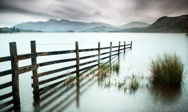
in shot #1 (plus there's quite a bit of haloing aroufn the posts).
:


Have to say that I don't have a really strong view on these except to largely agree with comments made by others. Having said that I wish I had taken them!

However, I can see the haloing; but what caused it? Is it in the pp? If it is, what is it too much of? Sorry for the 'newby' question!

ERnie
 
No. 1 is the best of the three, the other two do nothing for me.
 
#1 looks great with the moody sky
 
Would like to see number 1 shot in black and white IMVHO it may lift it to another level.

Think I can see what you were trying in shot 3, but would have better being more to the shore. That way you could have got more of the pier in. Sorry number 2 does not do it for me.
 
Sky is too dark in 1, but good composition. It has potential.

It is too obvious that 3 is HDR, the foreground is too distracting.
 
Back
Top