Critique 1965 Mercedes

Dangermouse

Squeaky Clean
Messages
9,968
Edit My Images
No
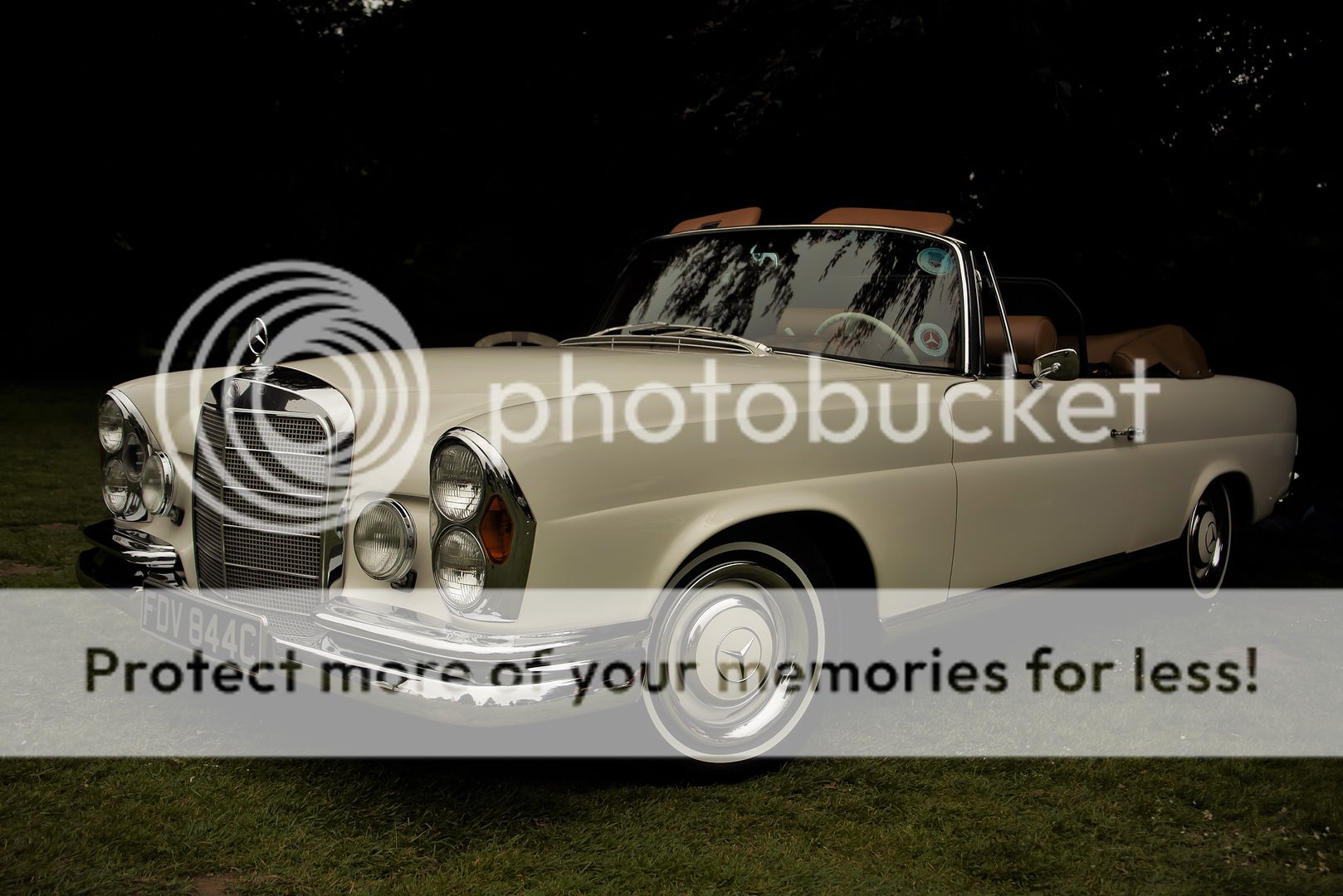
Taken at a local classic car show, if you could call it a show as local dealers took it over and turned it into a forecourt, anyway it was shot on a D810 iso500 1/1000 35mm f4.5
Any critique greatly accepted and tips on making shots like this much better, it is supposed to look like a 60s advertising shot.

_MGG7093-2_zpsz2zlcuog.jpg
 
it is supposed to look like a 60s advertising shot.


Sweet tones here Pete… maybe the renditions could
be a tad brighter… but yes, it works very well! :cool:
 
I'm with Kodiak on this one. It's very gloomy. Needs a lift of something.
 
A classy & classic car..............................as for the PP, as you say yes to 'edit my images' does this look more like it "should"???

In PS I set the "grey point" on the white wall tyre and as quite underexposed just pulled the highlight side in to set the DRL available limit(s). This retains the colour of the car as I surmise it is not a bright white but a cream white to match the sort of white that was popular in the 1960's & 1970's

_MGG7093-2_zpsz2zlcuog_edit.jpg

In regard to 'making the advertising shot' ~ I would have asked if the owner could lift and shift the hubcaps to make the Merc logo the correct way up ;)
 
Last edited:
Very good, Laurence! (y)(y)(y)
Thanks Daniel.....just wonder whether Pete @Dangermouse1964 agrees and whether it is anything close to the overall look.

In regard to the hubcaps that was something I read about a long while ago. With modern alloy wheels with their "marquee" centres the same applies i.e. get them symmetrical and centres upright.
 
Back
Top