A couple of B&W Still Life Images

TheBigYin

Moderator
Messages
16,671
Name
Mark
Edit My Images
No
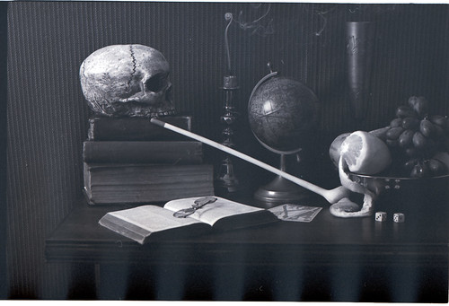
Well - now the March POTY competition has been voted on, and the votings over, I can finally release these couple of shots. They're actually 35mm film versions of a dijikal shot that was my March entry, though these have had a little less of the digital darkroom treatment.

Sadly, these were partly spoiled by my getting interrupted during processing the film, and the neg's were streaked a little by bromide drift through lack of agitation. Both shots have had a little "Dodge and Burn" work, mainly to cover the streaking, and they've both had a little bit of contrast work done, but to be honest, nothing that couldn't have been done in a traditional wet darkroom. Certainly nothing compared to the extensive work that the digital shot recieved.

Anyway - both shots were from the EOS-3, shot on Ilford Delta 100, (badly) developed in Perceptol stock solution @ 20c, and scanned on my Canoscan 8800F uisng Silverfast SE software.

Delta100_2011-03-30_030 by The Big Yin, on Flickr


Both shots are variations on the Vanitas style of still-life painting.
Vanitas still life paintings are mostly associated with the 16c and 17c Netherlands and Flanders painters. Heavily symbol laden, they were usually meant as a reminder of the transience of life, the futility of pleasure, and the certainty of death.


They also provided a moral justification for many paintings of attractive objects.


In these images I have included a number of Vanitas symbols...

The skull, a reminder of the certainty of death;

Over Ripe Fruit, which symbolizes the decay of ageing, and the ephemeral nature of life... also a peeled lemon, which is like life, attractive to look at, but bitter to taste.;

Smoke, or a Low flame and the almost burned out Candle which symbolize the brevity of life;

The Cards and Dice are an obvious reference to gambling - a form of excess;

The pipe is a symbol of vanity and excess;

The Bible rests on the book of Job: 14.1 - "Man that is born of Woman is of few days, and is full of trouble";

The Eyeglasses are an indication of ageing and decline;

The visible section of the Globe is showing the area from the Middle East to the Seas off China, reminding us of the Unrest and Natural Disasters currently unfolding in these areas;

In this case, the Dice have also been used to give a personal note to the picture - the 14th being my birthday... as to the significance of the reflected numbers, you'll have to work that one out yourselves ;-)

I don't think I've ever spent as long working on a single image (or series of variations working towards one image. Pretty much everything you see was sourced for the shot, with the exception of a couple of bits of brassware, and the contents of the fruitbowl. I even built the table for the shot, and did a genuine "stucco rustico" plaster background on a half sheet of plasterboard for the later shots, when I decided that the fabric background looked a little naff :LOL:
 
Last edited:
Cool I like painting like that espically from the 17th Century and Dutch but thats just me.

Couple of things ;)

#1 It is a pitty the bowl of the pipe is facing away and slightly behind the bowl it seems a little lost.
The lighting is good but the goblet? in the back seems to blend into the dark wall paper, like wise with the grapes in the fruit bowl.

#2 Not sure about the back ground but that could just be me, prehaps torn wallpaper would have added some thing to it :shrug:
To me the bible looks out of focus as does the mouth end of the pipe, hyperfocal distance focusing may help.

Apart from that I think they are cracking images (y)
 
Cool I like painting like that espically from the 17th Century and Dutch but thats just me.

Couple of things ;)

#1 It is a pitty the bowl of the pipe is facing away and slightly behind the bowl it seems a little lost.
Agreed - this was an earlier composition, and was changed to the second version, primarily because I wanted to move the pipe
The lighting is good but the goblet? in the back seems to blend into the dark wall paper, like wise with the grapes in the fruit bowl.
Again, I agree, the lighting was set for a dijikal colour version as per the link I gave earlier, and in B&W it does loose things a little.

#2 Not sure about the back ground but that could just be me, prehaps torn wallpaper would have added some thing to it :shrug:
To me the bible looks out of focus as does the mouth end of the pipe, hyperfocal distance focusing may help.
I think that it's probably as much the dodge/burn/blurring I needed to apply having screwed things up at the development stage, as the SOC scan looks a fair bit sharper. That being said, it was a quick grab-shot at the end of the evening, and I have missed focus a little.

Apart from that I think they are cracking images (y)

Glad you liked then - just fancied posting something a little different to the usual fare of Street 'togging or Landscapes we seem to mostly get in F&C :)
 
Last edited:
Much respect for the work put into these. The fact that they are also really interesting to look at is icing on the cake too! I've seen quite a few paintings in various galleries in this style and you've definitely nailed it. Could you say something about how you lit them please?
 
I like #2 more than the digital one you submitted, it's the best of the bunch. It's nice to see someone doing stuff like this instead of the usual, but I think you hit the nail on the head when you said that you've never put this amount of time into a single shot before.

Like Nick, I think the Bible is a bit out of focus (probably shot at a wider aperture than the digital one?) and the extinguished candle with the whisp of smoke would have looked great in this shot too.

My only little gripes are
a) the little dust/hair on the apple
b) the framing is slightly off i.e. the edge of the table is cut off at an awkward point for me.
 
I like #2 more than the digital one you submitted, it's the best of the bunch. It's nice to see someone doing stuff like this instead of the usual, but I think you hit the nail on the head when you said that you've never put this amount of time into a single shot before.
Thanks - it's great that you like this one more, though I have to say I do actually prefer the digital one myself. Maybe one rainy day I'll drag the set back out and do a re-shoot but with the lighting and everything sorted for B&W film rather than digital. Might be a nice project for the new Bronica :thinking:

Like Nick, I think the Bible is a bit out of focus (probably shot at a wider aperture than the digital one?) and the extinguished candle with the whisp of smoke would have looked great in this shot too. I've had a bit of a think about it, and I'm guessing that it's more to do with the smaller DOF of the 35mm sensor rather than the 1.6 crop in the 7D. As I was sans-lightmeter while doing all this, I slavishly copied over all the settings from the digital to the 35mm, and as I was working with 100iso film, but had the 7D on 200iso for the bulk of the evenings shooting, I may just have opened up the aperture a stop rather than re-balancing all the lighting. So, combination of a fairly murky subject, lower than expected DOF, and me being in a rush to tear things down as it was rapidly approaching midnight and I was getting nagged to "leave the bedroom normal - not with all you're crap all over" probably meant I just duffed it up.:shake:

As to the Candle smoke... Dunno if it's just the one's I bought, but they don't seem to smoke like the old ones I remember from BITD. To get a decent bit of smoke out of these ones, you had to have the candle burning for 10 minutes minimum - otherwise you blew it out, and it went out - no smoke, no fuss, and no flaming picture! So, the second one got a burning candle instead :shrug:

My only little gripes are
a) the little dust/hair on the apple - my bad - I simply missed that - I'll spot that out when I get 5 minutes
b) the framing is slightly off i.e. the edge of the table is cut off at an awkward point for me. - yep - I could have done with a 18" longer sheet of plasterboard really, then I could have shown the full table. Thing is, a half sheet of plasterboard, when it's plastered on both sides (I had 2 attempts at the "stucco rustico" :LOL:) is quite heavy enough to be manhandling around - a full 8'x4' would just be too much in a domestic environment. Remember, I want to keep these sets and have a go at a few more setups yet :)

I'll certainly be rolling all the feedback into any further shots I do. It all started out as an exercise in getting to grips with using my new studio flash heads. :LOL:
 
Much respect for the work put into these. The fact that they are also really interesting to look at is icing on the cake too! I've seen quite a few paintings in various galleries in this style and you've definitely nailed it. Could you say something about how you lit them please?

Well - I sort of started with a little story in my head, and used it to pre-visualise what I wanted out of the light. In my mind, this is the side table of a scholarly chap "of a certain age" (hence the pince-nez!) He's contemplating his own mortality during a insomnia ruined night, and whiles away the hours reading a number of books - the bible of course, and a number of medical tomes (filed under Eddie the unconvincing Skull)
Eventually, he realises that he's been awake all night, the candle's burned to a nubbin, and he puts down his pipe and glasses and crosses the room to open the curtains. As he does so, a low shaft of light enters the room from camera left, raking across the assembled detritus of his evening.

So - how does that translate into a lighting description... bearing in mind I'd had the lighting kit for about 3-4 days, and it's upwards of 17 years since I'd used studio lights beforehand. Therefore, my solutions may not have been the most elegant, or even the right ones, but I did get roughly what I wanted. Here goes.

Table is set on a black pedestal (okay cardboard box covered in matt black emulsion) and placed 6 inches from the rear fake wall. One 300w flash set 6 feet from centre line of table and 3 to camera side of fake rear wall. This was firing through a Gobo, intended to fake a old sash window. Chunk of polystyrene foam with a window cut out, and covered in baking parchment. Intended to cast a image of the window onto the globe (wasn't a success tbh :( ) Black dustsheet to front of table to mop up any spill light to front. Large black-emulsioned polystyrene board 1 foot to camera right, again to "soak up any overspill light. Second 300w head set immediately at RHS of camera, fitted with softbox, and on pretty much minimum power, just to slightly soften the shadows from first head. For initial digital shooting, I used my laptop and Canon utility to take a picture every 5 seconds, set the laptop where I could see it whilst stood to the side of the composition, holding another black foamboard, and shaping any overspill light.

Once I was happy with this, I quickly swapped to the film camera, and took a couple of frames on film as well, though this time with a long wired cable release. Unfortunately, it's looking more and more like I didn't spend enough time focussing.

To be absolutely honest, My main focus was to get something for the POTY that might get a vote or two, which I succeeded with. To get something on film as well was almost a bonus!
 
I loved the colour digi version of this but I think in some respects I like this better (I can only see 1 photo at the moment). I love the little curl of smoke although I do agree about the bowl of the pipe, could be brought back a little. But its the tones in the shot that make it, just beautiful.

Andy

Second one should be back now Andy, I'd spotted out the hair on the apple and re-posted via Lightroom, but of course, I forgot it'd bust the link :bonk:
 
It's got to be the colour version for me........can you imagine Rembrandt or whoever seeing that subject and thinking "I'll paint that in B/W". ;)
 
It's got to be the colour version for me........can you imagine Rembrandt or whoever seeing that subject and thinking "I'll paint that in B/W". ;)

I know, Brian, and believe me, I would have, but the only camera I really can rely upon for use with the studio flash kit, at least at the time I did these was the EOS-3, and guess what... it had a roll of Delta 100 in there:shrug: These were, in fairness, a complete by-product of producing the digital colour version - I spent maybe 2 hours a shoot getting exactly what I wanted in the digital version, then - once I'd got something I was reasonably happy, I'd transfer all the settings to the EOS-3, slap the film camera on the tripod and shoot 4 frames (one up 2/3ev, one down 2/3ev, and an extra on the money for luck - film stocks cheap, time in the studio is priceless!) Total time each version - maybe 5 minutes. Maybe I should have taken 6 and focussed properly :LOL:

Not having the correct film loaded was one of the main motivations behind getting the Bronica though, so at least something good came from it (y)
 
To be honest, I don't think I can add any more to what has already been said other than I prefer the lighter tones of the second because of the definition it gives each object (although I do think the first is more fitting with the Vanitas theme). And I definitely think you should give it another go with the larger format as I think the more intricate details (such as the cards and the text in the bible) would easily justify it. I really like the set up, the lighting and the outcome of all 3 images. I especially like the curly whisp of smoke in the first B&W in this thread!

I can't remember whether or not you have access to a darkroom but if you do, it might be interesting to have a go at some hand tinting to put some colour into it, just as an experiment. It's super easy to do with a set of highlighters (a la my friend Hayley's series of portraits, for example).
 
I really like what you're doing here. I think both images have merits. Tradition printing would do these negs justice I recon. I can't think of anything else contructive to add, apart from to say keep it up (y)
 
To be honest, I don't think I can add any more to what has already been said other than I prefer the lighter tones of the second because of the definition it gives each object (although I do think the first is more fitting with the Vanitas theme). And I definitely think you should give it another go with the larger format as I think the more intricate details (such as the cards and the text in the bible) would easily justify it. I really like the set up, the lighting and the outcome of all 3 images. I especially like the curly whisp of smoke in the first B&W in this thread!

I can't remember whether or not you have access to a darkroom but if you do, it might be interesting to have a go at some hand tinting to put some colour into it, just as an experiment. It's super easy to do with a set of highlighters (a la my friend Hayley's series of portraits, for example).

Jak, thanks for the feedback - I'm definitely going to have another go at this - after all, I've aquired 2 large boxes of props for this, and plastered about 5 square meters of board for backdrops, not to mention building a table and sundry other stuff... Only problem was, I was on the receiving end of the "All signal, no noise" treatment for best part of a week when MrsYin copped an eyeful of what I was working on. After my previous competition entry, which consisted of me lying ostensibly on a mortuary table, dressed in a plastic sheet and toe-tag, she wasn't too happy, and to wander into the spare bedroom to see me arranging what looked to her like something from a horror movie (I didn't think that Eddie was all that convincing TBH :LOL:) just tipped her over the edge. So, this month I've done a quickie - just to appease her, and left the still-lifes alone for a week or so.

I don't actually have access to a darkroom at the moment - I'm shying away from the idea because I know If I do get the kit, I'll disappear into there one afternoon, and when I come back out, MrsYin will have finally carried out her threat to leave home for good! So I can't really do that until I manage to get her off the business bank account as a co-signatory :naughty:
 
I really like what you're doing here. I think both images have merits. Tradition printing would do these negs justice I recon. I can't think of anything else contructive to add, apart from to say keep it up (y)

I wish that the negatives were up to being wet printed, but to be honest, both these shots have had quite extensive "work" done on them post digitising, as I buggered up the developing, and got a bad case of bromide drag on the negs.

Delta100_2011-03-30_030.jpg by The Big Yin, on Flickr

The above is a straight from the scanner (after resizing and possibly sharpening a bit by lightroom) version of the first shot. I don't think I'd be up to getting an even toned print from a neg. like that :shake:
 
Last edited:
i like first

Thank you - I have however posted this shot for critique, so If you would like to give a little more detailed appraisal of the shot, rather than just a quick post to get you one more mark closer to accessing the classifieds, then please feel free :LOL:
 
Back
Top