A few favourites from my shoot with Ella

Messages
1,564
Name
Graham
Edit My Images
No
I've been plodding on through all the images I have from the other evening and I wanted to share a few of my favourites. The editing process is getting quicker but it's quite hard work!

I've edited each image on its own and have not really set out to post these as a set, so while consistency across all the images in this post is not really my aim, I'd appreciate any feedback on the processing of the individual images?


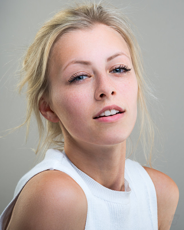
EllaScott-239-Edit
by Graham Mayers, on Flickr


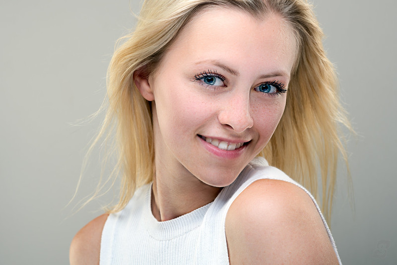
EllaScott-140-Edit
by Graham Mayers, on Flickr


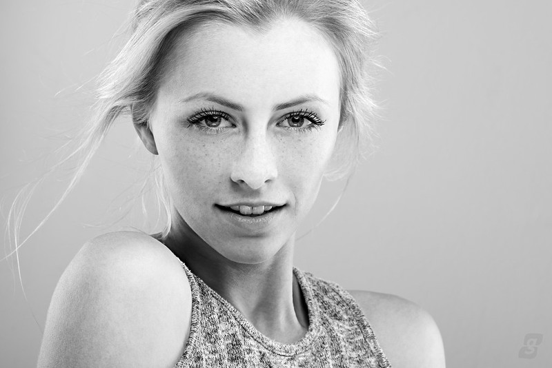
EllaScott-282-Edit
by Graham Mayers, on Flickr


EllaScott-287-Edit-2
by Graham Mayers, on Flickr
 
1 - Not overly struck on the pose.
2 - Best of the set IMO.
3 & 4 are also very good.

I've just looked at these on Flickr and they look better, on here the skin looks a little grainy on the shadow side.
 
I think 2, 3 and 4 show a much better contact between the model and camera; she appears more relaxed, composed and confident.
Nice work with the pp, I like the B&W conversion.
Wow, those eyelashes....
 
Number 1 is ok but the connection with the model doesn't look quite right! Really like 2 & 4. Nice mono conversion.

S
 
Thanks all for commenting :) I really like #1 but it's interesting to read that you guys think the connection is not there.

I had to tweak the WB on #287 to get the mono conversion looking how I wanted it - the colour version is on my Flickr.

It's amazing how different Ella looks in some poses - just a change in angle dramatically alters her face shape and the feel of the image.
 
I'm also not too convinced with the expression of the first Graham but the rest are fabulous. Really nice, natural processing.
 
I can see why #1 is said to be the weaker image but as a whole set I think it works really well.
#4 is stunning.
 
#2 and #4 are stunning. The lighting, model's expression, everything. I really like how you've post processed all of them. It's all too easy to overdo it but I think you've really nailed it. I'd be over the moon if I'd taken these.

Regarding the comments regarding the 'lack of connection' in #1 and #3, I think that may be due more to the position of the catch light in the model's eyes. She's definitely engaging with the lens. But it looks to me as if the reflection of the beauty dish is creating the impression she's not.
 
Hmmm, I'm going go against the crowd and say I really like no. 1. The expression is much more interesting to me than the 'simple' smiles, draws you in and makes you wonder what she is thinking.
3 for me feels like an unnatural slightly forced smile.
Love the colours / pp
 
These are really lovely, really like the pp work, very natural and clean. Awesome stuff dude! :)
 
Hmmm, I'm going go against the crowd and say I really like no. 1. The expression is much more interesting to me than the 'simple' smiles, draws you in and makes you wonder what she is thinking.
3 for me feels like an unnatural slightly forced smile.
Love the colours / pp

I agree, number 1 is my favourite, so striking! What I'd say a more 'editorial' look, her expression is perfect!
 
+1 for number 1. It is far more interesting and there is an 'enigmatic' look about her, and great colour. Love number 4 also!
 
Hmmm, I'm going go against the crowd and say I really like no. 1. The expression is much more interesting to me than the 'simple' smiles, draws you in and makes you wonder what she is thinking.
3 for me feels like an unnatural slightly forced smile.
Love the colours / pp
I'm in 100% agreement with Tom on this one.

1 for me.
2 is good, but no connection for me.
3 is too forced and she looks to be 'recoiling' a bit.
4 close to 1. Very good.
 
I'm also not too convinced with the expression of the first Graham but the rest are fabulous. Really nice, natural processing.

Thanks. I was aiming for natural processing so I'm glad it's come across like that :)

I can see why #1 is said to be the weaker image but as a whole set I think it works really well.
#4 is stunning.

#4 is one of my favourites too, thanks for commenting.

#2 and #4 are stunning. The lighting, model's expression, everything. I really like how you've post processed all of them. It's all too easy to overdo it but I think you've really nailed it. I'd be over the moon if I'd taken these.

Regarding the comments regarding the 'lack of connection' in #1 and #3, I think that may be due more to the position of the catch light in the model's eyes. She's definitely engaging with the lens. But it looks to me as if the reflection of the beauty dish is creating the impression she's not.

Thanks for the comment and insight. It was a great opportunity to learn for me and I'm pretty pleased with how things turned out :)

Hmmm, I'm going go against the crowd and say I really like no. 1. The expression is much more interesting to me than the 'simple' smiles, draws you in and makes you wonder what she is thinking.
3 for me feels like an unnatural slightly forced smile.
Love the colours / pp

Thanks very much (y)

Number two is the best one for me.

Cheers :)

These are really lovely, really like the pp work, very natural and clean. Awesome stuff dude! :)

Thanks Bethy!

I agree, number 1 is my favourite, so striking! What I'd say a more 'editorial' look, her expression is perfect!

Thanks very much - I really like this one too!

+1 for number 1. It is far more interesting and there is an 'enigmatic' look about her, and great colour. Love number 4 also!

Thanks very much :D

I'm in 100% agreement with Tom on this one.

1 for me.
2 is good, but no connection for me.
3 is too forced and she looks to be 'recoiling' a bit.
4 close to 1. Very good.

Thanks for the comment - I can see what you mean by 'recoiling'... something to bear in mind and work on with her in the future.
 
Back
Top