

- Messages
- 4,266
- Name
- Rick
- Edit My Images
- No
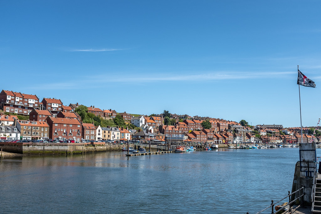
Just a few shots with the X100F.
 DSCF2327 by rick phillips, on Flickr
 DSCF2331 by rick phillips, on Flickr
 DSCF2341 by rick phillips, on Flickr
 DSCF2347 by rick phillips, on Flickr
 DSCF2356 by rick phillips, on Flickr
DSCF2327 by rick phillips, on FlickrDSCF2331 by rick phillips, on FlickrDSCF2341 by rick phillips, on FlickrDSCF2347 by rick phillips, on FlickrDSCF2356 by rick phillips, on Flickr
 DSCF2347-Edit
 DSCF2331-2
 DSCF2347-Edit-2
 DSCF2341-2
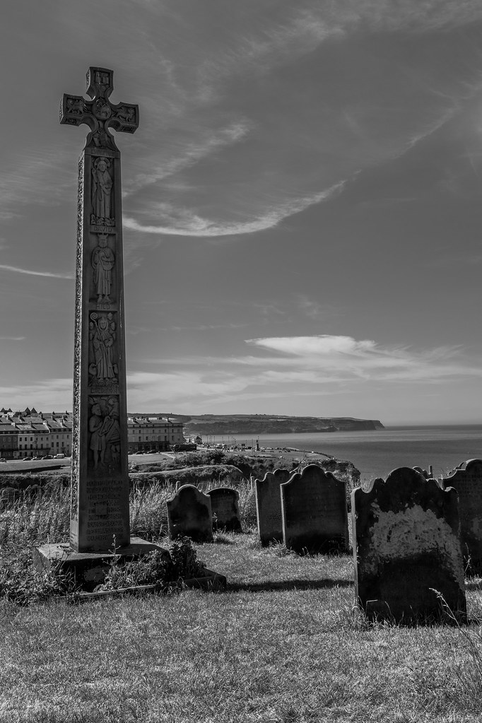 DSCF2338-2
")
 DSCF2329
 DSCF2330