

More trains from the worth valley, light was completely rubbish and grey and there was no real exhaust from the locos, so I have been experimenting with the processing.
Any comments appreciated.
[url=https://flic.kr/p/2ni4zEi]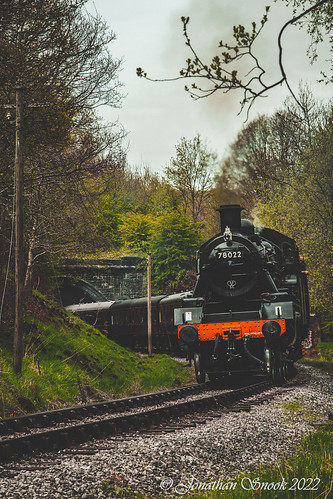 78022 leaving Mytholmes Tunnel by Jonathan Snook, on Flickr[/URL]
[url=https://flic.kr/p/2nhXXYn]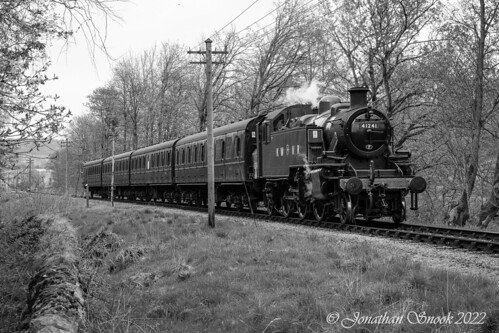 41241 2mt Tank by Jonathan Snook, on Flickr[/URL]
 78022 at Oxenhope by Jonathan Snook, on Flickr
[url=https://flic.kr/p/2nhZU6i] Oxenhope by Jonathan Snook, on Flickr[/URL]
Any comments appreciated.
[url=https://flic.kr/p/2ni4zEi]
 78022 leaving Mytholmes Tunnel by Jonathan Snook, on Flickr[/URL]
[url=https://flic.kr/p/2nhXXYn]
 41241 2mt Tank by Jonathan Snook, on Flickr[/URL]78022 at Oxenhope by Jonathan Snook, on Flickr
[url=https://flic.kr/p/2nhZU6i]
 Oxenhope by Jonathan Snook, on Flickr[/URL]
")