Andy Warhol style

Messages
14
Name
david craven
Edit My Images
Yes
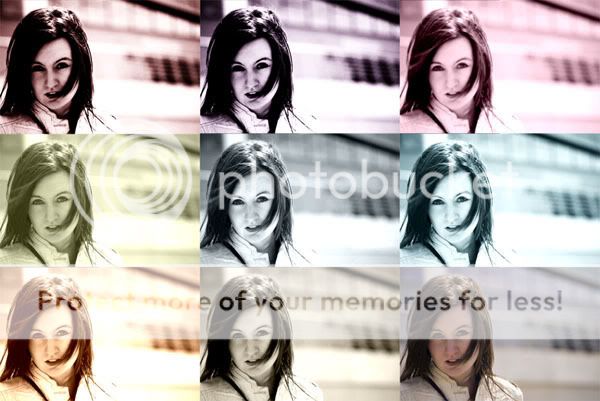
i origionally decided to do this as a way of getting opinions on which effect people liked one the image, but i thought it actually looked quite good with them all like this hehe

compilation.jpg
 
My 2p :)

I think you need to stick to just 4 shots. Having 9 different colours leaves some looking a bit washed out.

Also, there is too much space to the left of her, get her central in the frame with a less distracting background :)
 
I really like it. Have you asked the model what she thinks? I'll bet she'd really like a framed copy :)

Not sure which of the effects I prefer though. It would depend on what you intend to use any individual shot for or what you want to achieve with it.
 
I think you need to stick to just 4 shots. Having 9 different colours leaves some looking a bit washed out.

:agree:
I love Andy Warhol style images but I think you need to stick to about 4 to 6 images.

But then like Alison said, if you did this for the model, as long as she likes it who cares what we think :shrug: :LOL:
 
i agree with what betty said, try doing it with 4 shots, the top right one, middle left and right and bottom left. i think it would look a bit better if the last one was another colour as opposed to the original.

good attempt(y)
 
Back
Top