

You are using an out of date browser. It may not display this or other websites correctly.
You should upgrade or use an alternative browser.
You should upgrade or use an alternative browser.
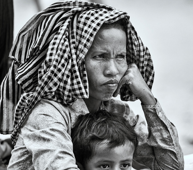
B&W Asian Woman
- Thread starter kissfoto
- Start date
OP
- Messages
- 1,777
- Name
- Ian
- Edit My Images
- Yes
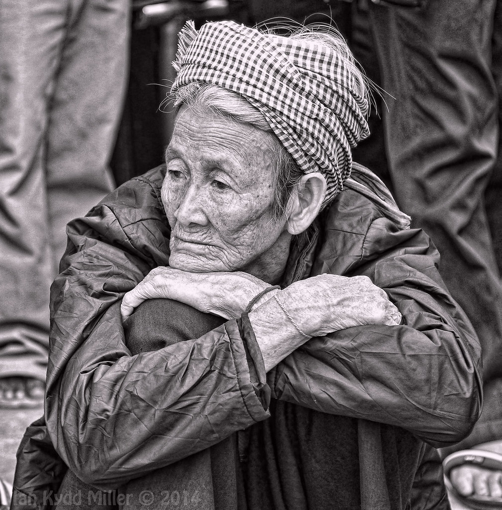
It has a great feel and creates some thought. The only thing that i don't like (and i don't think there's a lot you can do about it) is the guys foot in the bottom right corner.
Could easily do a quick amputation in PS but it is one of my NO NO 's
OP
- Messages
- 1,777
- Name
- Ian
- Edit My Images
- Yes
some good shots posted Ian
keep em coming
agree about the foot and as I said on your other image, processing just a little harsh for my eye ....... but that's just me
Maybe but its how I like to process ...
OP
- Messages
- 1,777
- Name
- Ian
- Edit My Images
- Yes
I like this , she looks to be very lost in her thoughts ,
lovely shot
Thanks
- Messages
- 234
- Name
- Paul
- Edit My Images
- Yes
I like the photo a lot. I think it is a little over processed for my taste, especially in the sharpening. I assume your using TOPAZ? Topaz is very easily over used in photography and stands out like a sore thumb. 'Yep that guy's using TOPAZ' (I'm guilty of that) I think it would be nicer if you targeted areas specifically for enhancement instead of a global one. For example sharpening and enhancing the women instead of the background, or at least at a certain percentage. It would help to bring her forward as the whole picture looks flat with no depth and seperation from the background. To help with depth i would mask the women and tone down the darks in the background VERY subtley. Just to recede the background. BUT a cracking picture non the less. Its all very subjective at the end of the day.
Last edited:
OP
- Messages
- 1,777
- Name
- Ian
- Edit My Images
- Yes
I like the photo a lot. I think it is a little over processed for my taste, especially in the sharpening. I assume your using TOPAZ? Topaz is very easily over used in photography and stands out like a sore thumb. 'Yep that guy's using TOPAZ' (I'm guilty of that) I think it would be nicer if you targeted areas specifically for enhancement instead of a global one. For example sharpening and enhancing the women instead of the background, or at least at a certain percentage. It would help to bring her forward as the whole picture looks flat with no depth and seperation from the background. To help with depth i would mask the women and tone down the darks in the background VERY subtley. Just to recede the background. BUT a cracking picture non the less. Its all very subjective at the end of the day.
 We all have our different ways of looking at things and that's what makes photography fun.
- Messages
- 234
- Name
- Paul
- Edit My Images
- Yes
True, so true!
Did you use Topaz out of interest?
OP
- Messages
- 1,777
- Name
- Ian
- Edit My Images
- Yes
True, so true!
Did you use Topaz out of interest?
Yes part of my normal processing method, really like if not pushed to far.
")
- Messages
- 595
- Edit My Images
- No
This shot could be much more effective. It's a good shot that just needs a more sympathetic treatment in order for a viewer to better empathise and engage. My following suggestions are simply that - suggestions. Feel free to ignore any or all.
Frankly, the square crop just doesn't work, mainly because the subject is looking left of centre with less space to look into than there is to the right. Unbalanced and static. A simple crop would also solve the phantom foot problem. Background is intrusive with ugly noise clumping especially top right. Darkening off will go a long way to solving this as well as bring the main subject more front and forward in tonal terms. Hands are terribly tonally flat, as is the face, but less so. Selective tonal contrast control will help enormously in these areas. Sharpening is causing haloing along edges and generally is over done. Lastly, the eyes are rather 'dead' and flat, a touch of work also needed here. Overall, the image as shown is flat and personally, I'd like to see this more three dimensional in tonal terms.
Frankly, the square crop just doesn't work, mainly because the subject is looking left of centre with less space to look into than there is to the right. Unbalanced and static. A simple crop would also solve the phantom foot problem. Background is intrusive with ugly noise clumping especially top right. Darkening off will go a long way to solving this as well as bring the main subject more front and forward in tonal terms. Hands are terribly tonally flat, as is the face, but less so. Selective tonal contrast control will help enormously in these areas. Sharpening is causing haloing along edges and generally is over done. Lastly, the eyes are rather 'dead' and flat, a touch of work also needed here. Overall, the image as shown is flat and personally, I'd like to see this more three dimensional in tonal terms.
- Messages
- 12,662
- Edit My Images
- No
This shot could be much more effective. It's a good shot that just needs a more sympathetic treatment in order for a viewer to better empathise and engage. My following suggestions are simply that - suggestions. Feel free to ignore any or all.
Frankly, the square crop just doesn't work, mainly because the subject is looking left of centre with less space to look into than there is to the right. Unbalanced and static. A simple crop would also solve the phantom foot problem. Background is intrusive with ugly noise clumping especially top right. Darkening off will go a long way to solving this as well as bring the main subject more front and forward in tonal terms. Hands are terribly tonally flat, as is the face, but less so. Selective tonal contrast control will help enormously in these areas. Sharpening is causing haloing along edges and generally is over done. Lastly, the eyes are rather 'dead' and flat, a touch of work also needed here. Overall, the image as shown is flat and personally, I'd like to see this more three dimensional in tonal terms.
+1
IMHO - the processing is harsh and flat and unimaginative and does not bring out the character of the subject, especially in B & W, (is it B & W?) ......... as i said in this and your other "portrait"
but all you seem to want is for people to like your image and not post C & C, or for you to discuss comments
as you say "Maybe but its how I like to process ..."
Good luck
Last edited:
- Messages
- 234
- Name
- Paul
- Edit My Images
- Yes
The other portrait you've done is prime example of over sharpening/processing in the wrong areas. Topaz exaggerates the Bokeh in the background which isn't desirable. Just some sensitivity and careful spot enhancements etc works wonders on some photos.
sometimes Topaz can make photos look 'over digital'
Hope my advice and others doesn't offend you. Lots of photographers can be very sensitive about criticism. Don't be! It's a good thing!
sometimes Topaz can make photos look 'over digital'
Hope my advice and others doesn't offend you. Lots of photographers can be very sensitive about criticism. Don't be! It's a good thing!
OP
- Messages
- 1,777
- Name
- Ian
- Edit My Images
- Yes
+1
IMHO - the processing is harsh and flat and unimaginative and does not bring out the character of the subject, especially in B & W, (is it B & W?) ......... as i said in this and your other "portrait"
but all you seem to want is for people to like your image and not post C & C, or for you to discuss comments
as you say "Maybe but its how I like to process ..."
Good luck
I am sorry you feel that I am not open to crits, far from it I have found all the comments here very useful and will be working on things in the future.
- Messages
- 12,662
- Edit My Images
- No
I am sorry you feel that I am not open to crits, far from it I have found all the comments here very useful and will be working on things in the future.
I read your blog Ian and found it interesting Ian ....... there must be a lot of wild life out there ...... it would be interesting to see a few shots if you have time
are you using proprietary presets on your B & W images ..... if so I think that you can do a lot better just following the normal processing route, I am just an ordinary photograph and don't really do portraits but I look at a lot of shots and you clearly have interesting subjects out there to build a portfolio from
Last edited:
- Messages
- 4,907
- Name
- Simon
- Edit My Images
- No
some good shots posted Ian
keep em coming
agree about the foot and as I said on your other image, processing just a little harsh for my eye ....... but that's just me

OP
- Messages
- 1,777
- Name
- Ian
- Edit My Images
- Yes
I read your blog Ian and found it interesting Ian ....... there must be a lot of wild life out there ...... it would be interesting to see a few shots if you have time
are you using proprietary presets on your B & W images ..... if so I think that you can do a lot better just following the normal processing route, I am just an ordinary photograph and don't really do portraits but I look at a lot of shots and you clearly have interesting subjects out there to build a portfolio from
Strangely enough wildlife is difficult here, forrest are being illegally cleared and can be dangerous places to be. Not really my scene anyways. Will be trying some different styles of processing and will get back on here when I'm through. Cheers
- Messages
- 595
- Edit My Images
- No
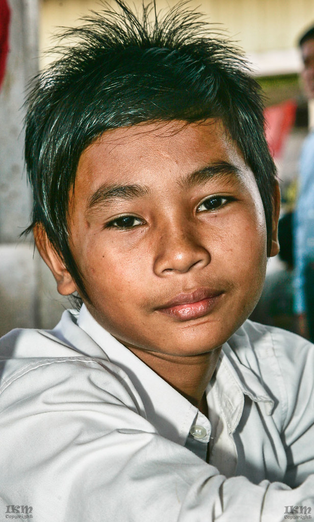
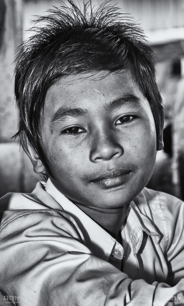
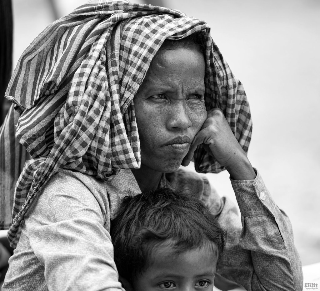
I find your processing does lend a strangely cold and metallic look to the image. And I can't work out what's going on with the hair (in colour) any HDR processing here? Or shadow uplift? Is this on-camera flash? The lighting has that unpleasant 'flash' look about it. Anyway as for the processing, being curious, I converted the colour image to my own taste from a screen grab to compare processes.
(Please note that I'm NOT saying it's better, just different)

(Please note that I'm NOT saying it's better, just different)
OP
- Messages
- 1,777
- Name
- Ian
- Edit My Images
- Yes
Not a problem and I certainly see the difference ( digitally selenium toning may be giving the metallic look). I think I can explain the color in the hair the sunshade above was green (they use it a lot in Cambodia) it makes this very difficult and yes these were taken with direct flash. I have stopped using flash at all now in these circumstances. Cheers
- Messages
- 7,911
- Name
- Terry
- Edit My Images
- Yes
It has a great feel and creates some thought. The only thing that i don't like (and i don't think there's a lot you can do about it) is the guys foot in the bottom right corner.
I find the feet on Each side to help make the shot.
OP
- Messages
- 1,777
- Name
- Ian
- Edit My Images
- Yes
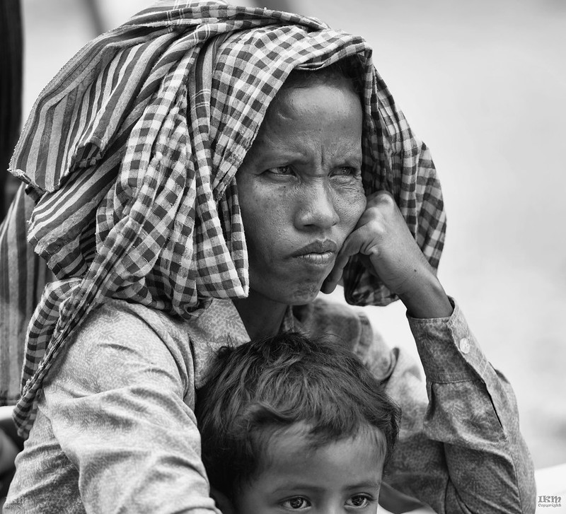
what I feel from a viewer point of view is that you need to treat your subjects, (in the images that you have posted to date), when processed, with my sympathy, if you see what I mean
I process usually to bring out what I see, yes I could treat the subject a little more sympathetically and maybe I should ... (actually the old lady ''known locally as Mama'' loved the 16 x 16 I printed for her) ...
OP
- Messages
- 1,777
- Name
- Ian
- Edit My Images
- Yes
Even if you're not sharpening I think you're manipulating the local contrast a bit much, either via structure/ clarity / tonal contrast or during the conversion by separating neighbouring tones too much. Maybe
I will look at that. Thanks
OP
- Messages
- 1,777
- Name
- Ian
- Edit My Images
- Yes
I soooo prefer the first photo. Looks more natural and 'film' like. Super picture and subject. You have access to wonderful subjects.
We all have our own way of seeing things. I appreciate your comments. Cambodia is a wonderful place for a photographer.
OP
- Messages
- 1,777
- Name
- Ian
- Edit My Images
- Yes
I think somewhere in the middle and your there[emoji4]
Pretty much what I thought.
- Messages
- 4,907
- Name
- Simon
- Edit My Images
- No
My own experience, fwiw. Which is not a lot.
I used to ramp up structure / clarity / tonal contrast / local contrast / wide area sharpness / whatever you want to call it / all the time. I still do sometimes, but I've come to realise it's not a substitute for more painstaking dodging and burning. Even though it gives a similar effect with much less effort.
I've experimented with Nik, ACR, Topaz Clarity, luminosity masks and more - including various DnB techniques - to achieve the effect. But when I have time, painting on a soft light grey layer - in conjunction with colour correction - gives me the best results.
OP
- Messages
- 1,777
- Name
- Ian
- Edit My Images
- Yes
Do you own a Wacom? Or something similar?
Nope.
- Messages
- 234
- Name
- Paul
- Edit My Images
- Yes
I highly recommended one. It will help transform your photo retouching and enhancement. You will be able to target areas with much better finesse than you would ever do with a mouse. Feels a bit strange at first but within a few days it will become second nature. I have used a Wacom for 20 years and it's essential for what I do. You'll never look back