

- Messages
- 695
- Name
- Alan
- Edit My Images
- Yes
I tend to steer away from editing pictures to much, so i've been practicing in LR just doing minor changes.
The shot was taken in a pub at a bday meal last night, with the light coming from the window behind
So does this look over cooked?
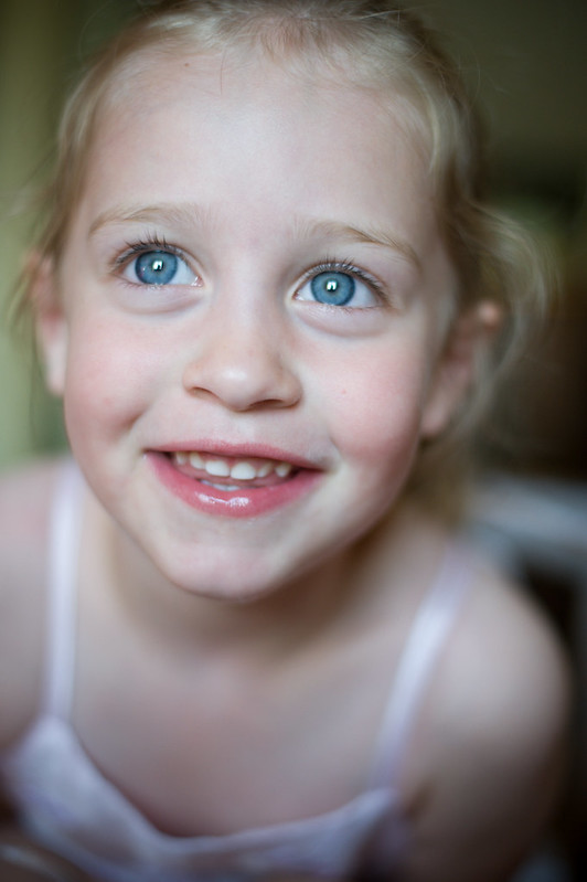 Phoebe Before by Alan Cook, on Flickr
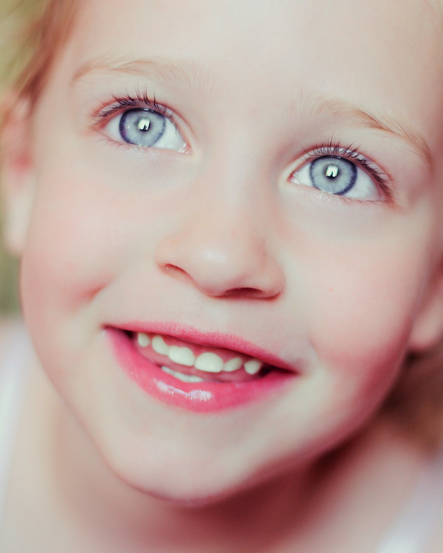 Phoebe After by Alan Cook, on Flickr
 Phoebe After RT by Alan Cook, on Flickr
The shot was taken in a pub at a bday meal last night, with the light coming from the window behind
So does this look over cooked?
Phoebe Before by Alan Cook, on FlickrPhoebe After by Alan Cook, on FlickrPhoebe After RT by Alan Cook, on Flickr
Last edited:
")