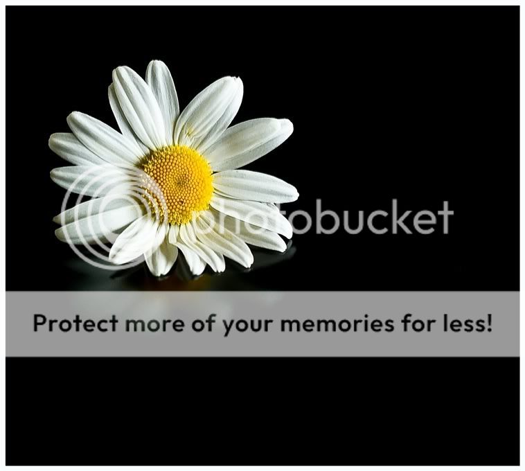
I don't dislike two and three but one is just streets ahead for balance and the delicacy of the lighting control.
There are a couple of folk on here now honing this area to the point where I can really see me having to shell out for a copy of their book sooner or later.
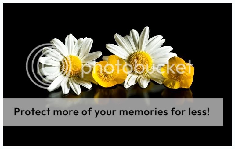
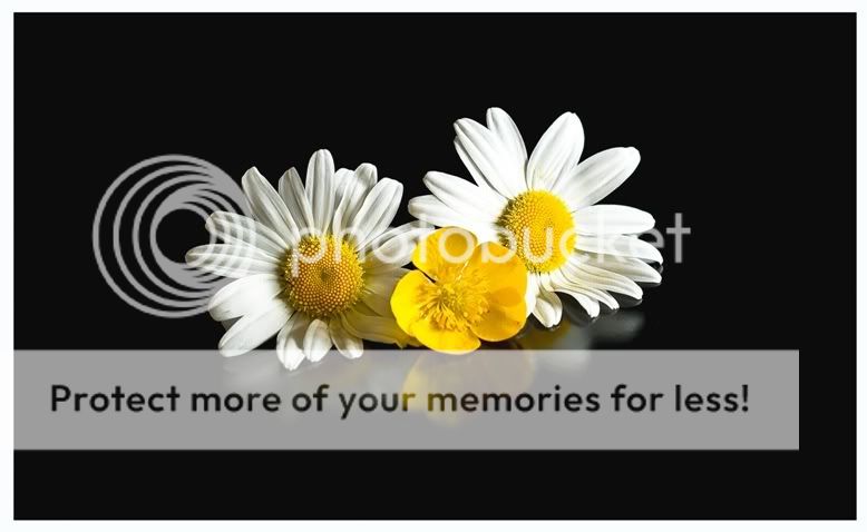
Agree - compositions are interesting in 2 and 3 - the latter is the eyes and nose of a face - but the petal textures in #1 are sooo much better because of the lighting
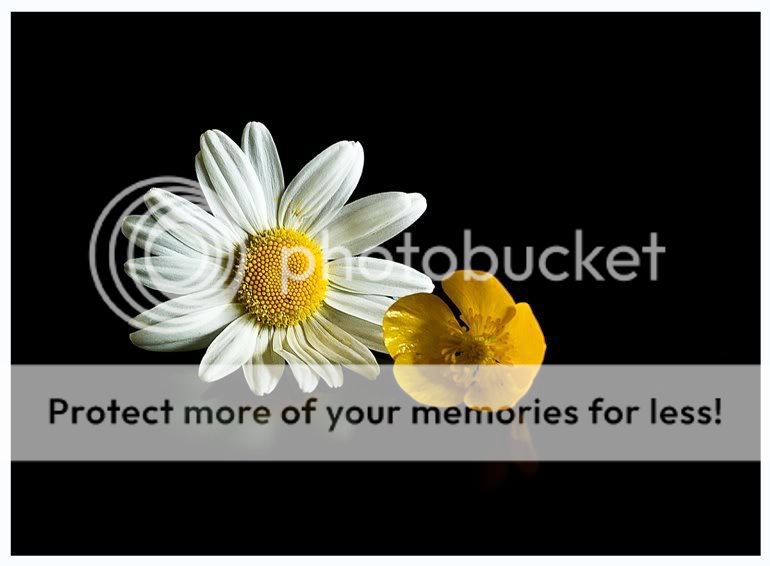
Very nicely done Mo but I have to agree with the other comments. Maybe it is because the daisies are double the size of the buttercups and the perspective is thrown.
This site uses cookies to help personalise content, tailor your experience and to keep you logged in if you register.
By continuing to use this site, you are consenting to our use of cookies.
")

