Bishops Palace Wells Somerset.

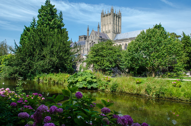
#1 does little to gain interest really, it has no real focal point with so many features interrupting others, I'm unsure what I should be looking at ... church, wall, water, flowers?.
#2 I like the composition here and the building is clearly the point of the pic, however the top is too closely cropped, losing the top of the tree and being very close to the church tower ... it needs more headroom IMO.
#3 I quite like this and to me is the best composed of the set ... except I'm unsure about the 'fence'.
In general I find them all over-saturated.
 
Thanks Gramps, didn't actually notice I cut the top of the tree off! lot of driving yesterday and was late. You are right about the saturation, we have 2 computers and depending which one is being used (kids) I end up with the other and the lg monitor is not as good as the iiyama.
 
I think No. 3 is by far the best, it could do with a bit of CW rotation and I would crop a bit off the bottom, the path in the bottom LH corner is not adding a lot to the image. The standard format works well in landscape but I always find it a bit long and thin when used in portrait mode.
 
Back
Top