In my humble opinion, do some research if you want something interesting. There are some examples of different covers in the illustration image for our zine exchange thread
here. But Googling "front cover running book" will get you
90% of the way there.
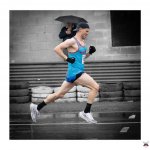
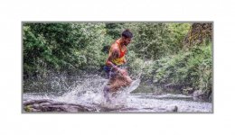
I do tend to prefer a full bleed image with legible stand out text. You've got half of that in your last image. The cover has no title on it (that I can see). I'd probably do something like this.

Hopefully you get the idea. Colours are sampled from within the image (used the yellow short and the orange vest, the red from the cones/other vest were a bit too garish). With hindight I'd probably go white for the author name at the botom. Leave enough bleed to make sure the text isn't cut off. You don't need a stand out image for the front cover, just something with lots of space for a title, because a book without a title on the front cover wouldn't work for me. This took less time in Photoshop than it did to resample it at a forum acceptable size and reupload it.
I'd probably use a thinner font (oor a thicker one that's got closer spaced letters), and might even be tempted to put some zoomy racing lines through the text if it was super thick, but the best thing to do is a bit of research, then create your own idea from that with what you know. This is a landmark summary book of ten years worth of photography that means something to you. The cover is surely worth a bit of extra time.
Either way, good luck with your project. It sounds like a fine idea.
Edit to add: If you're struggling to make text stand out, you can drop it in a coloured rectangle (or circle to make it look like a sticker), or add a hard outline or glow to the letters to make them pop out a bit.