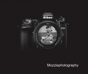
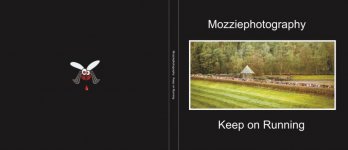
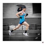
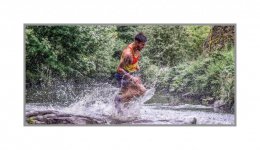
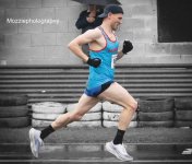
Book cover - unsure about the "look" of it.

Messages
1,620
Name
Stephen
Edit My Images
Yes
Finding it really hard to choose font style and how the image and text is arranged. Spent the last ten years snapping at local running events and have now decided to call it a day. Thought I'd put an album together of all the venues I've covered. Just can't decide what should be on the front cover and where to put the text. Looks very amateurish at the moment. Two possibilities and a few odd pictures below. Thoughts?
 

Attachments

  • 275287773_935878330459242_9142555693056501196_n.jpg
    275287773_935878330459242_9142555693056501196_n.jpg
    40.5 KB · Views: 72
  • Front cover.jpg
    Front cover.jpg
    44.4 KB · Views: 62
  • xxx.jpg
    xxx.jpg
    202.6 KB · Views: 62
  • 263613380_882406192473123_3964634558516082566_n.jpg
    263613380_882406192473123_3964634558516082566_n.jpg
    140.2 KB · Views: 55
  • scott.jpg
    scott.jpg
    120.8 KB · Views: 64
  • Trunce 77.jpg
    Trunce 77.jpg
    159.3 KB · Views: 67
None of them really grab you. How about find the best shot of someone running directly towards you. Dispense with the bottom half and concentrate on the arms and look of determination. Sort of like a sprinter on the track. And then stylise it in the form of a painting, or something of that nature.
 
Hi. What a great project - will you share the book with the various clubs?

My 10 pence worth: the first cover is dominated by the camera and so seems to be more about your kit than the athletes. A title will come - perhaps, on the second example, consider putting the title at the top - assuming you decide to have an image on the cover. Perhaps also, reduce the font siize of your name considerably. The image currently in place on your cover has a great deal of field and woodland; consider picking a dramatic shot of one of your runners; the agony and the ecstasy of the finish line for example. You might also consider trying a white cover - black is very heavy.

I just went looking at a full cover photo sport books: https://shop.visionsp.co.uk/products/this-sporting-life-standard-edition.

Here's another one: https://www.amazon.co.uk/Art-Sports-Photography-Marc-Aspland/dp/3791381164

You could put a small one of the Nikon on the back cover at the bottom edge of the corner with your contact details if you want to distribute this somehow.

Regarding the layout of the book itself, have you got a plan? Chronological order, by club, by type of event. When people turn pages, they look at the right hand page first and then the left hand page. So, for example, the left hand page of the first double page spread - let's call it p2, will help flow if it connects in some way with page 4.

Whether you choose to include page numbers may depend on the size of the book. Font size - keep it small so it doesn't become more important than the image... hope that helps.
 
Thanks @Chipper for all the input and @Plain Nev . That's really helpful. I'm ordering them in alphabetical order as each venue has been visited a number of times. I'll keep experimenting.
 
Finding it really hard to choose font style and how the image and text is arranged. Spent the last ten years snapping at local running events and have now decided to call it a day. Thought I'd put an album together of all the venues I've covered. Just can't decide what should be on the front cover and where to put the text. Looks very amateurish at the moment. Two possibilities and a few odd pictures below. Thoughts?
The one with the camera is naff. Destroy it! :LOL:

No need to try anything fancy.

The second one is fine. Just play around with the image, text size and style and background colour.

Another option is a full bleed photograph with text overlaid in the negative space.
 
About printers, assuming you are not going for hand made; if you want a soft cover, you could get samples from Mixam, for example. I am just about to complete two zines [stapled A5 softcovers] for a jeweller and a sculptor. They are 20 pages and this count includes the covers. The sample pack would then enable you to select papers that work for you. As these were for either giving to clients / selling, I selected the heaviest paper for cover with a lamination and also the heaviest gsm for the pages. You could order a bunch of these if it was a small book and send one to each club as a gift and thanks for access or sell them. I suspect though that you will have quite a tome if it is 15 years' worth of shots.

If it is a one off for your own personal use, I have used Blurb, All Star and Saal. Saal digital did have an offer running of £100 voucher which was genuine and enabled me to have a high quality, layflat hardback for around £15. [Downside - my brother wanted one of them so I had to buy one anyway!]. You have to download their colour profile. I have heard good things. about Whitewall. Photobox also do hardbacks but the colour consistency last time I did that [6 years ago] was not great for me.
 
It's for personal use and the layout inside might not suit everyone. Some of the images might not be perfect but they have a distinct memory that means a lot to me.
 

Attachments

  • 359437664_1228596204520785_4092481321381990331_n (2).jpg
    359437664_1228596204520785_4092481321381990331_n (2).jpg
    162.1 KB · Views: 7
  • 51658170441_64b08fc1bf_o.jpg
    51658170441_64b08fc1bf_o.jpg
    146 KB · Views: 7
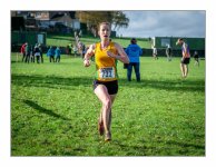
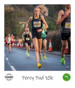
Decided that this one is a good candidate. Running towards me. Other people interesting. Colours.


Mickleden Straddle.jpg
 
Decided that this one is a good candidate. Running towards me. Other people interesting. Colours.


View attachment 395193
That's striking. Perhaps a border in black around the image which enables you to put your title in the top area [ be aware of the printer's bleed] at all edges and your Mozziephotography byline at the bottom; it could serve [the border] the draw the attention of the viewer in whether it is you or your mates, peers etc who want to look through it.
 
In my humble opinion, do some research if you want something interesting. There are some examples of different covers in the illustration image for our zine exchange thread here. But Googling "front cover running book" will get you 90% of the way there.

I do tend to prefer a full bleed image with legible stand out text. You've got half of that in your last image. The cover has no title on it (that I can see). I'd probably do something like this.
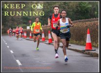
Screenshot 2023-07-13 223343.jpg
Hopefully you get the idea. Colours are sampled from within the image (used the yellow short and the orange vest, the red from the cones/other vest were a bit too garish). With hindight I'd probably go white for the author name at the botom. Leave enough bleed to make sure the text isn't cut off. You don't need a stand out image for the front cover, just something with lots of space for a title, because a book without a title on the front cover wouldn't work for me. This took less time in Photoshop than it did to resample it at a forum acceptable size and reupload it.

I'd probably use a thinner font (oor a thicker one that's got closer spaced letters), and might even be tempted to put some zoomy racing lines through the text if it was super thick, but the best thing to do is a bit of research, then create your own idea from that with what you know. This is a landmark summary book of ten years worth of photography that means something to you. The cover is surely worth a bit of extra time.

Either way, good luck with your project. It sounds like a fine idea.

Edit to add: If you're struggling to make text stand out, you can drop it in a coloured rectangle (or circle to make it look like a sticker), or add a hard outline or glow to the letters to make them pop out a bit.
 
Last edited:
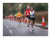
I prefer this one too, but with the title and other text on the road lower left and along bottom, to me it is less distracting or confused looking than in the trees.

run.jpg
 
Massive thanks for all the input, much appreciated. The book will be for personal use, with quite a few pages inside. Doubt anyone would want a copy anyway.
 
Back
Top