
- Messages
- 130
- Edit My Images
- Yes
Hello,
Strolling around Brecon hills, enjoying time in solitude.
Very ordinary landscape photo with a tad bit of evening sun, does it work like this?
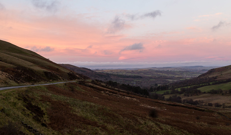
Brecon Beacons, Wales by Rudlin, on Flickr
Patch of land bathing in sunlight caught my eye, saturated colours.
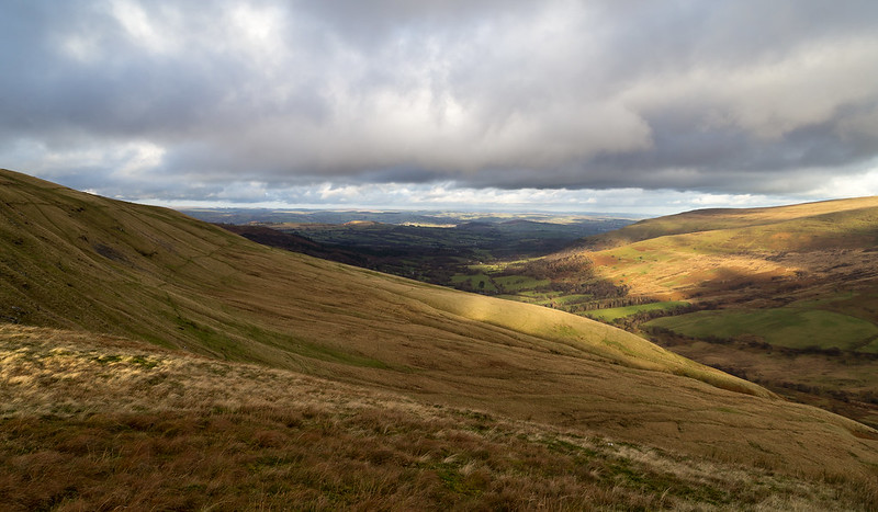
Brecon Beacons, Wales by Rudlin, on Flickr
Crop of sunrays captured in the distance
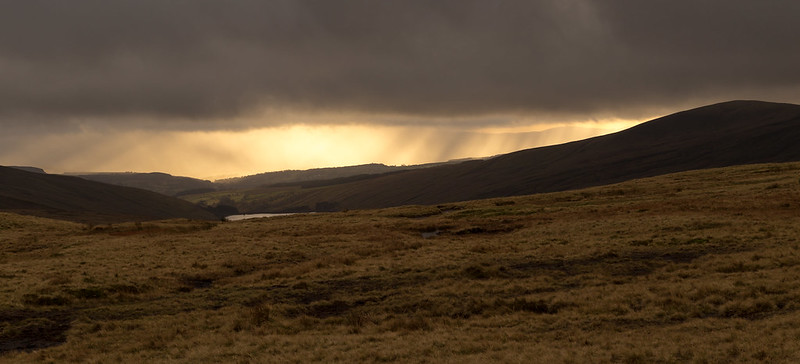
Brecon Beacons, Wales by Rudlin, on Flickr
Can this picture be considered as a Landscape photo?
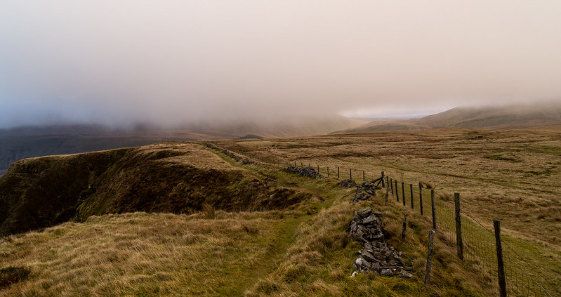
Brecon Beacons, Wales by Rudlin, on Flickr
and one B&W
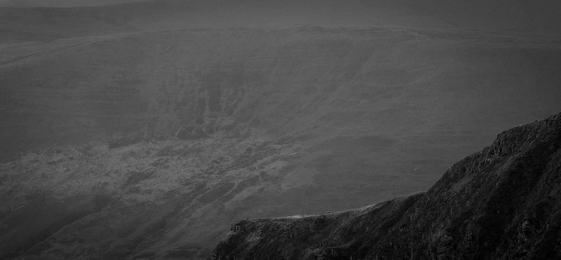
Brecon Beacons, Wales by Rudlin, on Flickr
Strolling around Brecon hills, enjoying time in solitude.
Very ordinary landscape photo with a tad bit of evening sun, does it work like this?
Brecon Beacons, Wales by Rudlin, on Flickr
Patch of land bathing in sunlight caught my eye, saturated colours.
Brecon Beacons, Wales by Rudlin, on Flickr
Crop of sunrays captured in the distance
Brecon Beacons, Wales by Rudlin, on Flickr
Can this picture be considered as a Landscape photo?
Brecon Beacons, Wales by Rudlin, on Flickr
and one B&W
Brecon Beacons, Wales by Rudlin, on Flickr
")