
You are using an out of date browser. It may not display this or other websites correctly.
You should upgrade or use an alternative browser.
You should upgrade or use an alternative browser.
Brighton Cinemas
- Thread starter Jakska
- Start date
TheBigYin
Moderator
- Messages
- 16,669
- Name
- Mark
- Edit My Images
- No
Really like these Jak,
what sort of post processing where you doing?
From the look of the shots I'd say scanning them and very little else - most of that kind of look would come from the "really expired Portra 400NC" - Portra 400NC is a fairly subdued film colourwise, and as with most of the pro-range films once they're out of date their characteristics can be even more extreme.
This is really one of the joys of working with film - you can choose the film to get the look you want
")
Last edited:
I could explain it for you if you wantOK then, explain it to me please. I see some blown out snaps of some cinemas and I see a rather facile document and I'm expected to see value for my tax in that? I really hope you can explain it so I dont feel like all that money I paid the taxman has been totally poured down the drain.
you're a [offensive comment removed] who thinks that because someone's young and learning that they have nothing to give to society, and that when you see something that doesn't interest you it must be a waste of time and money. Like I said before, I am here studying at university to learn a trade and to build a path towards a good career, I'm not a layabout student who spends his time getting drunk every night and going in for lectures for 2 hours a week. I'm in the studio 10-6 every weekday and I often work late into the evenings. My course is actually extremely good value for money in comparison to a lot of "academic" courses like English or History; I get good teaching time by very experienced people in their particular fields and I am learning towards a goal. And before you start moaning again how about you justify why you feel it's necessary to be so rude about my work.Thanks MelReally like these Jak,
what sort of post processing where you doing?
as TheBigYin said; there's not much post work on these other than a spot of dust removal, the film has done most of the work! NC really does tend to mellow out once it has passed its best. I shot it rated at 100 rather than 160 which would probably explain the slight yellow cast.
Last edited by a moderator:
- Messages
- 473
- Edit My Images
- Yes
I see the art of debate is not dead then.
Let me explain my thoughts. You post a set of prints with little or no artistic merit. I follow up your link to look at the whole project report and see little in it that could not be accomplished by an 11 year old and a computer.
I have every sympathy and understanding for the learning process. Maybe I am missing something in the pics and report that demonstrates where you are on the learning curve so, once again, please explain it to me. since I (and many others) are paying for much of this learning process, its not unreasonable for us to question where the money is going to, don't you think?
Your orignal post requests a critique. I don't see any great benefit to you to tell you that a set of poorly composed prints represent any kind of photographic achievement. Again, explain please if there is some deeper element of expression in the pics or project that I am not getting.
Firstly I'd appreciate it if you weren't so condescending. Secondly I highly doubt an 11 year old could use a complex grid structure--let alone set one up--or bind a book, as simple as perfect-binding is. I also doubt they could collate as much information as I gathered in an easy-to-view manner or relate it to a concept and gather it in a way that is suited to its purpose. The book is a quick reference guide to people in Brighton who wish to see a film and want to know where is best suited to them at the best price therefore the layout within the book, as well as the format and size of the book itself, is designed around the information gathered and the target audience.I see the art of debate is not dead then.
Let me explain my thoughts. You post a set of prints with little or no artistic merit. I follow up your link to look at the whole project report and see little in it that could not be accomplished by an 11 year old and a computer.
I have every sympathy and understanding for the learning process. Maybe I am missing something in the pics and report that demonstrates where you are on the learning curve so, once again, please explain it to me. since I (and many others) are paying for much of this learning process, its not unreasonable for us to question where the money is going to, don't you think?
Your orignal post requests a critique. I don't see any great benefit to you to tell you that a set of poorly composed prints represent any kind of photographic achievement. Again, explain please if there is some deeper element of expression in the pics or project that I am not getting.
If you so desire to know I am in my second year of three, studying Graphic Design. Your taxes are going towards the contact time provided by the tutors and technicians, keeping the equipment in the workshops running, providing me and other students on my course with a studio (which is actually just a plain room with garish yellow/red/blue tables in) and also keeping the library up to date as well as admin costs and so on. We are not provided with any materials and have to fund printing, finishing and all hardware and software out of our own pocket. Plus it's not like I'm stealing your tax money; once I graduate I will also have to pay into the system to fund your retirement and healthcare.
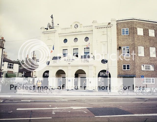
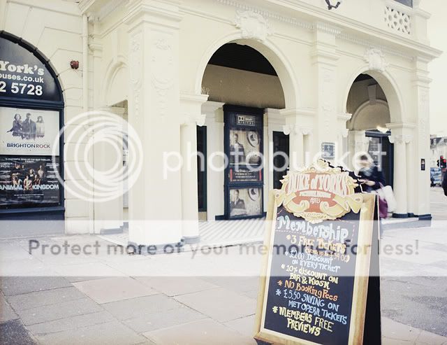
Finally I wouldn't exactly say the photographs are poorly composed or "snaps" as you put it, I didn't just point my camera and shoot hoping to get an ok shot. There are 9 photographs in the book, 3 x 3 sets, one for each cinema location;
One long shot to give a locational context
One closer shot of the logo and signage
One closer still shot of the entrance or ephemera surrounding the cinema
Each one was thought about to give the best representation of those three criteria and laid out into the pages of the book accordingly.
TheBigYin
Moderator
- Messages
- 16,669
- Name
- Mark
- Edit My Images
- No
OK then, explain it to me please. I see some blown out snaps of some cinemas and I see a rather facile document and I'm expected to see value for my tax in that? I really hope you can explain it so I dont feel like all that money I paid the taxman has been totally poured down the drain.
Perhaps you could confine your critique to the images posted, and NOT to the OP's current occupation?
- Messages
- 473
- Edit My Images
- Yes
Perhaps you could confine your critique to the images posted, and NOT to the OP's current occupation?
Sorry, I thought my critique was primarily of the pictures. I explored further into the presentation and use of the pics whilst trying to find out what the purpose of the pictures was. Without knowing the objective of the photographer, its very difficult to get anything from that set of images.
I certainly have no criticism make of the OP's current occupation. I'm not sure where you gathered any criticism of any specific occupation in my posts. If you are suggesting that I am anti student or anti university, that would also not make too much sense since I spent seven years at university myself and fully understand the learning process.
No, my comments were driven by the images presented in which I couldn't see any particular merit. You are right; this is a photography forum. I wonder sometimes what service we do to our fellow photographers by failure to properly examine their photographic offerings.
So really I would like to turn the question round and ask you to provide some helpful critique on the OP's cinema pics.
Defiance
Green and Hairy
- Messages
- 2,096
- Edit My Images
- Yes
Well, I am happy that my taxes are going to help someone who wants to make something of their life and is unlike the many who can't get their backside out of bed for anything except to impregnate the girls on the local council estate and get benefits paid by tax...
In regard the photos, giving you some constructive critique, I would have liked to see you try something a bit different. For example, focusing on just a small detail like the signs or part of the architecture to add some more art to interest. Would have liked some lower angles and more use of depth of field (e.g. on the blackboard sign). As it's cinema, a night shot may have added more context to it too.
In regard the photos, giving you some constructive critique, I would have liked to see you try something a bit different. For example, focusing on just a small detail like the signs or part of the architecture to add some more art to interest. Would have liked some lower angles and more use of depth of field (e.g. on the blackboard sign). As it's cinema, a night shot may have added more context to it too.
Thank you.Well, I am happy that my taxes are going to help someone who wants to make something of their life and is unlike the many who can't get their backside out of bed for anything except to impregnate the girls on the local council estate and get benefits paid by tax...
In regard the photos, giving you some constructive critique, I would have liked to see you try something a bit different. For example, focusing on just a small detail like the signs or part of the architecture to add some more art to interest. Would have liked some lower angles and more use of depth of field (e.g. on the blackboard sign). As it's cinema, a night shot may have added more context to it too.
And thanks for the critique as well, really good advice. Night shots would have been a great idea and would have added a different angle to the whole thing, especially as most people go and see films in the evening!
TheBigYin
Moderator
- Messages
- 16,669
- Name
- Mark
- Edit My Images
- No
Well - as requested by "custodian" (why are the arse-ey ones always anonymous ?) I suppose I aught to try and give a little crit.
Photo 1 - as a "record shot" of what the cinema looks like in its overall setting, with a view to help locating it as you drive by, it passes muster. As an architectural shot, it's flawed in a number of ways. Firstly, the framing is a little loose, its more of a shot of the road in front of the building, than the building itself. Secondly, you've got a bad case of the converging verticals, something easily tweaked in PP, but better addressed in the camera by use of the proper lens for the job - i.e. a tilt/shift lens, or better still, the proper camera - a plate camera with the relevent movements to allow you to get the whole facade of the building looking as though it isn't going to fall over backwards at any moment (Note: i've not been to Brighton, and the cinema MAY be falling over backwards, but I doubt that they'd be able to stay open if it was.) Thirdly, and what actually kills it for me, is the fact that you've shot the building in totally unsuitable weather conditions. It's a white building, and you've shot it on a day with a bright white overcast sky, and consequently lost any contrast the building may have had. Presumably you live in Brighton - surely a re-visit would have been in order to get things right :shrug: With architectural shots, it's always best to suss out the building thoroughly, and take your shots at a time where there is a minimum of distraction around - 5am Sunday Mornings in summer is usually quite good for that - certainly it'd have meant fewer bikes chained to the front and side of the building. Alternatively, as mentioned above, if the intent was to show the place as a thriving little cinema, then a shot at night, would have hopefully shown the place as busy and thriving - hopefully aiding in your potential selling of the picture to the Cinema for their promo purposes.
Photo 2 - much better to my eyes, though you really do need to buy yourself a tripod and spirit level and use them. Again, the verticals of the building are not vertical! Stick the camera on a tripod, use a slow shutter speed, small aperture, and if needed ND filters to get a shutter speed so slow it doesn't matter if someone walks through the shot. Instead of them being a little blurred, they'll just disappear in a 60 second exposure.
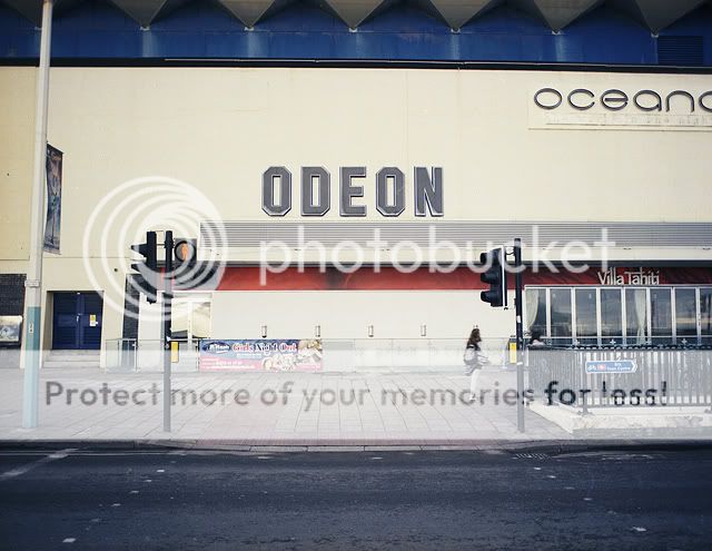
Photo 3 - Once again we've got converging verticals, and also to my eyes a strange optical illusion where the word "ODEON" looks to be off-centre. It isn't - the E is centred on the image, but I think that the vertical of the lamp standard breaks the white space to the left, whereas the right is uninterrupted. This makes the words look offset to the left. I'd suggest a longer length lens, and shooting from a higher viewpoint so that you're not looking up so much to the lettering. I've shot pictures like this from a step-ladder before now - although you do have to accept that you're unlikely to get a tripod that'll go that high, so you're into hand held, and straightening the image at printing stage. Perhaps a portrait format shot, aligned just inside the traffic lights left and right would have worked better - it'd certainly have been more of a shot of the ODEON and less of a shot of the Villa Tahiti or the Oceanarium.
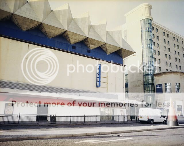
Shot 4 - you've probably guessed what I'm going to say..... yep - converging verticals again. Exagerated by the tall narrow aspect of the nearby Travelodge. Again, it's not been shot in ideal conditions - theres a little more colour in the sky, but it's blown a little at the roofline. That in itself would have been cause for a re-shoot personally. Also - why not wait until the delivery driver left before taking the shot? Again, this is something that is best dealt with by shooting at a time of the day where people aren't around (it also helps shooting at 5am on sunday mornings in june if you're going to shlepp a 8 foot step ladder around to shoot from )
)
Still - kudos for getting out there and having a go with the Bronny - i've spent many a happy hour shooting architectural stuff with a ETRS myself, not to mention many a unhappy hour looking at the results afterwards and planning how i'd do a better job next time. I did like the chioce of the Portra 400NC film - it always gives a look that reminds me of the slightly faded/washed out look you get in the nicer, less commercial seaside areas.
(happy now Mr Custodian sir... considered specific critique, not necessarily what the OP might have wanted to read of course, but my take on these shots. Certainly a good deal more constructive than your original post! )
As a rule, I only give critique of this depth if someone actually posts a shot with the Critique flag raised, and as this wasn't the case here - if anything I've said offends Jak, please remember, a) it's intended to be helpful - and wherever I could I've come up with solutions that could help b) it's only one man's opinion, and after all opinions are like ********s - everybodys got one, but they shouldn't necessarily be put on public display!
Photo 1 - as a "record shot" of what the cinema looks like in its overall setting, with a view to help locating it as you drive by, it passes muster. As an architectural shot, it's flawed in a number of ways. Firstly, the framing is a little loose, its more of a shot of the road in front of the building, than the building itself. Secondly, you've got a bad case of the converging verticals, something easily tweaked in PP, but better addressed in the camera by use of the proper lens for the job - i.e. a tilt/shift lens, or better still, the proper camera - a plate camera with the relevent movements to allow you to get the whole facade of the building looking as though it isn't going to fall over backwards at any moment (Note: i've not been to Brighton, and the cinema MAY be falling over backwards, but I doubt that they'd be able to stay open if it was.) Thirdly, and what actually kills it for me, is the fact that you've shot the building in totally unsuitable weather conditions. It's a white building, and you've shot it on a day with a bright white overcast sky, and consequently lost any contrast the building may have had. Presumably you live in Brighton - surely a re-visit would have been in order to get things right :shrug: With architectural shots, it's always best to suss out the building thoroughly, and take your shots at a time where there is a minimum of distraction around - 5am Sunday Mornings in summer is usually quite good for that - certainly it'd have meant fewer bikes chained to the front and side of the building. Alternatively, as mentioned above, if the intent was to show the place as a thriving little cinema, then a shot at night, would have hopefully shown the place as busy and thriving - hopefully aiding in your potential selling of the picture to the Cinema for their promo purposes.
Photo 2 - much better to my eyes, though you really do need to buy yourself a tripod and spirit level and use them. Again, the verticals of the building are not vertical! Stick the camera on a tripod, use a slow shutter speed, small aperture, and if needed ND filters to get a shutter speed so slow it doesn't matter if someone walks through the shot. Instead of them being a little blurred, they'll just disappear in a 60 second exposure.
Photo 3 - Once again we've got converging verticals, and also to my eyes a strange optical illusion where the word "ODEON" looks to be off-centre. It isn't - the E is centred on the image, but I think that the vertical of the lamp standard breaks the white space to the left, whereas the right is uninterrupted. This makes the words look offset to the left. I'd suggest a longer length lens, and shooting from a higher viewpoint so that you're not looking up so much to the lettering. I've shot pictures like this from a step-ladder before now - although you do have to accept that you're unlikely to get a tripod that'll go that high, so you're into hand held, and straightening the image at printing stage. Perhaps a portrait format shot, aligned just inside the traffic lights left and right would have worked better - it'd certainly have been more of a shot of the ODEON and less of a shot of the Villa Tahiti or the Oceanarium.
Shot 4 - you've probably guessed what I'm going to say..... yep - converging verticals again. Exagerated by the tall narrow aspect of the nearby Travelodge. Again, it's not been shot in ideal conditions - theres a little more colour in the sky, but it's blown a little at the roofline. That in itself would have been cause for a re-shoot personally. Also - why not wait until the delivery driver left before taking the shot? Again, this is something that is best dealt with by shooting at a time of the day where people aren't around (it also helps shooting at 5am on sunday mornings in june if you're going to shlepp a 8 foot step ladder around to shoot from
)Still - kudos for getting out there and having a go with the Bronny - i've spent many a happy hour shooting architectural stuff with a ETRS myself, not to mention many a unhappy hour looking at the results afterwards and planning how i'd do a better job next time. I did like the chioce of the Portra 400NC film - it always gives a look that reminds me of the slightly faded/washed out look you get in the nicer, less commercial seaside areas.
(happy now Mr Custodian sir... considered specific critique, not necessarily what the OP might have wanted to read of course, but my take on these shots. Certainly a good deal more constructive than your original post! )
As a rule, I only give critique of this depth if someone actually posts a shot with the Critique flag raised, and as this wasn't the case here - if anything I've said offends Jak, please remember, a) it's intended to be helpful - and wherever I could I've come up with solutions that could help b) it's only one man's opinion, and after all opinions are like ********s - everybodys got one, but they shouldn't necessarily be put on public display!
- Messages
- 16,290
- Name
- Andy Grant
- Edit My Images
- Yes
Top post Mark. Useful and constructive crit without the need to slag off.
When I posted my original post to Cuss-todian I'd been to the pub so thought it might be a better idea to wait for a more sober time before responding further, however I still feel the same way now as I did then so I will hold my tongue and allow my glowering resentment to seep through cyber-space to show my annoyance. :razz:
Andy
MindofMel
Suspended / Banned
- Messages
- 1,586
- Name
- Mel
- Edit My Images
- Yes
From the look of the shots I'd say scanning them and very little else - most of that kind of look would come from the "really expired Portra 400NC" - Portra 400NC is a fairly subdued film colourwise, and as with most of the pro-range films once they're out of date their characteristics can be even more extreme.
This is really one of the joys of working with film - you can choose the film to get the look you want
Really like the effect - will look into some Portra 400NC myself.
- Messages
- 2,871
- Name
- Dave
- Edit My Images
- Yes
Two cinemas I know and use often!
To the doubters, behind the odeon is a massive, massive nightclub, in fact the whole road is full of them. Good on you bettering your life and not ****ing it up the wall.
I like the 3rd shot the most, the sign being framed (bracketed) by the traffic lights works for me
Oh and you missed out Cineworld in the marina!!
cobra_lite
Suspended / Banned
- Messages
- 228
- Edit My Images
- No
Happy to see the Duke of Yorks still has its legs...lol
Behind you as you stand there is a rather good bike shop, if you're that way inclined - M&J Cycles - if it's still trading.
As to the images: I rather like the 'Time-Expired' look of these - suits Brighton to a 't'...
Behind you as you stand there is a rather good bike shop, if you're that way inclined - M&J Cycles - if it's still trading.
As to the images: I rather like the 'Time-Expired' look of these - suits Brighton to a 't'...
- Messages
- 473
- Edit My Images
- Yes
Well - as requested by "custodian" (why are the arse-ey ones always anonymous ?) I suppose I aught to try and give a little crit.
Photo 1 - as a "record shot" of what the cinema looks like in its overall setting, with a view to help locating it as you drive by, it passes muster. As an architectural shot, it's flawed in a number of ways. Firstly, the framing is a little loose, its more of a shot of the road in front of the building, than the building itself. Secondly, you've got a bad case of the converging verticals, something easily tweaked in PP, but better addressed in the camera by use of the proper lens for the job - i.e. a tilt/shift lens, or better still, the proper camera - a plate camera with the relevent movements to allow you to get the whole facade of the building looking as though it isn't going to fall over backwards at any moment (Note: i've not been to Brighton, and the cinema MAY be falling over backwards, but I doubt that they'd be able to stay open if it was.) Thirdly, and what actually kills it for me, is the fact that you've shot the building in totally unsuitable weather conditions. It's a white building, and you've shot it on a day with a bright white overcast sky, and consequently lost any contrast the building may have had. Presumably you live in Brighton - surely a re-visit would have been in order to get things right :shrug: With architectural shots, it's always best to suss out the building thoroughly, and take your shots at a time where there is a minimum of distraction around - 5am Sunday Mornings in summer is usually quite good for that - certainly it'd have meant fewer bikes chained to the front and side of the building. Alternatively, as mentioned above, if the intent was to show the place as a thriving little cinema, then a shot at night, would have hopefully shown the place as busy and thriving - hopefully aiding in your potential selling of the picture to the Cinema for their promo purposes.
Photo 2 - much better to my eyes, though you really do need to buy yourself a tripod and spirit level and use them. Again, the verticals of the building are not vertical! Stick the camera on a tripod, use a slow shutter speed, small aperture, and if needed ND filters to get a shutter speed so slow it doesn't matter if someone walks through the shot. Instead of them being a little blurred, they'll just disappear in a 60 second exposure.
Photo 3 - Once again we've got converging verticals, and also to my eyes a strange optical illusion where the word "ODEON" looks to be off-centre. It isn't - the E is centred on the image, but I think that the vertical of the lamp standard breaks the white space to the left, whereas the right is uninterrupted. This makes the words look offset to the left. I'd suggest a longer length lens, and shooting from a higher viewpoint so that you're not looking up so much to the lettering. I've shot pictures like this from a step-ladder before now - although you do have to accept that you're unlikely to get a tripod that'll go that high, so you're into hand held, and straightening the image at printing stage. Perhaps a portrait format shot, aligned just inside the traffic lights left and right would have worked better - it'd certainly have been more of a shot of the ODEON and less of a shot of the Villa Tahiti or the Oceanarium.
Shot 4 - you've probably guessed what I'm going to say..... yep - converging verticals again. Exagerated by the tall narrow aspect of the nearby Travelodge. Again, it's not been shot in ideal conditions - theres a little more colour in the sky, but it's blown a little at the roofline. That in itself would have been cause for a re-shoot personally. Also - why not wait until the delivery driver left before taking the shot? Again, this is something that is best dealt with by shooting at a time of the day where people aren't around (it also helps shooting at 5am on sunday mornings in june if you're going to shlepp a 8 foot step ladder around to shoot from
Still - kudos for getting out there and having a go with the Bronny - i've spent many a happy hour shooting architectural stuff with a ETRS myself, not to mention many a unhappy hour looking at the results afterwards and planning how i'd do a better job next time. I did like the chioce of the Portra 400NC film - it always gives a look that reminds me of the slightly faded/washed out look you get in the nicer, less commercial seaside areas.
(happy now Mr Custodian sir... considered specific critique, not necessarily what the OP might have wanted to read of course, but my take on these shots. Certainly a good deal more constructive than your original post! )
As a rule, I only give critique of this depth if someone actually posts a shot with the Critique flag raised, and as this wasn't the case here - if anything I've said offends Jak, please remember, a) it's intended to be helpful - and wherever I could I've come up with solutions that could help b) it's only one man's opinion, and after all opinions are like ********s - everybodys got one, but they shouldn't necessarily be put on public display!
Agree with your crit. Well described and accurate (apart from the bits about me!!)
I really welcome that kind of in depth crit because the OP will benefit from it. Too often on this forum we get a kind of mutual admiration society where people post snapshots (word used deliberately) and receive adulatory comments for pics of little or no merit. Now that might be good to make the poster feel better but sadly does nothing for the collective standard of photography.
Maybe I am grumpy or cynical but I'm really looking at trying to get people to be brave enough to say what they really think of pictures posted on here. You have expressed the views of many (most?) photographers in looking at the cinema pics. that is they are very ordinary pics taken with little regard for effect or composition, Praising those does nobody any real good. A basic course in composition or at least exposure, dealing with converging verticals and picking key points of interest in pics would have helped the OP do a better job.
Is the objective to make the cinemas attractive? Would a well composed night time shot with neon lights and people do that more effectively? Would some increase in wide angle view add appeal? I'd like to know what exactly the poster was trying to achieve with the pics. Without knowing his intentions, it is quite difficult to know whether he succeeded in meeting those intentions.
Hope that clarifies where I'm coming from with this.
TheBigYin
Moderator
- Messages
- 16,669
- Name
- Mark
- Edit My Images
- No
...I really welcome that kind of in depth crit because the OP will benefit from it. Too often on this forum we get a kind of mutual admiration society where people post snapshots (word used deliberately) and receive adulatory comments for pics of little or no merit. Now that might be good to make the poster feel better but sadly does nothing for the collective standard of photography.
I think if someone explicitly used the "Critique" flag, then they're fair game for something like my full critique above. However, unless I've a spare half hour or more, I'm not likely to pass that kind of detailed comment unless an image either really moves me, or really deeply offends.
Maybe I am grumpy or cynical but I'm really looking at trying to get people to be brave enough to say what they really think of pictures posted on here. You have expressed the views of many (most?) photographers in looking at the cinema pics. that is they are very ordinary pics taken with little regard for effect or composition, Praising those does nobody any real good. A basic course in composition or at least exposure, dealing with converging verticals and picking key points of interest in pics would have helped the OP do a better job.
I certainly don't wish to set myself up as speaking for anyone else but myself on this matter. One historic point, that you may or may not be aware of, is that until very recently, we have not actually had a critique section for film shots. Therefore, a large number of the people here have had only one place to post shots that are explicitly FILM shots without the incessant "it's a bit grainy" or "I'd like to see the colour version of that Black and White" picture. This has been the venerable "Show us your film shots" thread in the talk section. As this was outside of the critique section, comments much more in depth than "Nice picture" or "What film was that on" were pretty much frowned on. Maybe this has carried over to the Film Shots critique section, who knows?
Is the objective to make the cinemas attractive? Would a well composed night time shot with neon lights and people do that more effectively? Would some increase in wide angle view add appeal? I'd like to know what exactly the poster was trying to achieve with the pics. Without knowing his intentions, it is quite difficult to know whether he succeeded in meeting those intentions.
Again, I think that it's down to an education process for everyone - maybe if you're actually posting something in the Critique section, you should really state what you were trying to achieve with the shots, how you'd tried to work towards that, and where you require assistance in improving them - just to give anyone who wants to help a framework to work within. Theres no point in me banging on for 3 paragraphs about using a T/S lens for example if the OP hasn't access to one. :shrug:
Hope that clarifies where I'm coming from with this.
Broadly I'm in agreement that we should be giving better and more full critique. I wish I had enough time to give full Crit. to more stuff, I find it hard to do much more than the work in the Photo's from Film section, with the occasional dip into landscapes. At least in those sections I'm less likely to experience a dummy-spit from the poster. Its amazing how many people throw a wobblie when you complain that the water in one of their shots is so far off level that you could indulge in downhill waterski-ing on it
- Messages
- 16,290
- Name
- Andy Grant
- Edit My Images
- Yes
Agree with your crit. Well described and accurate (apart from the bits about me!!)
I really welcome that kind of in depth crit because the OP will benefit from it. Too often on this forum we get a kind of mutual admiration society where people post snapshots (word used deliberately) and receive adulatory comments for pics of little or no merit. Now that might be good to make the poster feel better but sadly does nothing for the collective standard of photography.
Maybe I am grumpy or cynical but I'm really looking at trying to get people to be brave enough to say what they really think of pictures posted on here. You have expressed the views of many (most?) photographers in looking at the cinema pics. that is they are very ordinary pics taken with little regard for effect or composition, Praising those does nobody any real good. A basic course in composition or at least exposure, dealing with converging verticals and picking key points of interest in pics would have helped the OP do a better job.
Is the objective to make the cinemas attractive? Would a well composed night time shot with neon lights and people do that more effectively? Would some increase in wide angle view add appeal? I'd like to know what exactly the poster was trying to achieve with the pics. Without knowing his intentions, it is quite difficult to know whether he succeeded in meeting those intentions.
Hope that clarifies where I'm coming from with this.
OK I can't disagree with anything you wrote above, my beef was with your first post which addressed none of the things you just stated and was just plain rude. However, everyone is entitled to an occasional grumpy post (I'm prone to the occasional one myself) so its water under the bridge as far as I'm concerned.
As to the critique which Mark left, it is very accurate, helpful and informative and definitely the sort of thing that I would like to receive (but unfortunately rarely do).
Cheers
Andy
Wow, this thread has moved along a bit since last night!
And sorry dod
Yeah it does clarify, cheers. The photographs were mainly just to add another visual element to the book itself and sit behind the text as light yellow monotones; they're the final part of the hierarchy to be honest and are only meant to serve as a non-textual guide to the reader. But I agree that I didn't explain the premise behind them well enough to begin with, it's definitely something I need to work on (especially as I'm submitting a piece of work to Sega within the next week or so!)Is the objective to make the cinemas attractive? Would a well composed night time shot with neon lights and people do that more effectively? Would some increase in wide angle view add appeal? I'd like to know what exactly the poster was trying to achieve with the pics. Without knowing his intentions, it is quite difficult to know whether he succeeded in meeting those intentions.
Hope that clarifies where I'm coming from with this.
I did include Cineworld in the final piece but the photographs have rather less merit than these (much like the complex the cinema itself is situated in!!) so I didn't feel it was worth uploading them at all. And I think I've been down West Street twice in the 2 years I've been living in Brighton, twice too many times as far as I'm concerned. It's a horrible road, haha!Two cinemas I know and use often!
To the doubters, behind the odeon is a massive, massive nightclub, in fact the whole road is full of them. Good on you bettering your life and not ****ing it up the wall.
I like the 3rd shot the most, the sign being framed (bracketed) by the traffic lights works for me
Oh and you missed out Cineworld in the marina!!
That is some amazing critique, and all I can say is thank you! There are a few things like lighting and time of day that I have excuses for because of deadlines, but they really are excuses, rather than reasons, due to bad time management on my part. Everything you've said makes perfect sense and I will definitely keep it in mind next time I do something like this. I must say I'm far happier photographing portraits and natural landscapes than I am in an urban environment--especially with the looks you get carrying round an ETRS with all gizmos attached on a tripod that stands as tall as you, standing still in the middle of a pedestrian crossing island for minutes at a time trying to wait for cars to get out of the frame--but it's something I need to get better at, especially as I spend most of my time walking around the city rather than in the open air nowadays. And you've absolutely not offended me, rather the opposite in fact because of the time and effort you clearly put in to your replies....I suppose I aught to try and give a little crit.
Photo 1 ...
And sorry dod
TheBigYin
Moderator
- Messages
- 16,669
- Name
- Mark
- Edit My Images
- No
snip...As to the critique which Mark left, it is very accurate, helpful and informative and definitely the sort of thing that I would like to receive (but unfortunately rarely do).
I'll give as much crit as you want Andy, if you'll tell me where I can get hold of a skull for my next project