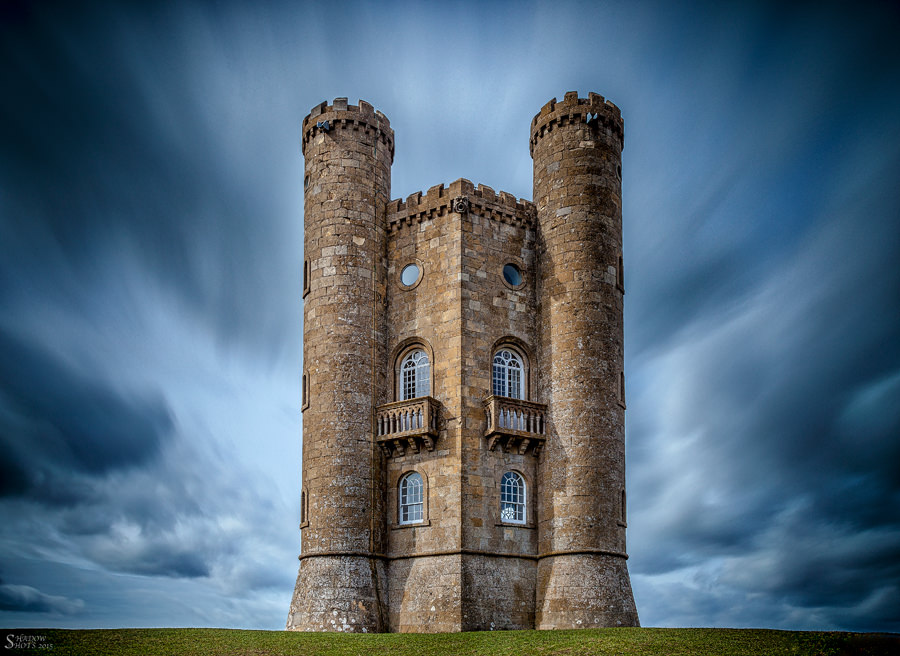
Broadway Tower

All depends on what you were trying to achieve.

For me its a little over processed and the shadows on the tower don't 'fit' well with the type of dramatic sky, where the sky appears to be lit from behind the tower.

Blend of two or more I presume?
 
I don't mean this in a bad way, but whats with RPS members and heavy vingettes? It seems to feature heavily in members work from that instituion.

Otherwise its a good shot a nice long exposure, strong contrast moody feel whilst rendering good detail. and nice to see corrected verticals rather than the usual converging rubbish you often get from this location.

Just lose the vingette, it doesn't do much to the shot and is very obviously put there.
 
Last edited:
Agree with the processing - looks a little bit like you pasted an image of a castle onto a moody background. The castle looks almost golden-lit whereas the sky is all dark and moody.
 
The shot is one exposure with a Big Lee Filter with the sun from approximately 7 o clock when looking at the shot.

I do not think the vignette is that harsh and was attempting to draw the attention to the central point of the shot and the castle.

Yes I have learnt about verticals now and hate the lean in other shots.

I like it myself and proves you cannot please everyone.
 
Last edited:
I like it I would be happy if I had taken this shot keep the good work up
 
I like the symmetry, and don't mind the vignetting (but I would use a little less perhaps).

I like a good mix of colour temps, but the sky does seem a bit blue in comparison.
 
I like it. The blue may need toning down a little, it doesn't look natural but adds to the dramatic sky. The vignette is ok for me, just enhances the castle even more. Like Nick i think mono could work well, but then i make most things mono so may be a little bias.
 
I like the symmetry, and don't mind the vignetting (but I would use a little less perhaps).

I like a good mix of colour temps, but the sky does seem a bit blue in comparison.

Thanks. I think the blue has come from the filter and whilst I could have toned it down, prefer the way it works.
 
I like it. The blue may need toning down a little, it doesn't look natural but adds to the dramatic sky. The vignette is ok for me, just enhances the castle even more. Like Nick i think mono could work well, but then i make most things mono so may be a little bias.

I know what you mean about mono and I have been through a phase of that recently so wanted my portfolio to have something different and in colour for a change.

I don't want to get bogged down! ;-)
 
I'm always confused by comments saying it looks unnatural, try mono???? Eh? What's that about?
 
I'm always confused by comments saying it looks unnatural, try mono???? Eh? What's that about?
Because its the blue colour that looks unnatural........ A black and white photo is going to look like a black and white photo, there are no colours to look unnatural.
 
But black and white as a whole is natural then? The whole thing will look unnatural. It just doesn't make any sense.
 
I disagree about the vignette. I think it helps draw you in. The average viewer isn't going to be looking at the edges of the frame they will be viewing the subject. I like it.

Agree with this entirely.
 
Nowt wrong with your shot Graham, nice image :clap:
Certainly got people talking about it !!
surely that's what Photography is all about ??

:canon:

:exit:
 
Last edited:
Yeah I know. I have nothing against mono I just don't get the comment. It looks a bit unnatural, convert to something that is totally unnatural. You see it often and it doesn't make any sense to me.
 
Black and white will look black and white, how its supposed to look.
I see my world in colour and I usually prefer to depict it that way.
 
Great image I read all the comments above and this still looks great :)


Gaz
 
Much better than my attempts to photograph the tower.

Obviously it is a very stylised photo with long exposure, heavy vignette and vivid blues, but that was what you were after and I like it. It pops.
 
Its a good image, the blue is a little overdone for my taste but thats a personal thing. I think its vignette is too heavy though, the tower has enough presence already to draw your eye without the almost black edges.

Is this the new fashion then vignetting like this, it reminds me of overcooked hdr! (not the image, the vignette)
 
Nowt wrong with your shot Graham, nice image :clap:
Certainly got people talking about it !!
surely that's what Photography is all about ??

:canon:

:exit:

Absolutely agree here. Now that I have the new version of LR CC I can possibly re-edit this with the vingnetting being reduced a little, especially on the bottom corners. The sky has been untouched from a colouring point of view but just a little contrast may have changed that, though I am sure the vingette has contributed.

Personally I am pleased with the shot as this was my first outing with the Big Stopper, so this kind of work just adds to my appetite to shoot more.

I also know that I cannot please everyone all the time, but I am happy. Keeps people guessing as well.

Thanks for all the feedback and I will grow.

I did like the comment regarding a 'new fashion' of photography....if only I could invent something new in this domain. ;-)

Is this the new fashion then vignetting like this, it reminds me of overcooked hdr! (not the image, the vignette)
 
I like it but the vignetting is a tad strong for me and taking some of it out might make the photo look more natural as it's the vignetting that appears to give the sky the mood.

Personally, I'd have input more foreground interest and even used a much lower angle - perhaps lying on the ground. Also if you were putting the castle in the center of the frame then it's a tad off. Overall I like the photo thought.
 
Back
Top