
You are using an out of date browser. It may not display this or other websites correctly.
You should upgrade or use an alternative browser.
You should upgrade or use an alternative browser.
Brown Brick Road
- Thread starter andiphoto
- Start date
- Messages
- 1,089
- Name
- Tumbleweed
- Edit My Images
- Yes
I like it. Path draws your eye in and there's plenty of interest which is neatly arranged (nothing distracting).")
- Messages
- 3,107
- Name
- Nick
- Edit My Images
- Yes
anymore C&C im scared incase this topic reaches the brink of bolivian without getting much Critique..
Freudian slip?? LOL

- Messages
- 3,278
- Name
- Andy
- Edit My Images
- Yes
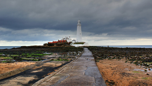
Looks good to me . There are some great vivid colours in there (whoever said; "It's grim oop north ?) and the dark clouds help the lighthouse to stand out from the background.
Funnily enough, I would have been tempted to try the opposite of what the previous commentator suggested and actually aim the camera more to the left, in order to concentrate on the more colourful and varied scenery there. This would also have the effect of pushing the lighthouse further into the right hand side of the picture, whilst still leaving a recognisable view of the path (I think ).
).
Would also be great to get a slightly higher vantage point for the shot, to allow a better view of the green weed and the red house roofs - so, take a step ladder next time (joking ).
. There are some great vivid colours in there (whoever said; "It's grim oop north ?) and the dark clouds help the lighthouse to stand out from the background.Funnily enough, I would have been tempted to try the opposite of what the previous commentator suggested and actually aim the camera more to the left, in order to concentrate on the more colourful and varied scenery there. This would also have the effect of pushing the lighthouse further into the right hand side of the picture, whilst still leaving a recognisable view of the path (I think
).Would also be great to get a slightly higher vantage point for the shot, to allow a better view of the green weed and the red house roofs - so, take a step ladder next time (joking
).- Messages
- 2,813
- Name
- Greg
- Edit My Images
- Yes
I really like the composition, and the colours to.
- Messages
- 206
- Name
- Neil
- Edit My Images
- Yes
It appears (to my eye at least) that the 'rule of thirds' is missing here. Is a crop possible for better composition?
Horizon almost central - lighthouse central - pathway central - and not much happening on the right hand side of the frame.
Having said all that, most of my shots are probably the same!
Love the reds greens blues and sandy browns though.
Horizon almost central - lighthouse central - pathway central - and not much happening on the right hand side of the frame.
Having said all that, most of my shots are probably the same!
Love the reds greens blues and sandy browns though.
- Messages
- 206
- Name
- Neil
- Edit My Images
- Yes
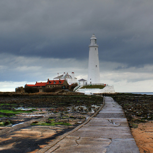
I think a bigger image would help also.RobertP
TPer Emeritus
- Messages
- 11,726
- Name
- Robert
- Edit My Images
- Yes
The central composition does not look too bad here. Thirds are usually better but it is not a set in stone rule.
The lead in path is the thing I don't like. It looks like you were walking along it and took a quick snap. A bit more thought with the camera position - maybe to the left so it leads in from the corner of frame or a bit lower viewpoint would have made a more constructed photo of it instead of a good snap.
The lead in path is the thing I don't like. It looks like you were walking along it and took a quick snap. A bit more thought with the camera position - maybe to the left so it leads in from the corner of frame or a bit lower viewpoint would have made a more constructed photo of it instead of a good snap.
OP
andiphoto
Knock-Off Nigel
- Messages
- 2,054
- Name
- Andrew
- Edit My Images
- No
thanks it was just a on the fly kinda picture... i was just walking toward the lighthouse and took it hand held..
i already said it did...
i was at work walking to the lighthouse (i word with disabled adults and people with learning difficulties.)
and i thought i would take a nice pic as the colours were nice..
OP
andiphoto
Knock-Off Nigel
- Messages
- 2,054
- Name
- Andrew
- Edit My Images
- No
nope.. is there....
i wish it was.. ill have a look.
There isnt any that look like the above picture.. you sure its Digital SLR Magazine..
http://www.digitalslrphoto.com/magazine/back-issue-archive.php
i wish it was.. ill have a look.
There isnt any that look like the above picture.. you sure its Digital SLR Magazine..
http://www.digitalslrphoto.com/magazine/back-issue-archive.php
Last edited: