

Hi all,
History:
Had an Epson stylus 880 circa the turn of the millennium. After the first set of genuine inks ran out I used some 3rd party ones, which were fine enough I guess. Never printed on photo paper, only Kodak 90gsm "bright white" (actually off-white) inkjet paper.
Eventually the printer gave up, printing blue horizontal lines about 12mm apart, all the way down the page. It had some issues with banding too, producing alternating lighter/darker bands. Finally decided to give up with it, opened it up and found a swamp of ink gunge inside it.
Moved on to a Canon PIXMA IP4300, just before the 4500 came out. ChromaLife100 CLI-8 genuine (as far as I can tell*) Canon inks were used always, with the same Kodak inkjet paper above and also Tesco "Extra White" (looks white) 90gsm inkjet paper, but more importantly a couple of prints on Canon Photo Paper Plus Glossy PP-101.
This printer recently gave up, with the dreaded 5-blinking amber flashes. Pulled the head out, ran warm water through it. Eventually started to work (after all the faint lines and banding went away - ink priming) and then wouldn't even print a document at all. Entered service menu and performed all sorts and no dice. It's now in parts heading for landfill.
*Inks bought from Amazon (sold by Amazon), 7dayshop and ValueShop (when they were actually legitimate, along time ago). As far as I could tell everything checked out, and was genuine.
I still have genuine Canon CLI-8 C+M+Y "Creative Pack", CLI-8 Yellow, and two CLI-8 BK carts sealed in plastic and in their boxes, unused and unopened. Canon have said there is no expiry, so if anyone wants these discounted, then message me and we'll work something out. Hopefully I am not breaking rules saying that. Please remove this offer if so.
Current Setup and Results:
We now have a PIXMA IP7250. Whilst I was less than happy about the idea of no rear sheet feeder, I couldn't justify the price of IX6850 A3+, we just don't have the wall space for A3 prints.
In use, it's not such a big deal, paper feeds in from the bottom tray print-side face down, and does a U-turn that our current UK government would be proud of, and comes out the front as expected.
Using a Dell u2415 IPS monitor, calibrated using a ColorMunki Display and ArgyllCMS/DisplayCal under Windows 7 Pro x64.
I have an X-rite 24-patch ColourChecker (for calibrating cameras/lenses and making RAW profiles) and have found the sRGB and AdobeRGB number values for the corresponding patches. Made an image in Photoshop and have checked the screen to the ColourChecker and it matches pretty darn well, except for the screen being back-lit, no real way to get 'thick' colour like a print.
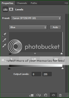
Printing onto Canon PP-101 (Photo Plus Glossy original) using a 16 bit sRGB image in Photoshop to the Canon XPS driver and letting the printer handle the colours (Photo Plus Glossy II / High Quality) produces a good looking image, with just a little tendency to put blues shades towards a greener hue, as well as perhaps adding a little extra magenta to skin tones. For a quick and simple fix I am simply using a Levels adjustment layer set to the blue channel setting black point to +5, white point to 250 (-5) and lifting the midpoint to 1.05. This makes things look a little cold on screen but fixes the printer colour fine.
Incidentally, it looks almost indistinguishable from output of the IP4300 it replaced.
Note: Leave paper to settle for at least 30 minutes before evaluating anything.. Darker yellows simply mush, blacks do not have any contrast and the whole image looks terribly soft when it comes out of the printer on this paper. If you check back, minute by minute it actually improves, as the ink moves to it's correct position in the paper coating structure. Best to evaluate the next day, leaving 12+ hours for it to settle, kept flat and without anything on top.
My overall impression of the PP-101 (and I guess PP-201) paper is that it gives a strong contrast and deep colour.
We've never been a fan of glossy 6x4 backs in the day, always going for the "pearl"/"lustre"/"semi-gloss" options where available.
So I now have some Canon SG-201 Photo Paper Plus Semi-Gloss on order to see how that works out comparatively.
A complete set of genuine Canon XL ink cartridges is on it's way too, so plenty of ink to experiment with.
Questions:
Paper
Whilst the Canon paper is 'guaranteed' to work with the printer, and the manual even goes so far as to advise against using any kind of non-Canon photo/art papers (BS!) I would like to see how things work out with something a bit more "premium" for want of a better word.
I have been in contact with a chap who has used the following with this printer:
Ilford Galerie Prestige Gold Mono Silk (270 gsm / 0.265 mm)
Ilford Galerie Prestige Smooth Pearl (310 gsm / 0.31 mm)
Fotospeed Photo Smooth Pearl (290 gsm / 0.29 mm)
What are people's experiences with non-Canon paper and this printer? How have the free ICC profiles worked out or the profiling service (eg. Fotospeed) actually performed?
Has anyone tried any Photo Rag matte papers? I fear that the 'Giclee Fine Art standard' Hahnemühle 308 (0.48mm) maybe just too resistant to bending to do the 180-turn, but the 188 gsm (0.30 mm) variant maybe fine, as well as the warmer Matt Fibre 200 (0.30 mm). The surface of these matte papers maybe also be an issue for such a consumer low-end printer, and may require the maintenance option "prevent paper abrasion" turned on.
I have 50X 6x4" Canon GP-501? from a value pack with ink. Again, glossy but a more budget version.
I also have a Permajet sample pack from a magazine, 5X 7x5" Oyster 271 gsm and 5X 7x5" Gloss 271 gsm.
Ink
So far I am on genuine Canon ink, but how have people got on with 3rd party inks?
For regular inkjet paper I doubt it makes a huge difference, maybe clogs a bit quicker, but for photo prints I would expect Canon to perform better. I suppose there are better quality ink manufacturers out there rather than Joe-no-name brand on a popular auction site.
Someone else to do the prints
What Fine Art Giclee printer services have people used and how do they fair?
I was considering just buying a mono-chrome laser printer for documents and having all of the photo prints done somewhere else. But we are picky and I can see us having nightmares with prints not delivering what I send. Then there is the issue where what I think I see on screen is actually not what I really am seeing - ya know this whole thing where ya spend a lot of time editing an image in isolation, only to realise you've made the skin dark orange, which looked nice and warm on screen, but awful on print. Then when you check back to screen you realise just how orange it really is! This is happening quite a bit - not printing anything for a long time leads to having a warped sense of what the image looks like.
History:
Had an Epson stylus 880 circa the turn of the millennium. After the first set of genuine inks ran out I used some 3rd party ones, which were fine enough I guess. Never printed on photo paper, only Kodak 90gsm "bright white" (actually off-white) inkjet paper.
Eventually the printer gave up, printing blue horizontal lines about 12mm apart, all the way down the page. It had some issues with banding too, producing alternating lighter/darker bands. Finally decided to give up with it, opened it up and found a swamp of ink gunge inside it.
Moved on to a Canon PIXMA IP4300, just before the 4500 came out. ChromaLife100 CLI-8 genuine (as far as I can tell*) Canon inks were used always, with the same Kodak inkjet paper above and also Tesco "Extra White" (looks white) 90gsm inkjet paper, but more importantly a couple of prints on Canon Photo Paper Plus Glossy PP-101.
This printer recently gave up, with the dreaded 5-blinking amber flashes. Pulled the head out, ran warm water through it. Eventually started to work (after all the faint lines and banding went away - ink priming) and then wouldn't even print a document at all. Entered service menu and performed all sorts and no dice. It's now in parts heading for landfill.
*Inks bought from Amazon (sold by Amazon), 7dayshop and ValueShop (when they were actually legitimate, along time ago). As far as I could tell everything checked out, and was genuine.
I still have genuine Canon CLI-8 C+M+Y "Creative Pack", CLI-8 Yellow, and two CLI-8 BK carts sealed in plastic and in their boxes, unused and unopened. Canon have said there is no expiry, so if anyone wants these discounted, then message me and we'll work something out. Hopefully I am not breaking rules saying that. Please remove this offer if so.
Current Setup and Results:
We now have a PIXMA IP7250. Whilst I was less than happy about the idea of no rear sheet feeder, I couldn't justify the price of IX6850 A3+, we just don't have the wall space for A3 prints.
In use, it's not such a big deal, paper feeds in from the bottom tray print-side face down, and does a U-turn that our current UK government would be proud of, and comes out the front as expected.
Using a Dell u2415 IPS monitor, calibrated using a ColorMunki Display and ArgyllCMS/DisplayCal under Windows 7 Pro x64.
I have an X-rite 24-patch ColourChecker (for calibrating cameras/lenses and making RAW profiles) and have found the sRGB and AdobeRGB number values for the corresponding patches. Made an image in Photoshop and have checked the screen to the ColourChecker and it matches pretty darn well, except for the screen being back-lit, no real way to get 'thick' colour like a print.
Printing onto Canon PP-101 (Photo Plus Glossy original) using a 16 bit sRGB image in Photoshop to the Canon XPS driver and letting the printer handle the colours (Photo Plus Glossy II / High Quality) produces a good looking image, with just a little tendency to put blues shades towards a greener hue, as well as perhaps adding a little extra magenta to skin tones. For a quick and simple fix I am simply using a Levels adjustment layer set to the blue channel setting black point to +5, white point to 250 (-5) and lifting the midpoint to 1.05. This makes things look a little cold on screen but fixes the printer colour fine.
Incidentally, it looks almost indistinguishable from output of the IP4300 it replaced.
Note: Leave paper to settle for at least 30 minutes before evaluating anything.. Darker yellows simply mush, blacks do not have any contrast and the whole image looks terribly soft when it comes out of the printer on this paper. If you check back, minute by minute it actually improves, as the ink moves to it's correct position in the paper coating structure. Best to evaluate the next day, leaving 12+ hours for it to settle, kept flat and without anything on top.
My overall impression of the PP-101 (and I guess PP-201) paper is that it gives a strong contrast and deep colour.
We've never been a fan of glossy 6x4 backs in the day, always going for the "pearl"/"lustre"/"semi-gloss" options where available.
So I now have some Canon SG-201 Photo Paper Plus Semi-Gloss on order to see how that works out comparatively.
A complete set of genuine Canon XL ink cartridges is on it's way too, so plenty of ink to experiment with.
Questions:
Paper
Whilst the Canon paper is 'guaranteed' to work with the printer, and the manual even goes so far as to advise against using any kind of non-Canon photo/art papers (BS!) I would like to see how things work out with something a bit more "premium" for want of a better word.
I have been in contact with a chap who has used the following with this printer:
Ilford Galerie Prestige Gold Mono Silk (270 gsm / 0.265 mm)
Ilford Galerie Prestige Smooth Pearl (310 gsm / 0.31 mm)
Fotospeed Photo Smooth Pearl (290 gsm / 0.29 mm)
What are people's experiences with non-Canon paper and this printer? How have the free ICC profiles worked out or the profiling service (eg. Fotospeed) actually performed?
Has anyone tried any Photo Rag matte papers? I fear that the 'Giclee Fine Art standard' Hahnemühle 308 (0.48mm) maybe just too resistant to bending to do the 180-turn, but the 188 gsm (0.30 mm) variant maybe fine, as well as the warmer Matt Fibre 200 (0.30 mm). The surface of these matte papers maybe also be an issue for such a consumer low-end printer, and may require the maintenance option "prevent paper abrasion" turned on.
I have 50X 6x4" Canon GP-501? from a value pack with ink. Again, glossy but a more budget version.
I also have a Permajet sample pack from a magazine, 5X 7x5" Oyster 271 gsm and 5X 7x5" Gloss 271 gsm.
Ink
So far I am on genuine Canon ink, but how have people got on with 3rd party inks?
For regular inkjet paper I doubt it makes a huge difference, maybe clogs a bit quicker, but for photo prints I would expect Canon to perform better. I suppose there are better quality ink manufacturers out there rather than Joe-no-name brand on a popular auction site.
Someone else to do the prints
What Fine Art Giclee printer services have people used and how do they fair?
I was considering just buying a mono-chrome laser printer for documents and having all of the photo prints done somewhere else. But we are picky and I can see us having nightmares with prints not delivering what I send. Then there is the issue where what I think I see on screen is actually not what I really am seeing - ya know this whole thing where ya spend a lot of time editing an image in isolation, only to realise you've made the skin dark orange, which looked nice and warm on screen, but awful on print. Then when you check back to screen you realise just how orange it really is! This is happening quite a bit - not printing anything for a long time leads to having a warped sense of what the image looks like.
")