- Messages
- 1,897
- Name
- mark
- Edit My Images
- No
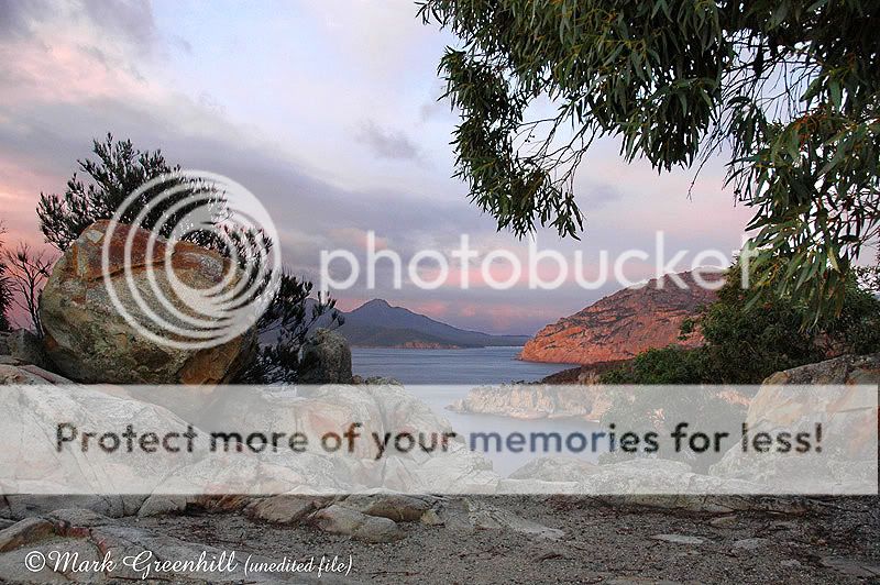
I slept in my car overnight to catch the sunrise on the red granite cliffs.

Hi Rob, Here's the untweaked original as requested. As the first rays of sun lit the scene the overall light was still quite flat.
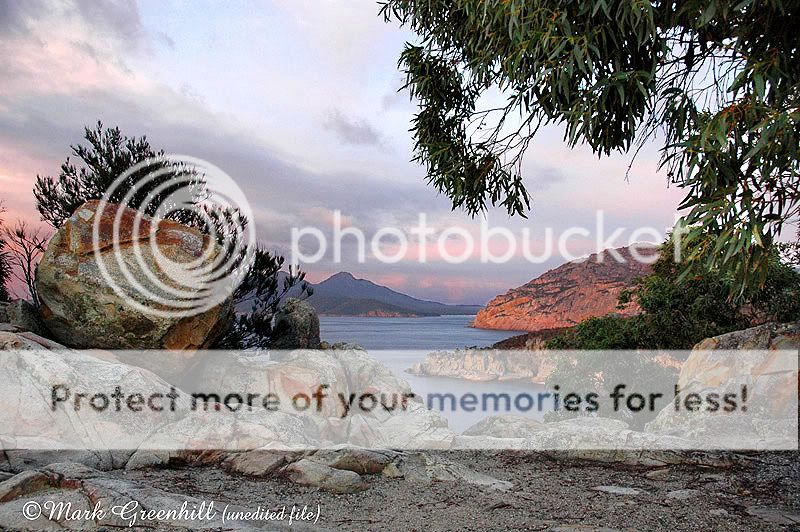
I have to correct my previous thread, it appears that I may have actually darkened the foreground -
certainly I have added contrast and saturation. In editing pictures I work intuitively and keep no record of what I have actually done.
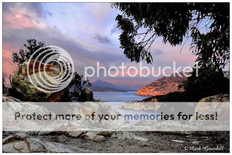
Thanks Rob, I guess if we were to log every edit we did we would end up with terabytes of data. Toby is right about the foliage being too blocky.You're gonna hate me, but having seen the original I now prefer the edited version. FWIW I'm the same, if I do edit a shot there's a good chance that 20 minutes after the event I won't be able to tell you what I did.
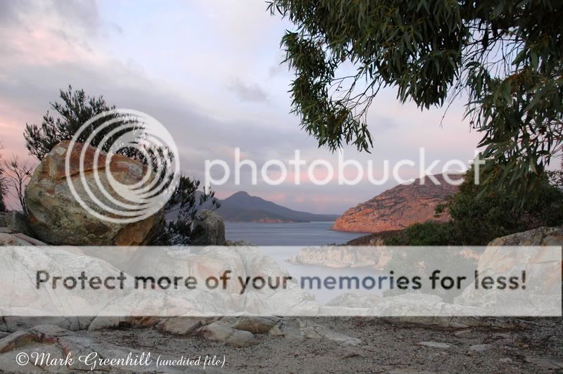
Thanks MisterE, In retrospect I think the foreground in the original looks better than my edit.I personally don't see a problem with the foreground. It looks well balanced. Great picture.