

You are using an out of date browser. It may not display this or other websites correctly.
You should upgrade or use an alternative browser.
You should upgrade or use an alternative browser.
Critique Cassidy & Ollie
- Thread starter gbmphoto
- Start date


sunnyside_up
<span class="poty">POTY (Joint) 2016</span>
- Messages
- 3,622
- Name
- Bethy
- Edit My Images
- No
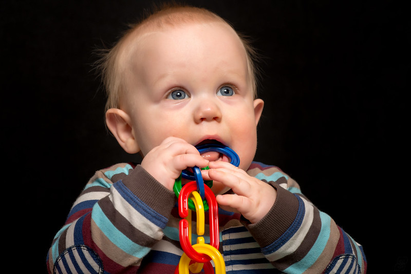
I love Cassidy's pic and all the colours! Although some might find it to be a distraction, I find it adds to the 'chirpiness' of the photo.
I'm afraid the first doesn't work for me. Just seems a bit flat to me. Just my opinion though. Don't think there's anything you can do about that at this point.
I'm afraid the first doesn't work for me. Just seems a bit flat to me. Just my opinion though. Don't think there's anything you can do about that at this point.
sunnyside_up
<span class="poty">POTY (Joint) 2016</span>
- Messages
- 3,622
- Name
- Bethy
- Edit My Images
- No
Thanks for commenting
Bethy, I'd like to know a bit more why you think it's flat? Is it the black background, the skin tones, boring clothing, bad lighting, etc.?
I suppose what I mean was there doesn't seem to be enough dimension to it... I can't nail it down to one thing in particular, perhaps it's the black background that's giving me that feeling...? Sorry, I should have explained that in my original post. My bad.
")
Don't get me wrong, it's a great shot... but personally, for me, it doesn't do anything for me, comparatively speaking against the second shot.
OP
- Messages
- 1,564
- Name
- Graham
- Edit My Images
- No
Thanks Bethy and John.
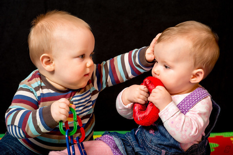
Interestingly, the parents both chose that one as their favourite although I wouldn't have chosen that one specifically. That's why I'm keen to hear what you guys think. They said it most represents how he is (smiling and laughing).
Interestingly, the parents both chose that one as their favourite
although I wouldn't have chosen that one specifically. That's why I'm keen to hear what you guys think. They said it most represents how he is (smiling and laughing).- Messages
- 2,777
- Name
- Drake
- Edit My Images
- Yes
Very nice!
OP
- Messages
- 1,564
- Name
- Graham
- Edit My Images
- No
sunnyside_up
<span class="poty">POTY (Joint) 2016</span>
- Messages
- 3,622
- Name
- Bethy
- Edit My Images
- No
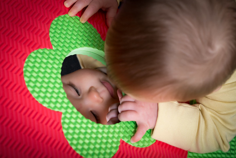
Love love LOVE the third one again! I think it's the colours for me that are ticking the boxes...