Cat

Hmm, for me the background is too busy and takes the focus away from the cat. I'm also wondering if colour versions would look better?
 
Hmmm I like the idea quite a bit and the composition of the first one. I think what is letting you down is the colour of the cat! He/She sort of blends in with the background for B&W which may indeed do better in colour.
 
I have to agree with Jojo on this one, the background domiates the shot far too much IMO. The technical ability is definately there as you seem to have taken some very nicely exposed shots in what look like difficult lighting conditions :)clap:) but unfortunately the cat is a little lost in the details.
 
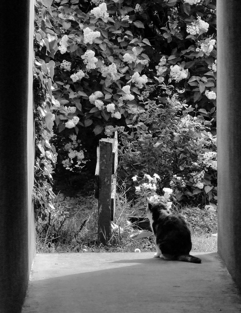
I would have liked the cat bigger but if I'd zoomed in any more, I would have lost the nice framing by the walkway. I changed it to b&w because the colours were too busy - the flowers are white, the cat is white and orange and black, and lots of greens going on - I felt it was too much and still drew focus away from the cat, so I thought I'd go mono and focus on a better 'atmosphere' from the shot. I think I still have a colour version on the mac, I'll have a look and post it if I do...

Thanks for the feedback!
 
Back
Top