

You are using an out of date browser. It may not display this or other websites correctly.
You should upgrade or use an alternative browser.
You should upgrade or use an alternative browser.
Color vs. B&W
- Thread starter CC92713
- Start date


- Messages
- 1,156
- Name
- Chris
- Edit My Images
- No
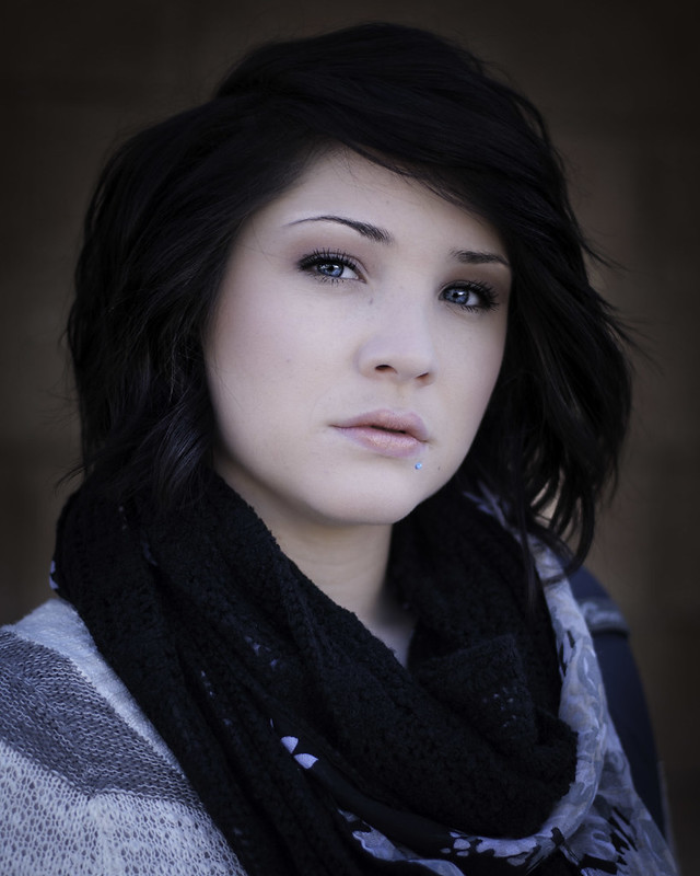
I also think the colour is better - but only because I also think that the cheeks in the B&W look too bright, whereas in the colour version there is some change of colour giving them shape.
Also .... are the eyes in perfect focus? I ask because the woollen thingy in the bottom LH corner seems to be sharply in focus - so I was wondering about the depth of field. Not sure myself
Good portrait though
Also .... are the eyes in perfect focus? I ask because the woollen thingy in the bottom LH corner seems to be sharply in focus - so I was wondering about the depth of field. Not sure myself
Good portrait though
- Messages
- 3,480
- Name
- Marcus
- Edit My Images
- Yes
Can I buck the trend here little? The black and white is definitely blown so would revisit that, but would suggest the colour is blown slightly losing all texture in the skin. What I've been scratching my head about on both images is the bright face, then the bright-ish hair at the front surrounding her face, then the dark hair all around where most of the detail is lost, then a halo type effect around all of it. I think the effects described spoil what could have been an outstanding image. Could you post up the original?
Colour by the way out of the two. That blue deffo complements the eyes.
Colour by the way out of the two. That blue deffo complements the eyes.
The colour is nicer but they are both overprocessed. The skin is unnaturally smooth. It's evident in the colour version, but the b&w just makes it even more intense.
Also, as others have said, there's a big halo around her head. Again, this is visible in the colour image but really stands out in the black and white.
What did the original look like?
Also, as others have said, there's a big halo around her head. Again, this is visible in the colour image but really stands out in the black and white.
What did the original look like?
- Messages
- 25,330
- Name
- Phil
- Edit My Images
- No
I tried very hard, I have left this thread half a dozen times without comment.I do like my photos on the brighter sideI did a quick re edit now that I see some of the things pointed out... not sure if its 'better' or not

Two words over processed.
I've no idea what makes people do this, but human skin has pores, and human eyes are never sharp enough to cut steak with. Just because it's possible to turn a perfectly pretty girl into a mannequin, it doesn't mean we should do it.
There were plenty of clues that the earlier version was over processed, why would you show us one that has even more processing?
OP
- Messages
- 298
- Name
- Christian Elizabeth
- Edit My Images
- Yes
I tried very hard, I have left this thread half a dozen times without comment.
Two words over processed.
I've no idea what makes people do this, but human skin has pores, and human eyes are never sharp enough to cut steak with. Just because it's possible to turn a perfectly pretty girl into a mannequin, it doesn't mean we should do it.
There were plenty of clues that the earlier version was over processed, why would you show us one that has even more processing?
At least you have viewed my photo half a dozen times I can not remember where I heard this but the saying was getting your work noticed is what's important not everyone is going to like every photo you take but at least its standing out.
... haha anyways I do appreciate what I get from this forum and I did tone down the processing. here is the original... this was just a test shot foe a shoot I was doing for a friend and I think its a little over exposed but I liked it.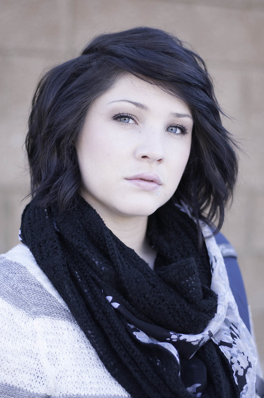

Last edited:
- Messages
- 3,480
- Name
- Marcus
- Edit My Images
- Yes
How dis den for a quick exposure adjustment?

13092795634_6b273cbff5_c edit for other by Marcus Charter, on Flickr
13092795634_6b273cbff5_c edit for other by Marcus Charter, on Flickr
sunnyside_up
<span class="poty">POTY (Joint) 2016</span>
- Messages
- 3,622
- Name
- Bethy
- Edit My Images
- No
At least you have viewed my photo half a dozen times I can not remember where I heard this but the saying was getting your work noticed is what's important not everyone is going to like every photo you take but at least its standing out.
I prefer the colour version you've posted here...
I'm not suggesting this as an edit, but there's a lot of detail still in the original jpg you uploaded you could use to process differently. Both eyes are nicely in focus, sharp enough already and nicely coloured - the pose works too. Below is the original small jpg with just the adjustments shown in liightroom.
*exposure was -1; didn't spot the tooltip covering the number on the screen grab!
View attachment 7623 View attachment 7624
*exposure was -1; didn't spot the tooltip covering the number on the screen grab!
View attachment 7623 View attachment 7624
I agree with others comments about the processing, but if the original was slightly over exposed in a flat light environment, theres not too much you can do in terms of shadow retrieval anyway to give depth.
However, personally I'd like to see a low contrast mono conversion of the original, with a full stop of exposure removed from it. If it looks good, then start to play with the contrast, but keep the image a true representation of the subject, otherwise you might have well just drawn the image instead of used a camera to take it.
However, personally I'd like to see a low contrast mono conversion of the original, with a full stop of exposure removed from it. If it looks good, then start to play with the contrast, but keep the image a true representation of the subject, otherwise you might have well just drawn the image instead of used a camera to take it.