

You are using an out of date browser. It may not display this or other websites correctly.
You should upgrade or use an alternative browser.
You should upgrade or use an alternative browser.
Copper Lion
- Thread starter Jao
- Start date
- Messages
- 6,964
- Name
- Phil
- Edit My Images
- Yes
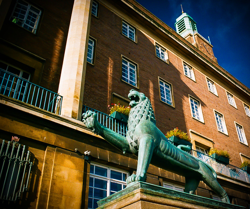
Not sure if you wanted C&C - if not ignore!
Interesting colours although over-saturated for my taste. A nice sharp photo but the composition isn't great - shooting from below gives a dramatic perspective but in this case it's given an untidy and distracting background.
Phil
Interesting colours although over-saturated for my taste. A nice sharp photo but the composition isn't great - shooting from below gives a dramatic perspective but in this case it's given an untidy and distracting background.
Phil
Asha
Blithering Idiot
- Messages
- 11,274
- Name
- Asha
- Edit My Images
- Yes
Well it's in the critique section so presumably that is what the man wants...in a constructive way of course!")
Pretty much agree with Phil although I don't personally find the colours over saturated.
The BG is "busy" which is a shame as it doesn't help to show off the lion to its best, but to be fair, if the planters, buildings etc are there then short of cloning everything out / severe manipulation of the image, I don't really see how else the shot could have been taken.
I don't know the Exif but even if shot with a very shallow DoF, the "busy ness" would still be very apparent.
Imo, if anything, the BG offers the viewer to see a little of the environment that the lion is set in and with having some sky in the shot, shows that the UK does occasionally have cloudless days!
The fact that the clock tower is also copper?? and the same colouring as the lion does help to "pull" the shot together if you understand what I mean.
OP
- Messages
- 3,935
- Name
- Adrian
- Edit My Images
- Yes
Not sure if you wanted C&C - if not ignore!
Interesting colours although over-saturated for my taste. A nice sharp photo but the composition isn't great - shooting from below gives a dramatic perspective but in this case it's given an untidy and distracting background.
Phil
Phil, C&C always welcome and appreciated. I am just please that anyone looks at my images
. In terms of the shot though I knew the saturation might not be everyones cup of tea. I do tend to like vivid colours! That said I have just looked at the image on someone elses computer screen and I can see that I might need to revisit the setting on mine. I will keep it vivid but do plan to tone it down a little.
In terms of the composition I agree the background is very busy. I like some of the lines in the scene and where I have placed the lion, but here are too many distractions probably.
I do intend to go back and reshoot this and will bare in mind your comments when I do.
Well it's in the critique section so presumably that is what the man wants...in a constructive way of course!
Pretty much agree with Phil although I don't personally find the colours over saturated.
The BG is "busy" which is a shame as it doesn't help to show off the lion to its best, but to be fair, if the planters, buildings etc are there then short of cloning everything out / severe manipulation of the image, I don't really see how else the shot could have been taken.
I don't know the Exif but even if shot with a very shallow DoF, the "busy ness" would still be very apparent.
Imo, if anything, the BG offers the viewer to see a little of the environment that the lion is set in and with having some sky in the shot, shows that the UK does occasionally have cloudless days!
The fact that the clock tower is also copper?? and the same colouring as the lion does help to "pull" the shot together if you understand what I mean.
Asha, Thanks too for your comments and taking the time to offer them. You are right about the busy background and the planters are perhaps the biggest distraction. I do use PP to play with colour, light and sharpness but have not ventured into cloning and I suspect this image would not be the best place to start

The EXIF is from the scanner that read the negative because this is a shot from film. My mental EXIF file
recalls that the shot was taken at f11. Thanks for your comments about the overall image and context. I was trying to place the lion in the context of it's surroundings, I also love the copper all over this pre war City Hall.
On reflection and based on yours and Phil's comments I will revist the location and reshoot this but perhaps try as you suggest to use a much shallower depth of field to try and isolate the subject a bit more. The advantage of it being made of copper is that it at least doesn't move!
Agains thanks both for the critique, it can only help me get better
- Messages
- 6,230
- Name
- Charles
- Edit My Images
- No
Hi Aiden
Have to agree with cmments above.
If going back I'd be after the lion, which looks to have interesting textures filling the frame and the bg pretty much Oof and try to get up a little higher so that the building, and no sky, is the only bg.
Have to agree with cmments above.
If going back I'd be after the lion, which looks to have interesting textures filling the frame and the bg pretty much Oof and try to get up a little higher so that the building, and no sky, is the only bg.
Asha
Blithering Idiot
- Messages
- 11,274
- Name
- Asha
- Edit My Images
- Yes
place to start
The EXIF is from the scanner that read the negative because this is a shot from film. My mental EXIF file
:
Aha I didn't realise it was shot on film....I know you frequent F&C regularly ( like myself!) but assumed you had gone out and shot some digi for a change.
Just for your info there is a specific critique section for film shots if you wanted to post future scans there.
OP
- Messages
- 3,935
- Name
- Adrian
- Edit My Images
- Yes
Asha, yes I do frequent the F&C forum, it is great and probably where I feel most at home! I love film, but I do love digital as well and I see them as very connected. Making the final image is the goal, whatever the route to get there.
That's why I chose to post the image in the Architecture and Urban section. That seemed to be the place to post the image. It struck me that the subject was more important than than the medium.
I am not sure what others will think of that, but I am working on the assumption that the feedback and critique sections are not exclusively digital. I might be wrong though and don't want to do the wrong thing. I am not new to photography but am relatively new to the online world of forums.
Asha
Blithering Idiot
- Messages
- 11,274
- Name
- Asha
- Edit My Images
- Yes
I chose to post the image in the Architecture and Urban section. That seemed to be the place to post the image. It struck me that the subject was more important than than the medium.
I am not sure what others will think of that, but I am working on the assumption that the feedback and critique sections are not exclusively digital. I might be wrong though and don't want to do the wrong thing. I am not new to photography but am relatively new to the online world of forums.
I don't think you would upset anyone.
Tbh I'm not sure if the c&c sections are exclusively digital or not unless specicfically listed as for film.... I guess there will be something listed in the "TP Bible of Rules"
but as it's sunday morning, I doubt my eyes will be happy being forced to read through I'm sure someone will come along and guide us....