

You are using an out of date browser. It may not display this or other websites correctly.
You should upgrade or use an alternative browser.
You should upgrade or use an alternative browser.
couple of shots from a shoot last night
- Thread starter s-leeson
- Start date
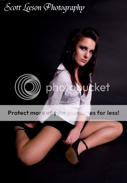
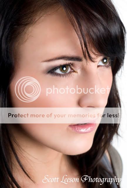

 No2 is streets ahead of No1!
lukewoodford
FYI, I am Luke Woodford.....by Luke Woodford
- Messages
- 3,320
- Name
- Luke Woodford
- Edit My Images
- No
Yeah awkwardness can be good but I dont think it works in 1, however number 2 is great.
lukewoodford
FYI, I am Luke Woodford.....by Luke Woodford
- Messages
- 3,320
- Name
- Luke Woodford
- Edit My Images
- No
i must say i like 1, i like the positioning, but i do prefer 2
If you like it and she likes it thats all that really matters mate
")
OP
- Messages
- 359
- Name
- scott leeson
- Edit My Images
- Yes
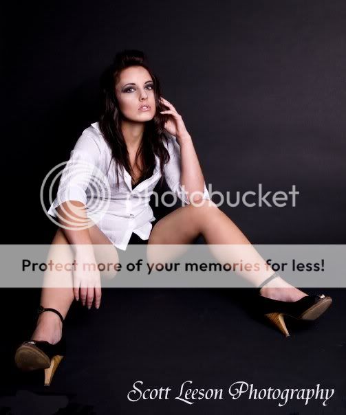
the 3rd shot wasn't meant to be a beauty shot, it was meant to be a different kind of shot to stand out. it wasn't planned to be flattering as such, but many pictures in magazines aren't flattering, but still look good, we both like the pic because of the attitude it shows.
we both like the pic because of the attitude it shows.
Then you dont need our opinions
- Messages
- 5,092
- Name
- James
- Edit My Images
- No
I agree with comments on 1 and 3. I know you were trying for that kind of shot in 3, and I like the face, but it does come across as a bit of a crotch shot. I'm not keen on how the shorts disappear to complete black in 1 and 3, but I guess that could be partly due to the web compression.
Number 2 is nice, though I find the fingers a little odd at the edge of the frame.
Number 2 is nice, though I find the fingers a little odd at the edge of the frame.
- Messages
- 1,520
- Name
- Rob
- Edit My Images
- Yes
I agree with comments about the pose in one, and 3, I'm afraid doesn't do much for me.
I really like 2 though. Striking eyes.
Did you do any airbrushing type bits in 1? It may just me me, but it looks like I can see brush type strokes on the skin of her left thigh :shrug:
I really like 2 though. Striking eyes.
Did you do any airbrushing type bits in 1? It may just me me, but it looks like I can see brush type strokes on the skin of her left thigh :shrug:
- Messages
- 464
- Name
- Jake Yorath
- Edit My Images
- Yes
I actually like the awkward angle of #1. Number 3 would likely depend on the personality of the subject. I suppose if she liked it, then you captured her personality quite well.
*ahem*...
2 for me, engaging eyes worked for me.
- Messages
- 556
- Edit My Images
- No
2 for me! numb 1 looks like some one has twisted round. just my opinion *** realy good shots ***!
EdinburghGary
Reply not Report
- Messages
- 19,065
- Name
- Gary
- Edit My Images
- Yes
2 I like a lot.
lukewoodford
FYI, I am Luke Woodford.....by Luke Woodford
- Messages
- 3,320
- Name
- Luke Woodford
- Edit My Images
- No
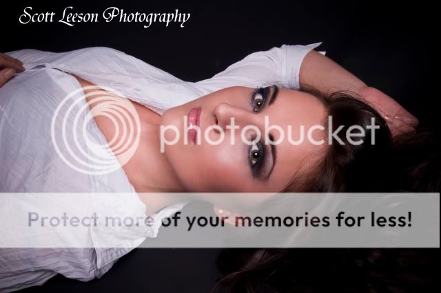
The last one is fantastic.
- Messages
- 1,270
- Name
- Garry Ure
- Edit My Images
- Yes
1 2 and 4 for me. I sort of like 3 but the black void of crotch is a bit unflattering. You've got great control over the light and you obviously know what works when it comes to posing and composition. Not a lot else to add really, apart from the fact that I not a fan of your logo (think it's the font/weight combo).
lukewoodford
FYI, I am Luke Woodford.....by Luke Woodford
- Messages
- 3,320
- Name
- Luke Woodford
- Edit My Images
- No
One thing to mention, I notice you dont maintain the ratio when you crop, it makes printing alot easier, just a thought.