

You are using an out of date browser. It may not display this or other websites correctly.
You should upgrade or use an alternative browser.
You should upgrade or use an alternative browser.
Cropping advice
- Thread starter RKC
- Start date
 Velator -
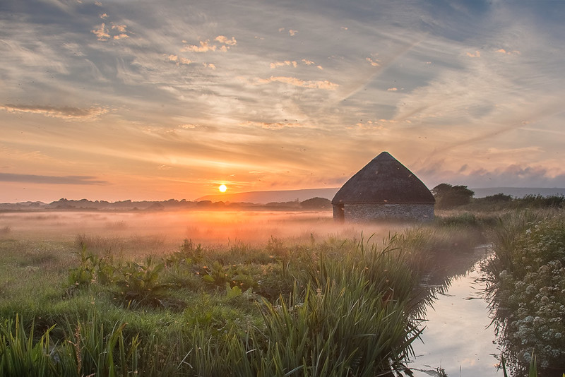 Velator 2-
- Messages
- 1,080
- Name
- Shaun
- Edit My Images
- Yes
I would go with number 2 as the I like the mist, but in doing so the birds now begin to distract as they now become more prominent may be a bit of PP
- Messages
- 20,926
- Name
- Steve
- Edit My Images
- Yes
Sensor dirt and fringing detract here but two compositionally is better althhiugh I like the foreground of one better. Great light and subject, which is good to see
- Messages
- 2,940
- Name
- Marie
- Edit My Images
- No
#2 has too much sky and not enough f/g for me, so I prefer #1.
I didn't really notice the road, but you could just clone it out if it annoys you.
I didn't really notice the road, but you could just clone it out if it annoys you.
- Messages
- 1,406
- Name
- Carol
- Edit My Images
- Yes
Love them both but number one just gets it for me, I love the way the flowers are your initial pof which leads you nicely to the water then up towards the building around to the sun and the light playing lovingly on the mist. Your eye is lead around the whole photograph from right to left with ease, the road is not a distraction and to be honest did not even notice it! The colours are wonderfully strong but not too over powering the mist adds a softness to the whole scene.
I feel number 2 is too tight in the frame and slightly too much sky and the loss of the flowers at the bottom of the frame has made it just so so for me but that is only my pov and everyone will have their own thoughts.
Great work!
I feel number 2 is too tight in the frame and slightly too much sky and the loss of the flowers at the bottom of the frame has made it just so so for me but that is only my pov and everyone will have their own thoughts.
Great work!
Last edited:
- Messages
- 1,216
- Name
- Graham
- Edit My Images
- Yes
Both of them are lovely images but I prefer number ome with water in the foreground.
OP
- Messages
- 4,341
- Name
- Bob
- Edit My Images
- Yes
Both have their strengths in my view - I especially like the water in the first and don't think that the road detracts from it")
I don't think the road particularly detracts, however for me the foreground foliage does. The second works better for me as the eye is drawn straight into the building, the sky and the light playing in the mist.
I would go with number 2 as the I like the mist, but in doing so the birds now begin to distract as they now become more prominent may be a bit of PP
Like them both number 1 for me. Agree with Kevin about the water and the road. Don't mind the foliage in the foreground it seems to lead my eye around to the building.
Sensor dirt and fringing detract here but two compositionally is better althhiugh I like the foreground of one better. Great light and subject, which is good to see
No 1 for me, I prefer the foreground at ST4 says and I would never have noticed the road if you hadn't mentioned it.
#2 has too much sky and not enough f/g for me, so I prefer #1.
I didn't really notice the road, but you could just clone it out if it annoys you.
#1 for me. In #2, I'm drawn only to the hut / building and don't see the surroundings
Love them both but number one just gets it for me, I love the way the flowers are your initial pof which leads you nicely to the water then up towards the building around to the sun and the light playing lovingly on the mist. Your eye is lead around the whole photograph from right to left with ease, the road is not a distraction and to be honest did not even notice it! The colours are wonderfully strong but not too over powering the mist adds a softness to the who scene.
I feel number 2 is too tight in the frame and slightly too much sky and the loss of the flowers at the bottom of the frame has made it just so so for me but that is only my pov and everyone will have their own thoughts.
Great work!
Both of them are lovely images but I prefer number ome with water in the foreground.
Wow thank you for the feedback it is very much appreciated, I am trying more landscape this year and your feedback is encouraging
been looking it again and think I do prefer first image, perhaps I could see the road as I knew it was there as most of you did not see it if I had not mentioned it, it could probably be cloned out with a bit of care.
Birds not sure could be dirty sensor @ST4 is that your thoughts dirty sensor? Fringing is what you mean the areas around the edge of the hut and dunes in the background?
- Messages
- 20,926
- Name
- Steve
- Edit My Images
- Yes
Look at the dark spots in the sky in your image. Sensor needs a damned good clean
OP
- Messages
- 4,341
- Name
- Bob
- Edit My Images
- Yes
Look at the dark spots in the sky in your image. Sensor needs a damned good clean
Just had a look and yes need to get the blower out see how much that removes
OP
- Messages
- 4,341
- Name
- Bob
- Edit My Images
- Yes
for me the road is not a problem but I would cut a bit from the bottom , must say I love the tones in this picture it sets a real nice mood for me
I'm another who prefers the first image I like the foreground and it just feels like a better balanced image.
But yes, the hut does have a narrow but bright halo.
Thank you for feedback need to some editing