
You are using an out of date browser. It may not display this or other websites correctly.
You should upgrade or use an alternative browser.
You should upgrade or use an alternative browser.
The TP52 - 2026 Darkslinger's 52 for 26
- Thread starter Darkslinger
- Start date


- Messages
- 5,597
- Name
- Kell
- Edit My Images
- Yes
The geometry set is exceptional. I do like buildings, and B&W, and heavy contrasts so they tick all the boxes for me. I'd have had a hard time deciding.
Same is true of the hobby set. Some really great images there. I think I'm with Dave in that I like the Columbine - partly because it looks so alien.
Same is true of the hobby set. Some really great images there. I think I'm with Dave in that I like the Columbine - partly because it looks so alien.

OP

- Messages
- 5,208
- Name
- bill
- Edit My Images
- Yes
Thanks Allan.A good set of images I particularly like the rain shot.
Yeah, I see itNice set Bill. Something Alien about that Columbine
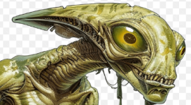
Thanks NickI could have gone for any of those. Your chosen shot seems like an outlier among them, but it works nicely.
Thank you SimonSome great shots there Bill!
Thanks Dominic, I wish that gardening had been my job.Geometry
A great set of images there.
Hobbies
Another good set of images.
I thought about using gardening as my hobby subject, but thought, It's also my job so I'll have to use one of my other hobbies.
LOL, thanks KellThe geometry set is exceptional. I do like buildings, and B&W, and heavy contrasts so they tick all the boxes for me. I'd have had a hard time deciding.
Same is true of the hobby set. Some really great images there. I think I'm with Dave in that I like the Columbine - partly because it looks so alien.
Thank you KeithGood. set Bill and agree with your choice with the rain drops
OP
- Messages
- 5,208
- Name
- bill
- Edit My Images
- Yes
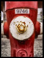
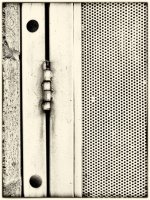
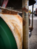
Week 22 Weathered Surfaces
A few shots from the local town of Cloverdale
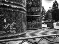
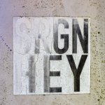
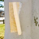
And a couple from White Rock
A few shots from the local town of Cloverdale
And a couple from White Rock
Last edited:

- Messages
- 2,447
- Name
- Alan
- Edit My Images
- No
There’s some good images there, I particularly like the green barrel


OP
- Messages
- 5,208
- Name
- bill
- Edit My Images
- Yes
Thanks Alan, I saw that at a second hand store while at a farmer's marketThere’s some good images there, I particularly like the green barrel
Thanks DaveNice set - can’t pick a fave
Thank you Paul.A great set!
Thanks JakGreat set
Thank you SimonAnother excellent set Bill.
I am told that it's an example of a street art/graffiti tag. The SRGN would be an acronym for a group or artist and HEY is like "Hey how's it going". Of course that could all just be BS....Good set. But I think the right one made it to the main thread.
I do like the SRGN HEY sign - what does it mean?

Thanks DavidVery nice set. I am stuck for choice.
Thanks Keith, I'm with you on thatGood set, the focus on the white area looks good against the red and numbers
Thank you NickAny of those work, but your chosen shot is really strong.
Thanks Allan, I used a combination of LR and Nik Analog EfexI do like the fire hydrant, nice processing too
OP
- Messages
- 5,208
- Name
- bill
- Edit My Images
- Yes
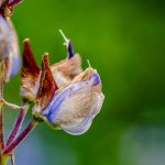
Week 23 - Faded Glory
I decided to do two things for this theme, take shots of wild flowers with flowers that were past their prime and to steal Kell's title...
With that said here are some of the shotes that I took while walking my dog in Tynehead Park
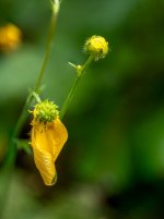
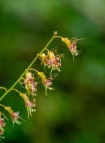
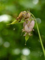
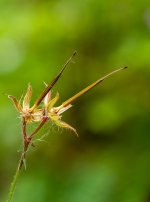
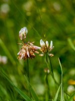
I decided to do two things for this theme, take shots of wild flowers with flowers that were past their prime and to steal Kell's title...
With that said here are some of the shotes that I took while walking my dog in Tynehead Park
OP
- Messages
- 5,208
- Name
- bill
- Edit My Images
- Yes
Lovely shots. Hard to pick one.
Great set
A great idea for the theme, and they work well
Lovely set of the faded blooms
Thank you all, not my best images but I wasn't that inspired. I found that this theme was too close to the last theme...just me...

- Messages
- 11,491
- Name
- Dave
- Edit My Images
- No
Not just you.Thank you all, not my best images but I wasn't that inspired. I found that this theme was too close to the last theme...just me...
OP
- Messages
- 5,208
- Name
- bill
- Edit My Images
- Yes
Thanks Keith, good to hear that I'm not aloneGood set Bill, great colours on that first shot and yes, not just you
OP
- Messages
- 5,208
- Name
- bill
- Edit My Images
- Yes
Thanks AllanGood set and I agree some of the themes this year and last year to be honest have been poor
OP
- Messages
- 5,208
- Name
- bill
- Edit My Images
- Yes
Thanks Kell, might be the best shot I've taken of a buttercup...Nice set of images.
I think I prefer umber two (the yellow).
OP
- Messages
- 5,208
- Name
- bill
- Edit My Images
- Yes
Week 24 Silence
So it took a little while for me to decide what to shoot but then I started to think of institutions dedicated to silence in one form or another, things like cemeteries, churches, shrines, etc.
That led me to think of the one thing I was intimately familiar with as a kid in school and the one refrain that I would often hear whispered to me, "Sshhhhhh, this is a library!"
So it was off to the main Vancouver Library where I spent a few hours wandering eight of the nine floors. I couldn't decide on just my usual six shots...
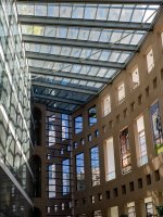
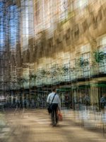


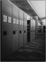
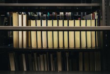
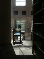
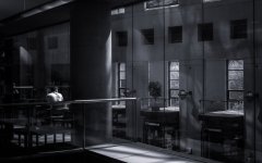
So it took a little while for me to decide what to shoot but then I started to think of institutions dedicated to silence in one form or another, things like cemeteries, churches, shrines, etc.
That led me to think of the one thing I was intimately familiar with as a kid in school and the one refrain that I would often hear whispered to me, "Sshhhhhh, this is a library!"
So it was off to the main Vancouver Library where I spent a few hours wandering eight of the nine floors. I couldn't decide on just my usual six shots...

- Messages
- 5,597
- Name
- Kell
- Edit My Images
- Yes
I think you said in my themread that your shot wasn’t as good as mine.
I beg to differ.
There’s a lovely play of light on the guy in white.
The only thing I’d say is that I might have cropped a fair bit of right hand side off to bring him further into frame.
Nothing else to add, it’s a great shot.
I beg to differ.
There’s a lovely play of light on the guy in white.
The only thing I’d say is that I might have cropped a fair bit of right hand side off to bring him further into frame.
Nothing else to add, it’s a great shot.
OP
- Messages
- 5,208
- Name
- bill
- Edit My Images
- Yes
Thanks Wayne!Smashed it Bill
Appreciate the kind words Allan!Excellent shot you put in the the other side but all together a very good set.
Thanks NickI like that a lot. It really suggests silent, without being so obvious.
Thanks Paul, I actually had another shot of a chair that was similar, there were so many potentially good shots...Great set! I think you chose the best shot, but the other B&W, and the sunlit chair would also be worthy entries. Great work!
Thanks Kell, I appreciate the input. I did play with different crops but ended up liking the odd numbers of windows on the right along with the odd number of black square insets.I think you said in my themread that your shot wasn’t as good as mine.
I beg to differ.
There’s a lovely play of light on the guy in white.
The only thing I’d say is that I might have cropped a fair bit of right hand side off to bring him further into frame.
Nothing else to add, it’s a great shot.
Thanks you KeithGood set again Bill, think the B&W really suits the theme.
OP
- Messages
- 5,208
- Name
- bill
- Edit My Images
- Yes
Week 25 Repetition in Nature
So I started out with the obvious interpretation of "pieces of nature that repeat" and got these whilst walking the dog:
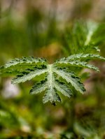
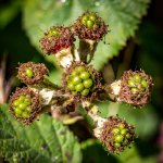
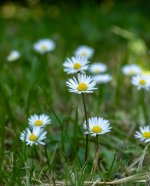
But then I started to notice the "hand of man" repeating in nature.
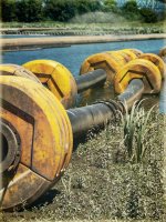
These floats stranded on the side of the river:
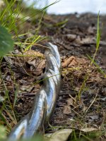
The repeating curls of the plastic covering of discarded wire
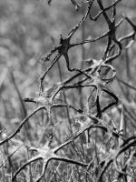
And the amoeba shaped pieces of this plastic garbage lying in the grass
So I started out with the obvious interpretation of "pieces of nature that repeat" and got these whilst walking the dog:
But then I started to notice the "hand of man" repeating in nature.
These floats stranded on the side of the river:
The repeating curls of the plastic covering of discarded wire
And the amoeba shaped pieces of this plastic garbage lying in the grass