
You are using an out of date browser. It may not display this or other websites correctly.
You should upgrade or use an alternative browser.
You should upgrade or use an alternative browser.
The TP52 - 2026 Darkslinger's 52 for 26
- Thread starter Darkslinger
- Start date


- Messages
- 6,542
- Name
- Dominic
- Edit My Images
- Yes
Cultural elements
That's a very colourful set of images.
Nostalgia
Another good set, there's something about old cars, they're not particularly comfortable, they're a bit unrefined, they're not that great to drive, but we all remember them with love.
That's a very colourful set of images.
Nostalgia
Another good set, there's something about old cars, they're not particularly comfortable, they're a bit unrefined, they're not that great to drive, but we all remember them with love.
OP

- Messages
- 5,162
- Name
- bill
- Edit My Images
- Yes
Thanks Paul, a lot of good memories tied up with that sign.Another great set Bill!
I think your chosen shot is very evocative for the theme, it reminds me of pictures I would see of the future-worlds in the newspapers and comics of my youth.
Thanks Keith, got lucky with the old car show.Good set Bill, like the big W and the 3rd shot with the steering wheel for me
Thank you SimonAs other said Bill, another top set.
Thanks Alan, yeah a lot of texture there.Great set, the final “W” would be my pick, carried a bit more character
Thanks you Allan, the first image that I took that day. It was parked on the street rather than as part of the cars show.I do like the first shot of the car its a great angle.
Thanks Nick.I like the subtle movement in your chosen shot, and the rust tones in the big W look lovely.
The first car shot really appeals to me too.
Thanks Dominic, for me it's the smell. When you sit in them, old cars just smell different, not bad, just different.Cultural elements
That's a very colourful set of images.
Nostalgia
Another good set, there's something about old cars, they're not particularly comfortable, they're a bit unrefined, they're not that great to drive, but we all remember them with love.
OP
- Messages
- 5,162
- Name
- bill
- Edit My Images
- Yes
Week 35 Snapperlicious
I wanted to find someplace different to shoot for this challenge. A friend told me about this place just off the side of the road that had a trail the ran under the Alex Fraser bridge so I thought that I'd check it out. More of a scouting trip then a serious shoot. I did bring my tripod thinking that I might shoot some long exposures but ended up not using it.
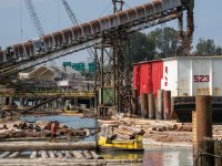
As you start down the trail towards the water, there is a small bridge that give an overview of a pulp mill to the left
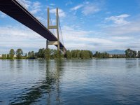
Then there is the bridge itself. I walked to the right side to capture some of the morning light
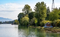
On the right side of the bridge, down the river there was a little cottage/shack that caught my eye
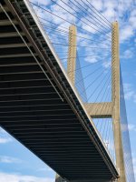
On my walk back to the trailhead, I thought that I'd try to get some more "artsy" shots of parts of the bridge. These are just a couple of them
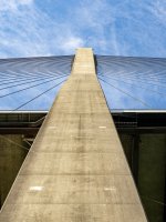
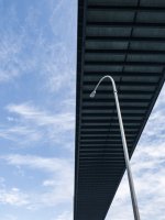
I wanted to find someplace different to shoot for this challenge. A friend told me about this place just off the side of the road that had a trail the ran under the Alex Fraser bridge so I thought that I'd check it out. More of a scouting trip then a serious shoot. I did bring my tripod thinking that I might shoot some long exposures but ended up not using it.
As you start down the trail towards the water, there is a small bridge that give an overview of a pulp mill to the left
Then there is the bridge itself. I walked to the right side to capture some of the morning light
On the right side of the bridge, down the river there was a little cottage/shack that caught my eye
On my walk back to the trailhead, I thought that I'd try to get some more "artsy" shots of parts of the bridge. These are just a couple of them


- Messages
- 2,412
- Name
- Alan
- Edit My Images
- No
I am partial to a good architecture shot, and really like your “artsy” pics.
OP
- Messages
- 5,162
- Name
- bill
- Edit My Images
- Yes
Thanks David, yes, I'll definitely be going back there.Your chosen image is excellent. I also like the other"artsy" shots of the bridge. Looks like you have found a good location.
Thanks DominicI think you've chosen the right image, but I would say that they're all pretty good.
Thank you NickYour chosen shot works great. It's obvious what it is, but there's an abstract feel to it.
Thanks Kell, I actually like that one the best as well but, for whatever reason, decided to post the one I didSome great angles on the set of car shots.
I like how you created your chosen shot, but I think I prefer the rust of the bigger W.
For snappers - I really like the graphic nature of the lamppost under the bridge.

Thanks Simon!Great set as per, Bill. Love the bridge shot.
Thanks you Alan, I only posted a couple of all the ones I shot.I am partial to a good architecture shot, and really like your “artsy” pics.
Thanks KeithGood set Bill, think you picked the right shot. Nice looking bit of architecture against the sky
Thanks Allan, I'm with you...All good as always, lamppost under the bridge is a belter though.
OP
- Messages
- 5,162
- Name
- bill
- Edit My Images
- Yes
Week 36 One Street Stories and Technique
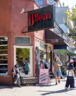
Fortuitous, the Commercial Drive No Car Day festival took place on the weekend. They cordon off about six blocks, thousands of people attend. There was so much that I couldn't decide on what to post so I've actually posted eight images rather than my usual six.
This is what it looked like as we approached it from the South end
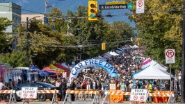
Of course I had to do a multi-exposure of the sign...
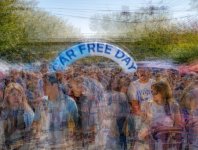
Lots of coffee shop along this street (and fresh donuts!)
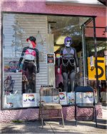
Also a hotspot for alternative lifestyles
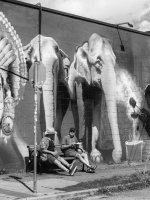
The murals on the sides of the buildings are awesome as well
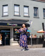
She looks like she's surprised that there's a Saly Limon restaurant here...
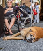
I was hot and I wasn't the only one that wanted to take a nap
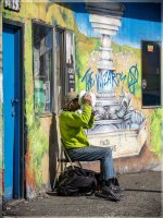
This was too perfect not to shoot, the guy with the lime green jacket sitting beside a lime green mural...and drinking from a bucket...
Fortuitous, the Commercial Drive No Car Day festival took place on the weekend. They cordon off about six blocks, thousands of people attend. There was so much that I couldn't decide on what to post so I've actually posted eight images rather than my usual six.
This is what it looked like as we approached it from the South end
Of course I had to do a multi-exposure of the sign...
Lots of coffee shop along this street (and fresh donuts!)
Also a hotspot for alternative lifestyles
The murals on the sides of the buildings are awesome as well
She looks like she's surprised that there's a Saly Limon restaurant here...
I was hot and I wasn't the only one that wanted to take a nap
This was too perfect not to shoot, the guy with the lime green jacket sitting beside a lime green mural...and drinking from a bucket...
- Messages
- 2,412
- Name
- Alan
- Edit My Images
- No
That green mural and jacket shot is an absolute belter. So much to see, and loads of character.
OP
- Messages
- 5,162
- Name
- bill
- Edit My Images
- Yes
Thanks Alan, it was too good to miss.That green mural and jacket shot is an absolute belter. So much to see, and loads of character.
OP
- Messages
- 5,162
- Name
- bill
- Edit My Images
- Yes
Thanks AllanLots going on there, nicely documented too.
OP
- Messages
- 5,162
- Name
- bill
- Edit My Images
- Yes
Week 37 Urban Wildlife
I decided to do a little bit of shoehorn and shoot a couple of places where some urban wildlife hang out.
Two different skate parks, one in Surrey (where I live) and one in Vancouver.
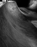
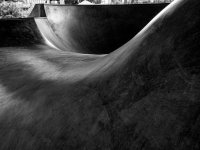
The Surrey park is right next to a community centre and is covered and very clean. It is comprised of a deep bowl and a lot of "smooth" curves. I thought that I'd take a few shots of how the curves and the light played together
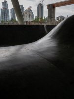
The Vancouver park is a little more isolated, next to a major thoroughfare and the Skytrain line and is far more gritty. I thought that I'd focus more on the graffiti.
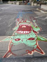
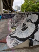
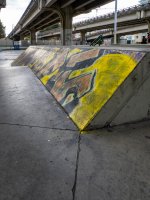
I decided to do a little bit of shoehorn and shoot a couple of places where some urban wildlife hang out.
Two different skate parks, one in Surrey (where I live) and one in Vancouver.
The Surrey park is right next to a community centre and is covered and very clean. It is comprised of a deep bowl and a lot of "smooth" curves. I thought that I'd take a few shots of how the curves and the light played together
The Vancouver park is a little more isolated, next to a major thoroughfare and the Skytrain line and is far more gritty. I thought that I'd focus more on the graffiti.
OP
- Messages
- 5,162
- Name
- bill
- Edit My Images
- Yes
Thanks Allan, yeah I think that they're better shots but I figured the one I chose maybe worked on a couple of different levels for "wildlife"Interesting set, I do like the black and whites of the curves.

- Messages
- 12,111
- Name
- Allan
- Edit My Images
- No
I get what you mean and I agree, I wasn't really thinking about themes though it didn't seen to matter I get the concept.Thanks Allan, yeah I think that they're better shots but I figured the one I chose maybe worked on a couple of different levels for "wildlife"

- Messages
- 5,749
- Name
- Keith
- Edit My Images
- Yes
As Alan said the curve shots are the more interesting, especially the 2nd for me. Gritty is a great description for the park with the skytrain line and graffiti.
I suspect I might be be missing something here but wondering why your chosen shot is upside down
I suspect I might be be missing something here
but wondering why your chosen shot is upside down
OP
- Messages
- 5,162
- Name
- bill
- Edit My Images
- Yes
Thanks Keith, I took the shot from the edge of the skate park looking in, it's as I saw it then. Here's one standing in the park looking out at the street:As Alan said the curve shots are the more interesting, especially the 2nd for me. Gritty is a great description for the park with the skytrain line and graffiti.
I suspect I might be be missing something here
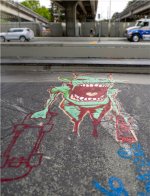
Thanks Paul.Another good set Bill. I especially like the light on the smooth curves.
- Messages
- 2,412
- Name
- Alan
- Edit My Images
- No
I like the skatepark shots, but for the theme I am drawn to the skatepark looking out, there is something menacing in the perspective
OP
- Messages
- 5,162
- Name
- bill
- Edit My Images
- Yes
Thanks DominicIt's a good set of images, I like the black and white curve shot, but can understand why you went with your chosen image.
Yeah, I like how it turned out, just the wild monster graffiti worked better for the theme.The skatepark shots are great. I really like the first one.
Thanks AlanI like the skatepark shots, but for the theme I am drawn to the skatepark looking out, there is something menacing in the perspective
OP
- Messages
- 5,162
- Name
- bill
- Edit My Images
- Yes
Week 38 No-Face Portrait
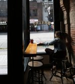
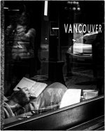
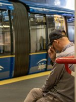
I managed to get out to a few places over the past few days. Most of these are the bog-standard "back to the photographer" shots but I really liked the one that I posted as my chosen image. Shot through the glass of a coffee shot. I think that it has the best story, though the man looking out over the harbour was a close second for me.
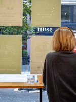
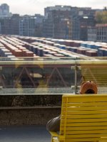
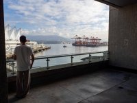
I managed to get out to a few places over the past few days. Most of these are the bog-standard "back to the photographer" shots but I really liked the one that I posted as my chosen image. Shot through the glass of a coffee shot. I think that it has the best story, though the man looking out over the harbour was a close second for me.
OP
- Messages
- 5,162
- Name
- bill
- Edit My Images
- Yes
Thanks Kell, the YREKAB shot was one I took on the fly as I was leaving. I wasn't sure how it would turn out until I saw it in post. I'm with you, the lighting really works for me. I tried it as a b&w but the colour version won me over.I really like both your chosen shot and the one above (the BAKERY or YREKAB) shot.
Both have excellent lighting and I’m drawn to the heavy contrast of the B&W.
LOL, I didn't even see that until you pointed it out Paul, now I can't unsee it...A good set, and I think you chose the best of the bunch. Interesting moiré pattern on the knee, it must be a fine check material.
I think that it might be some imperfection in the glass of the window.

OP
- Messages
- 5,162
- Name
- bill
- Edit My Images
- Yes
Thanks Dominic, I was happy with the results.That's a very good set of images, you could have picked anyone of them.
Thanks Nick, you've hit the nail on the head for why I chose it. More about the feel than any technical reason.It would be a tough choice between the last three of that set for me, but I really like how your chosen shot feels.
Thanks Dave, I thought I was your only friend in VancouverChosen shot is the best by far. I'll show it to a friend of mine who lives in Van